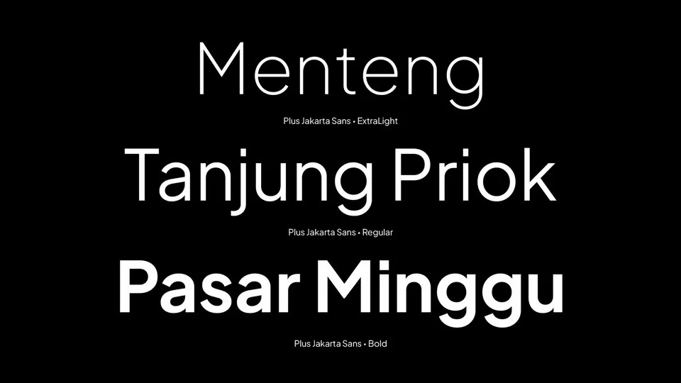
About Plus Jakarta Sans Font
My journey with typography has always been about discovering fonts that tell a story. As a graphic designer and typographer, I’m constantly hunting for typefaces that break the mold—and Plus Jakarta Sans Font caught my eye like a beacon in the design world.
I stumbled upon this gem while working on a branding project for a tech startup. Scrolling through font libraries, something about its clean lines and unique character immediately pulled me in. The moment I implemented it in my design, I knew this wasn’t just another sans-serif font—it was something special.
Diving into the Font’s Origins
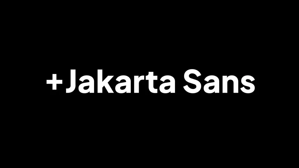
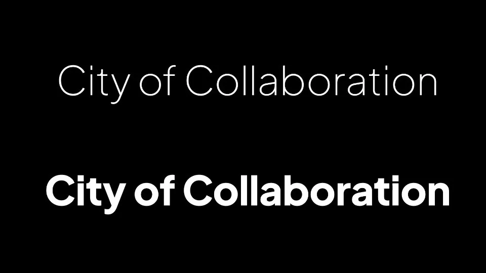
Plus Jakarta Sans isn’t just a typeface; it’s a typographic love letter to the vibrant city of Jakarta. Crafted by Gumpita Rahayu from Tokotype, this font emerged from a specific mission—the Jakarta City of Collaboration identity project in 2020. Commissioned by 6616 Studio for the Jakarta Provincial Government, the font carries the DNA of its urban inspiration.
Drawing inspiration from design legends like Neuzeit Grotesk, Futura, and 1930s grotesque sans serifs, this typeface brings a fresh perspective to geometric sans-serif styles. The design philosophy goes beyond mere aesthetics—it’s about capturing the spirit of a dynamic, diverse city through typographic expression.
What sets Plus Jakarta Sans apart is its thoughtful construction. The designers created a typeface with almost monolinear contrast and distinctively pointy curves. The x-height is slightly taller, providing crystal-clear spaces between capital letters and lowercase characters. This attention to detail ensures remarkable legibility across various sizes and applications.
Standout Features That Make This Typeface Shine
Every great font has its signature elements, and Plus Jakarta Sans is no exception. The typeface comes packed with features that make designers’ hearts skip a beat:
- Three distinctive stylistic sets: Lancip (Sharp), Lurus (Straight), and Lingkar (Swirl)
- Open counters that enhance readability
- Balanced spacing that preserves legibility at multiple sizes
- Alternative characters that add versatility
- Clean, modern geometric forms
- Subtle nods to 1930s grotesque typography
Where Can You Use This sans serif Font?
Versatility is the name of the game with Plus Jakarta Sans. Whether you’re designing:
- Sleek corporate branding materials
- Digital interfaces and websites
- Marketing collateral
- Editorial layouts
- Startup pitch decks
- Social media graphics
- Mobile app interfaces
This font seamlessly adapts. Its geometric precision works equally well in headlines and body text, making it a go-to choice for designers seeking a contemporary, professional look.
Font Licensing: What You Need to Know
Good news for designers and creatives! Plus Jakarta Sans Font is free for personal use. For commercial projects, you’ll need to purchase a commercial license. Always check the most current licensing terms to ensure you’re using the font correctly.
Final Thoughts
Plus Jakarta Sans isn’t just a font—it’s a storytelling tool that captures the essence of urban diversity and modern design. Its charm reveals itself gradually, much like the city that inspired it. Whether you’re a seasoned designer or just starting, this typeface offers something truly unique.
Disclaimer: Always download fonts from reputable sources and respect licensing agreements.
