Note: For Commercial Use Click “Buy The Font” Button!
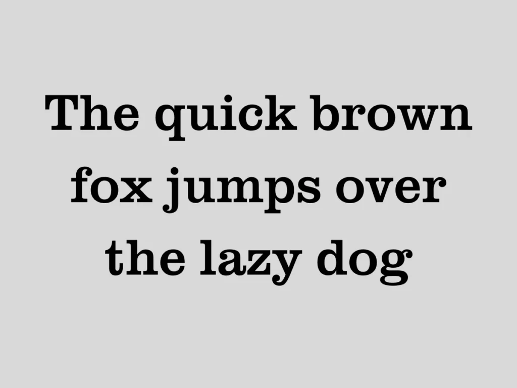
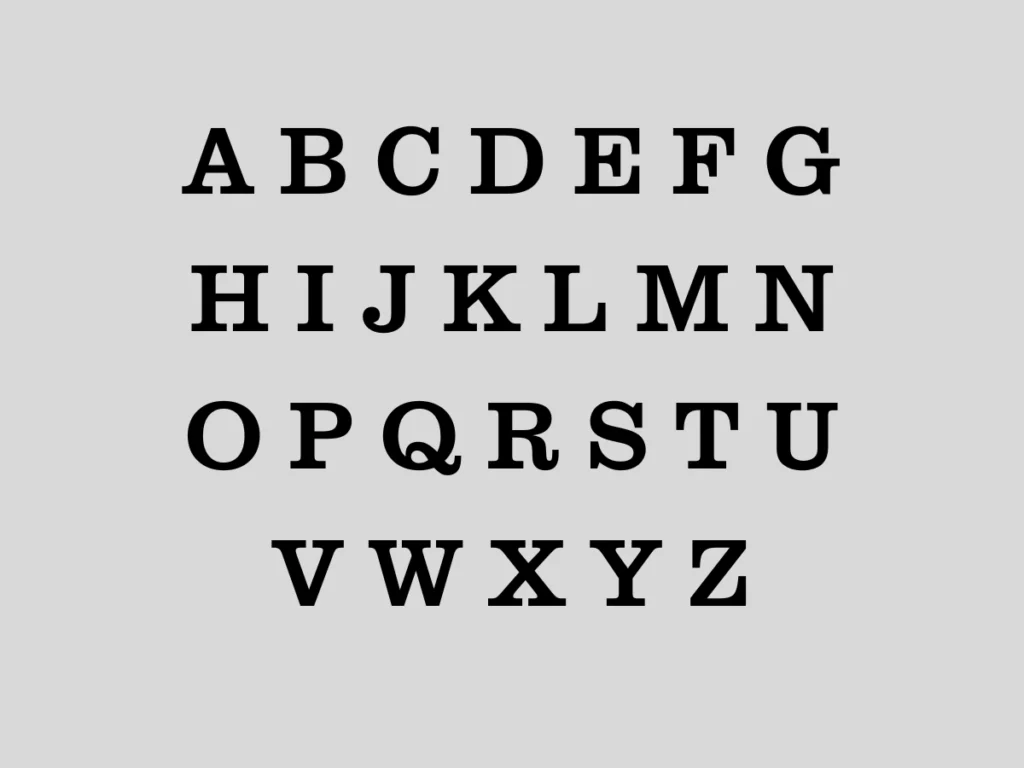
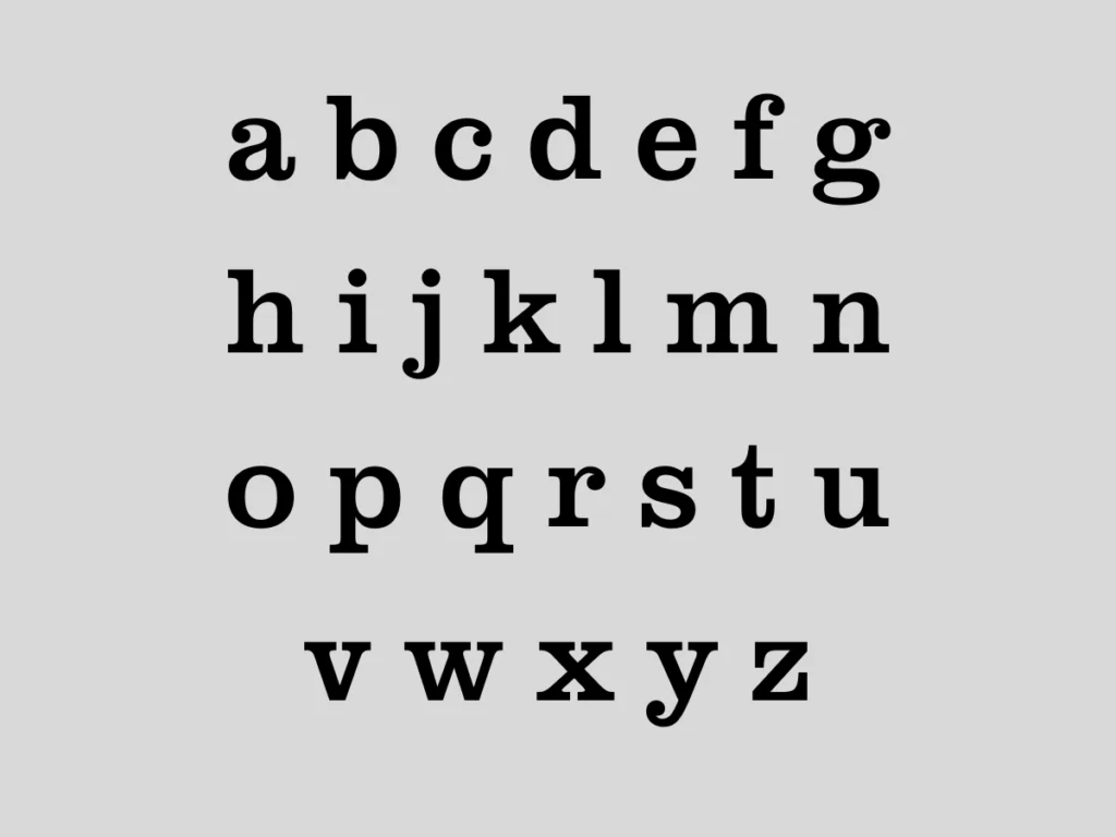
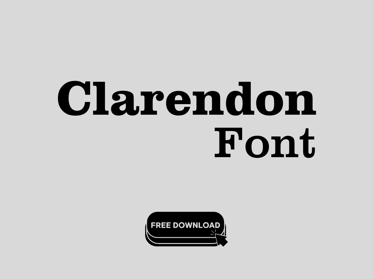
About Clarendon Font Family
As a typographer and graphic designer, I’m always on the lookout for fonts that bring character and style to my projects. Recently, I came across the Clarendon font family, a timeless slab serif typeface with a rich history dating back to 1845.
I used it in a branding project that required a balance of strength and elegance, and it did not disappoint. Its bold yet refined design immediately stood out, making it perfect for the project’s requirements. I wanted to share my experience with this font to help others explore its potential and decide if it fits their creative needs.
History of the Clarendon Font Family
The Clarendon font family originated in London in 1845, created at the Fann Street Foundry, led by Robert Besley. This slab serif typeface was crafted during a time when bold and legible fonts were essential for advertisements and posters.
Besley’s collaboration with punchcutter Benjamin Fox resulted in a design that combined thick, modern serif lines with a touch of elegance. The font’s style has stood the test of time, influencing an entire genre of typography.
Over the years, Clarendon has been embraced by notable foundries, including Monotype, Linotype, and Adobe, with adaptations like URW Clarendon font family and Besley’s Clarendon.
It’s also used across various mediums, from print to digital, and continues to be a favorite among designers for its versatility and timeless appeal. Designers like Patrick Griffin have contributed modern interpretations of Clarendon, ensuring it stays relevant in today’s typography landscape.
Features of the Clarendon Font Family
The Clarendon font family is more than just a slab serif; it’s a typographic masterpiece that blends form and function. Its bold lines and subtle contrast make it legible even at smaller sizes, ideal for body text and headlines.
The typeface includes OpenType features, oldstyle figures, and stylistic alternates, offering flexibility for creative projects. Glyph support is extensive, ensuring compatibility across different languages and formats.
Clarendon also features ball terminals, consistent ascenders and descenders, and small caps, which add a touch of sophistication. Its italic variations provide versatility, making it suitable for both formal and casual designs.
Whether you’re working on a logo, website, or printed material, Clarendon’s strong yet approachable style fits seamlessly. The font’s adaptability shines in both SVG and PNG outputs, maintaining high-quality raster and vector-based graphics for scalable designs.
Where Can You Use This Font?
Clarendon’s versatility makes it a go-to choice for a wide range of projects. Its bold yet elegant style works beautifully in branding, whether for logos, packaging, or advertising.
The slab serif design adds character to websites, enhancing readability while drawing attention. Social media graphics, printed materials, and even video and broadcast projects benefit from its timeless appeal.
For designers working on text-heavy projects like books, magazines, or ebooks, Clarendon’s legibility ensures a smooth reading experience. Its ability to blend modern and classic elements makes it a favorite for creating eye-catching headlines or sophisticated body text. The font’s compatibility with software like Adobe Photoshop, InDesign, and Microsoft Word ensures it can be seamlessly integrated into any workflow.
Font License
The Clarendon font family is available as a free download, making it accessible to designers at any level. While it’s free, donations to the creators are highly appreciated, supporting the continued development of quality fonts.
Before using it in commercial projects, always check the license information to ensure compliance with any specific usage restrictions. With its rich history and versatile features, Clarendon is a valuable addition to any designer’s toolkit.
