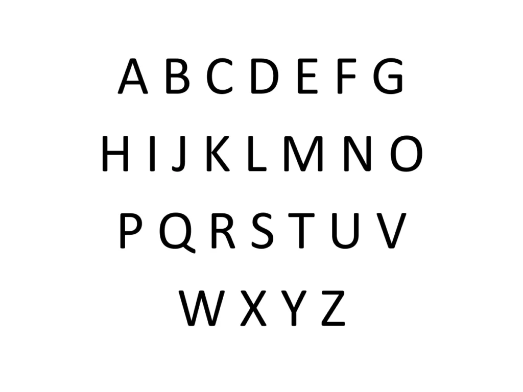
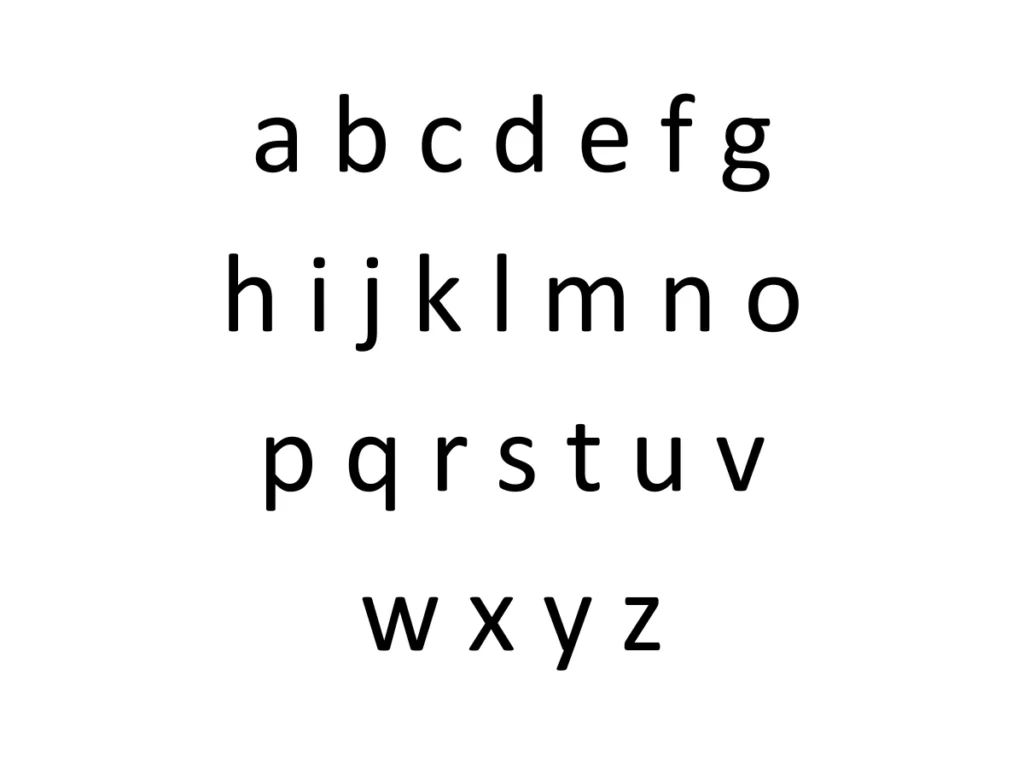
About Calibri font family
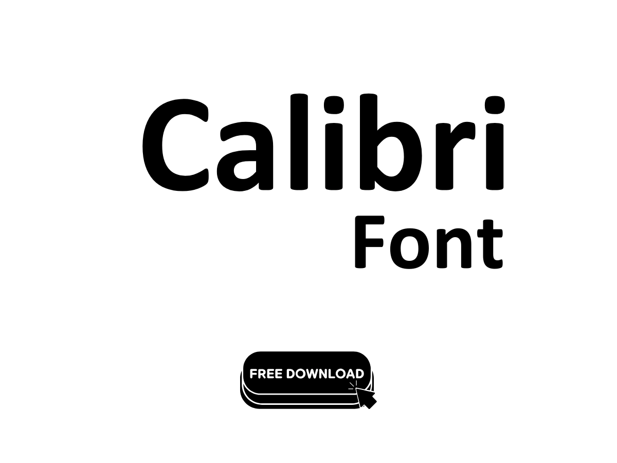
As a typographer and graphic designer with 8+ years of experience, I recently explored Calibri for a major branding project. I needed a font that could maintain readability across multiple platforms while conveying a modern, approachable feel. Calibri caught my attention during font testing for a tech startup’s visual identity system. Its clean lines and subtle warmth made it perfect for both digital interfaces and print materials.
Calibri emerged from the talented hands of type designer Luc(as) de Groot between 2002-2004. Microsoft commissioned this sans-serif typeface as part of their ClearType Font Collection, specifically optimized for screen display. The font gained widespread recognition when Microsoft made it the default font in Office 2007, replacing Times New Roman in Word and Arial in PowerPoint, Excel, and Outlook. De Groot crafted Calibri with careful attention to both technical excellence and aesthetic appeal, ensuring optimal readability across different platforms and screen sizes.
Calibri’s standout features include its versatile character set supporting multiple languages – from standard Latin to Cyrillic, Greek, Hebrew, and Arabic scripts. The font family offers various weights and styles, including light, regular, bold, and italic variants. Its OpenType format enables advanced typography features like ligatures, small caps, and both lining and text figures. The letterforms showcase subtle curves and soft terminals, creating that signature warm character while maintaining professional clarity. Notably, Calibri’s x-height and spacing were carefully optimized for onscreen display, making it highly legible even at small sizes.
Where can you use this free font-family?
Calibri shines across numerous applications. In web development, it works seamlessly in CSS font stacks and maintains consistency across browsers. The font excels in professional documentation, from PowerPoint presentations to PDF reports. Its compatibility with Adobe Creative Suite makes it valuable for graphic design work in Photoshop and InDesign. Calibri performs exceptionally well in user interfaces across Windows, Mac, and mobile platforms like iOS and Android. The font’s balanced design makes it suitable for both body text and headings in digital layouts, while its clear rendering on screens makes it ideal for email clients and word processors. For developers, Calibri integrates smoothly with various frameworks and maintains excellent readability in HTML implementations.
Font License
While Calibri comes pre-installed with Microsoft products, it’s free for personal use. Commercial applications require proper licensing through Microsoft. The font’s widespread availability across operating systems and platforms makes it a practical choice for cross-platform projects, though users should verify their specific licensing needs based on intended usage.
