

About Adomania Font
I’m a typographer and graphic designer always searching for fonts with character. While updating a brand’s digital look, I found Adomania Font through a type roundup from the Obscure Fonts Foundry™. It immediately stood out. I tested it on a new logo and supporting graphics. The clean geometry paired with just enough edge gave it personality. It brought balance to a layout that needed a modern, sharp style with a little twist. This review is a quick dive into how it performed and why I think it’s a solid pick for creative teams.
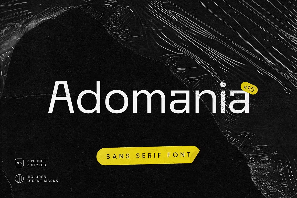
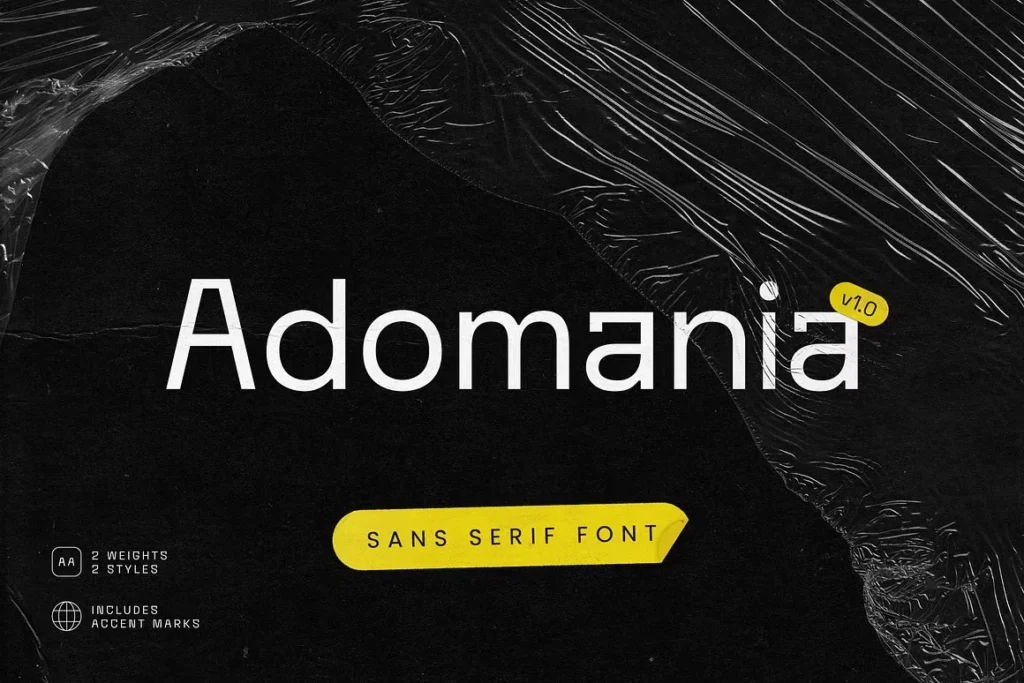
Adomania Font is a sans serif font with a modern and experimental feel. It was designed by Obscure Shop and released as part of their Obscure Fonts Foundry™ collection. It comes in 2 styles—light and bold—with both weights designed to match across projects. This font family was created for flexibility. Whether you’re working in Illustrator, Photoshop, or placing text on a simple page layout, it holds up. The overall look is geometric, but it doesn’t feel stiff. Instead, the design introduces just a bit of spice to standard minimal typography. The name “Adomania” fits the vibe perfectly. It’s about the sense of the future arriving early, and this typeface gives that energy. The otf file was easy to install, and the appearance was consistent across platforms. It worked well in both Adobe apps and basic tools. This font isn’t loud, but it’s definitely unique.
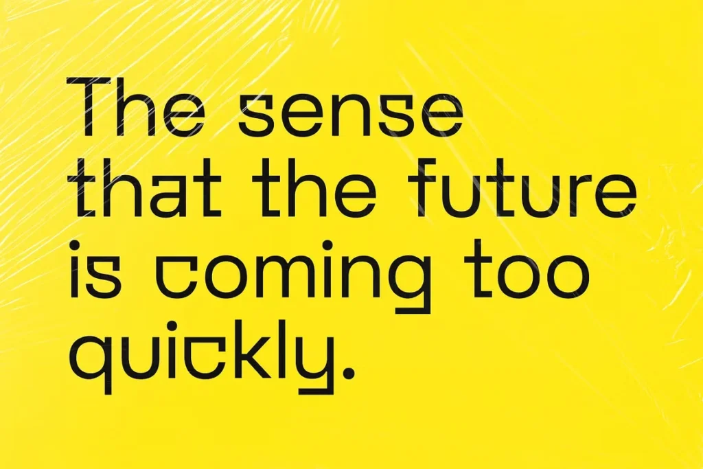
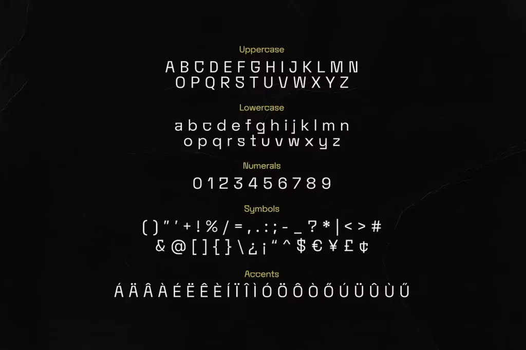
What makes Adomania Font really shine is its structure. The geometric design with clean lines feels futuristic but readable. The spacing is tight enough for headings, yet the text stays open and legible. Each character shows the care behind its shape. The bold style has impact, while the light version creates space in more relaxed layouts. I used both across brand mockups, and the width matched well with supporting graphics. Another strength is the plenty of symbols and accents it comes with. These extras help with global text coverage, especially in branding for international products. It’s a great choice for branding projects that want to stay modern but not boring. The type works best when paired with simpler body fonts. It’s not a headline-only face either. Short blocks of editorial work, web cards, and UI elements look strong in it too. It offers that fresh addition without overpowering the rest of your design. In a sea of similar sans-serif modern fonts, this one brings a crisp identity.
Where can you use this font?
Adomania Font is ideal for projects that need sharp visuals with a modern edge. It’s great for logos, web design, and short-form editorial work like digital ads or UI copy. I found it perfect for brands trying to feel new without going overboard. It has that uniform appearance with a creative spark. This makes it an easy pick for branding projects that need more life in their typography. If you’re working on style guides or presentations, the clean lines make layout and spacing feel tight and intentional.
You can also use it in product labels, digital posters, and landing pages. The font carries enough style to hold attention in a heading but stays simple enough to support other content. Whether you’re designing for print or screen, the results stay consistent. The installation process was smooth, and the file worked right away in both Mac and PC environments. I tested it in a Photoshop social media mockup and a full-page promo layout in Illustrator. It delivered crisp edges and balanced contrast in both. If you like exploring obscure fonts with functional personality, this is a safe and stylish pick. It’s not a free font, but it’s worth the license for long-term use.
Font License
Adomania Font Download requires a commercial license. There is no free download version for public or client use. To use it in logos, branding, or published projects, you must purchase it through the designer. Always review the font’s usage terms before adding it to your client workflow.
