

Note: To use this font for commercial purposes, click “Get Commercial License” Button!
About Obviously Font
I’m a typographer and graphic designer who spends a lot of time testing typefaces in real projects. While working on a branding design, I came across the Obviously Font and decided to give it a try. The sharp details, geometric style, and playful structure instantly caught my attention. I tested it on print layouts, web mockups, and even a few vinyl sign concepts. Each time it delivered a professional yet bold look. That’s why I’m sharing this review, so other designers can see how this font can add character and refinement to creative work.
The Font and Its Designer
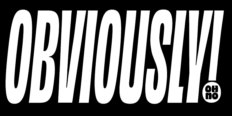
The Obviously Font Family is a geometric sans-serif typeface that feels modern yet approachable. Its structure is precise, with clean curves and balanced spacing that work beautifully in both bold headings and delicate text. The design is rooted in typographic tradition but refined with a contemporary twist, making it versatile for creative projects that require a mix of elegance and strength.
This typeface was created by OH no Type Co, a studio known for producing fonts with personality and function. The founder, James Edmondson, designed Obviously with an eye for detail and a love of hand-painted signage. His background in expressive typography shows in every letter. At Adobe Fonts, James Edmondson’s work is widely recognized for combining clarity with character, and Obviously is no exception.
The family includes multiple versions and weights, from light to bold, making it flexible for different applications. There are 96 styles available, and each version adds nuance to the overall family. This variety makes it suitable for variable font settings, web typography, and even large-scale signage. Released on Future Fonts and later refined into a full family, Obviously has become a favorite for graphic designers who want control and creativity in one package.
Features of Obviously Font
The strength of Obviously Font lies in its features that balance utility and style. Its geometric construction keeps the design consistent across all sizes, whether you are working on print or digital layouts. This consistency makes it reliable for design projects that need both bold impact and fine detail.
The typeface includes variable font options, giving flexibility to adjust weight and width in real time. Designers can explore Obviously in multiple ways, whether they need tight, squished letters for a playful look or wide, commanding text for bold signage. The smooth transitions between styles make pairing fonts within the family simple and intuitive.
Typography fans will notice the attention to detail in each letterform. The corners, spacing, and curves have been refined to keep the font readable even in long text. At the same time, the family supports experimental layouts. It’s perfect for tee shirt designs, web graphics, video and broadcast titles, and editorial spreads.
Another highlight is the compatibility with Adobe Fonts. Designers can access and sync it across software, making workflow integration seamless. With so many styles, alternative versions, and pairing possibilities, Obviously is more than a typeface, it’s a toolkit for modern branding.
Where Can You Use This Font?
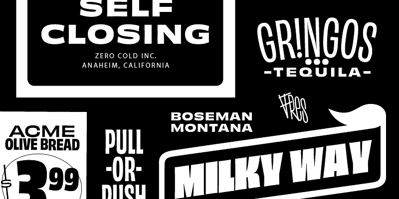
The Obviously Font can be used anywhere bold typography is needed. For branding projects, it elevates logos, packaging, and editorial layouts with its refined yet playful geometry. Its bold versions make it great for titles, while lighter weights handle text with elegance.
For print projects, the font is ideal in posters, signage, and magazines where clarity and style matter. On the web, Obviously translates well into responsive designs, maintaining structure across devices and screen sizes. Since it’s a variable font, designers can create fluid transitions for interactive media and web animations.
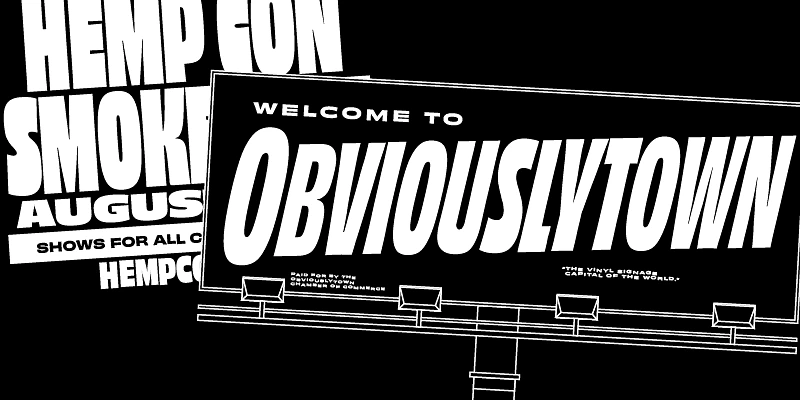
If you work with vinyl signage, Obviously shines with its bold letterforms that remain readable from a distance. The squished versions bring character to billboards and playful branding, while the wider cuts deliver impact in commercial spaces.
It’s also a strong choice for graphic design projects like tee shirt designs, advertising, or motion graphics. Because of its typographic flexibility, it adapts easily to alternative or similar fonts in your toolkit, but often stands out as the best solution. For me, using it in branding has shown how obviously font is both a professional tool and a seriously fun font to explore.
Font License
The Obviously Font Free Download is available for personal use. To use it in professional or commercial projects, a license must be purchased through OH no Type Co. Supporting the designer, James Edmondson, ensures continued development of fonts that combine style, detail, and creativity for the design community.


