

Note: To use this font for commercial purposes, click “Get Commercial License” Button!
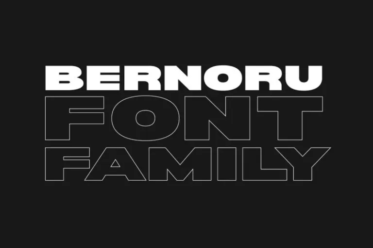
About Bernoru Font
I’m a typographer and graphic designer who often searches for typefaces that bring power and clarity into branding. The Bernoru Font caught my eye while exploring display styles for a bold campaign. Its striking look immediately stood out in my design tests.
I used it for a branding project focused on headlines and visual identity, and the results were both strong and modern. This review comes from first-hand use, not theory, which is why I’m confident in sharing how well it worked. Fonts are tools, and Bernoru proved itself to be more than capable in a real-world project.
The Font and the Designer
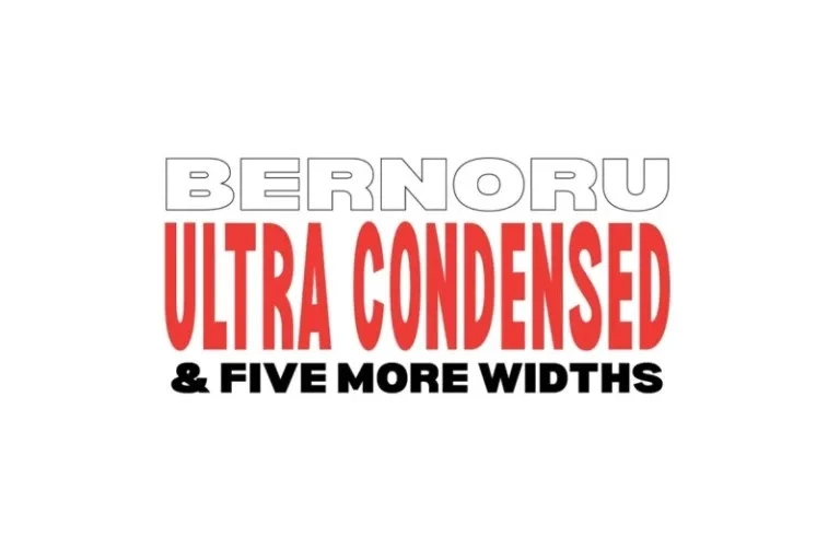
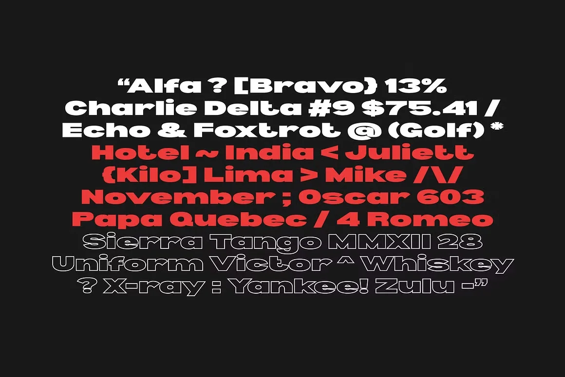
Bernoru Sans is a display typeface created by Graham Paterson, also known as grahampaterson. The font is crafted for impact, designed to dominate posters, headlines, and branding projects with bold character and confident proportions. It belongs to the bernoru font family, which currently comes in 6 widths ranging from bold ultra expanded to semi condensed, offering flexibility across different applications.
Paterson’s approach shows a deep respect for balance between form and function. The sans serif font structure provides clarity, while the wide range of weights and features gives designers room to experiment with scale and emphasis. Whether it’s for a logo, desktop project, or printing material, the Bernoru family adapts without losing its personality.
As a designer, Paterson’s style leans toward creative yet versatile solutions. The typeface is modern but timeless, avoiding the pitfalls of trendy fonts that fade quickly. Its clean geometry and thoughtful kerning support long-term usability. When you download the Bernoru font, you’re not just getting a font file, you’re accessing a roadmap of ongoing improvements. The full version promises even more updates, reinforcing the designer’s commitment to quality.
Features of Bernoru Sans Serif Font
The strength of the Bernoru Font lies in its carefully engineered details. The family currently includes 6 weights: bold ultra expanded, expanded, medium, semi condensed, condensed, and ultra condensed. Each one carries its own presence, giving you flexibility depending on project needs.
The font supports uppercase and lowercase characters, along with numbers, punctuation, and symbols. With over 2000 kerning pairs, spacing feels precise, ensuring readability even in large formats. The OTF file also comes with WOFF, WOFF2, and EOT, making it compatible across desktop, printing, and website use.
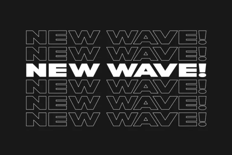
One highlight is its strong headline and branding focus. The wide shapes make it perfect for posters, while the narrower options give balance for tighter spaces. Whether you’re working on a commercial project or a creative design, the font holds its weight.
Paterson continues to expand its features and widths, following a roadmap of updates. That means new improvements and bug fixes are part of the long-term package. The inclusion of Latin characters increases its reach across languages, making it more practical. This commitment to support adds value, showing the designer’s focus on reliability and accessibility.
Where Can You Use This Font?
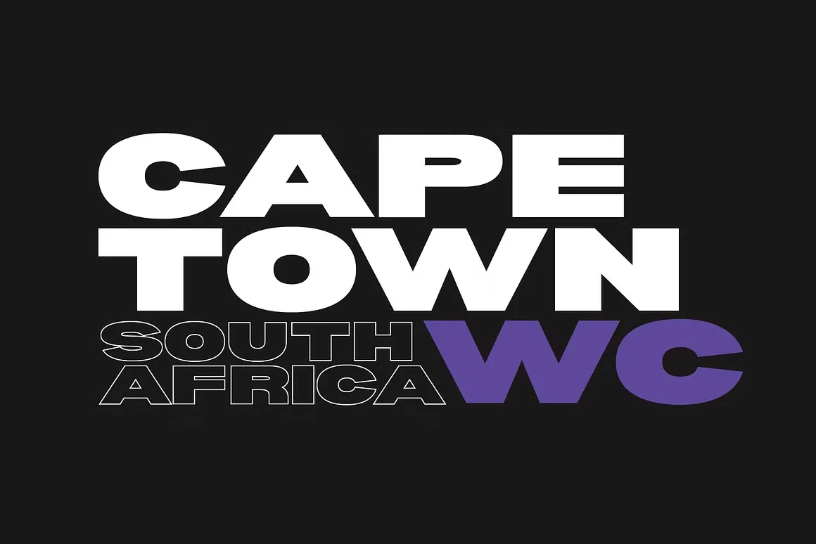
The Bernoru Font shines in projects that demand attention. For branding, it anchors a company’s voice with confidence. Logos benefit from its bold lines, while headlines and branding campaigns look sharp and modern. Its sans-serif structure ensures it reads clearly at scale.
In posters, the dramatic weight and features draw the eye instantly. The bernoru font family includes widths that work for both spacious and compact layouts. On websites, it functions well in headers or hero sections, giving strong first impressions. For printing, the sharp edges and well-designed kerning keep the results professional.
Designers will find it fits seamlessly into desktop projects like presentations, catalogs, or editorial layouts. The creative versatility allows you to pair it with more subtle typefaces for balance. In digital branding, it translates across mobile and desktop with consistency, maintaining its stylish and legible character.
From commercial logos to independent creative projects, Bernoru offers a solution that feels both full of character and technically reliable. If your work requires a typeface that stands tall and communicates strength, this font is a smart choice.
Font License
The Bernoru Font Free Download is available for personal use. To unlock the full version for commercial projects, you’ll need a proper license directly from Graham Paterson. Always check the included license file to confirm usage rights before applying the font in professional work.


