

About Stoic Font
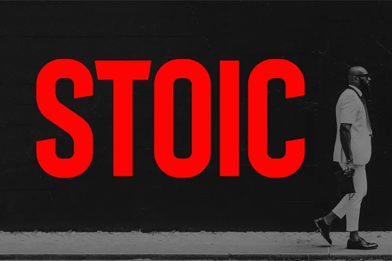
Stoic Font is a clean sans-serif font with a firm, steady look. I first noticed it while testing type choices for a simple landing page with a lot of short headings.
The shapes felt calm and controlled, which made the layout easy to read. I kept coming back to it whenever I wanted text that looked modern but not cold.
What stands out to me is how plain the letterforms seem at first, yet how tidy they stay in a grid. It feels like a safe, reliable option for everyday digital work.
Font Style & Design Analysis
This is a sans-serif font with a straightforward, modern direction. The strokes look even, with no decorative endings, which keeps the letterforms simple and clear on screen.
The designer or foundry for Stoic Font is not publicly confirmed from the sources I checked. I would always look at the official release page if credit details are important for a project or style guide.
The spacing feels fairly open, so text does not bunch up even in tighter layouts. It seems to sit in a medium weight, firm enough for headings yet not too heavy. The overall tone is quiet, stable, and practical, which supports a more neutral visual identity.
Where Can You Use Stoic Font?
I find Stoic Font most useful in digital interfaces, like dashboards or simple marketing sites. At larger sizes, the straight shapes give headings a clear structure without shouting for attention.
In smaller body text, the open spacing helps keep lines readable, especially on mobile screens. I would still test it for long articles, but for short paragraphs, cards, and labels it works well.
This font suits brands that want a calm, modern voice: tech tools, wellness apps, learning platforms, and minimalist portfolios. It also fits slide decks and basic brand systems where a neutral font family helps other design elements stand out.
Font License
Licence terms for Stoic Font are not fully clear from general references. Always check the official source for the latest licence, and confirm rights separately for personal, client, and wider commercial use. I never skip that step.


