

About Acherus Grotesque Font
Acherus Grotesque Font is a clean sans-serif typeface with a simple, modern feel. I first noticed it while testing options for a stripped-back digital dashboard design.
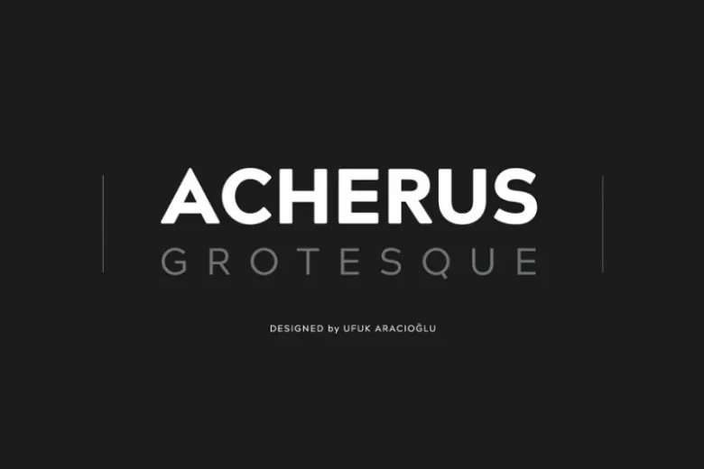
What caught my eye was the balance between geometric shapes and softer curves. The letterforms feel firm but not stiff, which makes the font easy to pair with other styles. On screen, the text stays clear even at smaller sizes, so it works well for everyday interface work.
I now reach for it when I need something neutral that still has a bit of character.
Font Style & Design Analysis
This is a sans-serif font with a geometric, low-drama look. Most strokes have even weight, which gives the whole font family a stable rhythm. It leans more practical than decorative, so it fades nicely into the background of content.
The exact designer or foundry behind Acherus Grotesque Font is not publicly confirmed, at least from the sources I could check. I would always look at the official distributor or foundry page for precise credit.
The shapes feel slightly rounded at the corners, so the text never looks harsh. Spacing is fairly open, which helps legibility on bright screens. The weights move from light to bold with clear steps, and the tone sits somewhere between casual and professional, which keeps layouts looking relaxed but organised.
Where Can You Use Acherus Grotesque Font?
I find Acherus Grotesque Font works best in interfaces, product sites, and simple brand systems. In large sizes, it makes clean headings that do not shout. On landing pages or dashboards, it supports information instead of competing with it.
At smaller sizes, the tidy letterforms and open spacing help with reading speed. Body text in apps, captions on charts, and form labels all stay clear. It feels especially at home in tech, SaaS, and education projects where clarity is more important than decoration.
For branding, I would use it for companies that want a modern but friendly visual identity. It pairs well with a more expressive display font for hero titles, while handling menus, UI text, and legal copy without drawing too much attention to itself.
Font License
Licensing for Acherus Grotesque Font can differ between sources, and the exact terms are not guaranteed. Personal use and commercial use may require different licences. I always check the official licence text from the distributor before using it in paid client work.
When I need a reliable, modern sans-serif that supports content instead of stealing the scene, this is one of the first options I test.


