
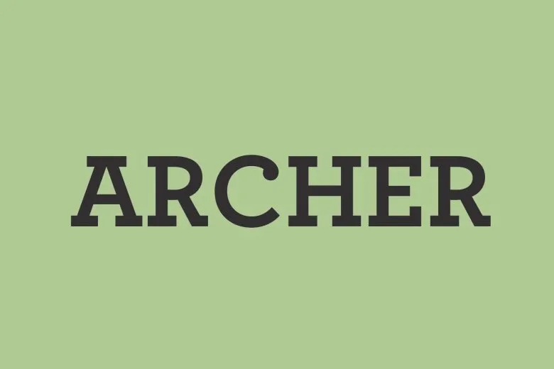

About Archer Font
Archer Font is a humanist slab-serif typeface with soft, rounded details. I see it used a lot where brands want a friendly but ordered look. It sits somewhere between serious and approachable.
I first paid attention to it in magazine layouts and brand guidelines for lifestyle products. The curves and ball terminals caught my eye straight away. It stands out because it keeps the sturdy feel of a slab, yet looks gentle and easy to read.
On screen and in print, the font family feels consistent. Shapes stay clear at different sizes, which makes it practical for real projects, not just moodboards.
Font Style & Design Analysis
This is a slab-serif font with a calm, well-balanced style. The letterforms use small ball terminals instead of sharp serifs, so they feel soft but still structured. Overall, the design leans more towards warmth than strict geometry.
From what I can find, the detailed designer and foundry credit for Archer Font is not publicly confirmed. I always treat it as a distinct typeface and check any source carefully before using it in client work.
The proportions are fairly open, with generous counters and tidy spacing. Stroke contrast stays low, which helps at smaller sizes. It usually comes in a range of weights, from light to bold, so it can handle both text and simple display roles while keeping a steady, approachable tone.
Where Can You Use Archer Font?
I reach for Archer Font when a project needs trust and warmth at the same time. It works nicely in branding and visual identity work for cafes, small shops, editorial brands, or any service that wants to feel human and dependable.
In larger sizes, the rounded slab serifs and ball terminals show up well on packaging, posters, and website headers. The font family can handle simple logos, especially for lifestyle, craft, and home-related products where a harsh modern look would feel wrong.
At smaller sizes, the open shapes stay readable in body text, menus, captions, and UI labels, as long as tracking is set with care. It suits audiences who prefer something softer than a strict modern serif, but more disciplined than a handwriting or script font.
Font License
Licensing for Archer Font can vary between personal and commercial use, depending on the distributor. I always check the official licence terms for this specific font family before using it in any paid client or large-scale project.
I like keeping it in mind when I want a soft slab look that still reads clearly across a whole system.


