
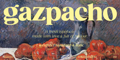

About Gazpacho Font
Gazpacho Font is a serif typeface with a strong, solid feel and clear, sharp details. I first tested it in a print layout where I needed something classic but not too old-fashioned.
What caught my eye was the balance between sturdy shapes and smooth curves. The letterforms feel thoughtful and tidy, which makes the font family easy to work with in longer text and strong headings.
Font Style & Design Analysis
This is a serif font with confident, well-defined strokes. The overall direction feels rooted in traditional book typefaces, but the structure looks a bit more contemporary and clean.
The exact designer or foundry for Gazpacho Font is not publicly confirmed, at least from the sources I checked. I would look at the official download or purchase page if you need precise credit details for a project.
The letterforms show firm verticals, moderate contrast in the strokes, and compact proportions. Spacing is fairly tight, which helps it hold together in headings, while the weights I tried stayed readable. The mood leans serious and dependable, suited to editorial and brand work that needs a traditional serif voice.
Where Can You Use Gazpacho Font?
In my tests, Gazpacho Font works well as a display font for titles, book covers, posters, and hero sections on websites. At larger sizes, the serifs and curves stay crisp and give a strong first impression.
At smaller sizes, it can handle body copy if you give it enough line spacing and avoid very light weights. I would use it for magazines, reports, and brochures where a classic serif look supports dense text.
This typeface also fits brand identities for education, publishing, culture, and professional services. When a visual identity needs trust, structure, and a bookish tone, this serif font can anchor logos, taglines, and supporting typography.
Font License
Licence terms for Gazpacho Font can vary, especially between personal and commercial use. I would always check the official source for the current licence, usage limits, and any web, app, or logo restrictions before publishing client work.


