
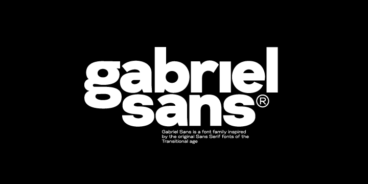

About Gabriel Sans Font
Gabriel Sans Font is a clean, modern sans-serif typeface that feels calm and straightforward on the page. I first tried it while testing options for a simple product website.
I noticed how quickly it settled into the layout without drawing too much attention to itself. The shapes look tidy and friendly, which makes it easy to pair with bolder display fonts. For everyday digital work, it feels like a steady, practical choice.
Font Style & Design Analysis
This is a sans-serif font with a very balanced, neutral style. The letterforms are open and uncomplicated, so text feels easy to scan on screens. It leans towards a modern look without going cold or overly technical.
I could not find a clearly confirmed designer or foundry for Gabriel Sans Font. Anyone using it in serious work should double-check the original source for proper credit details.
The curves look smooth, with even stroke widths and fairly generous spacing. In lighter weights, the font feels airy, while heavier styles give more presence for headings. Overall, the mood is steady, polite, and functional, which suits clear information design very well.
Where Can You Use Gabriel Sans Font?
I find Gabriel Sans Font works well for digital interfaces, app menus, and clean websites. At smaller sizes, the simple shapes stay readable, so it suits body text on screens and basic UI labels.
In larger headings, the font supports calm branding, product pages, and portfolios where clarity matters more than strong personality. It fits especially well for tech, education, and service brands that want a trustworthy, everyday voice.
Print projects such as brochures, manuals, and simple posters can also benefit from its clear structure. When paired with a more expressive display font, it helps hold a stable visual identity without fighting for attention.
Font License
Licence terms for Gabriel Sans Font are not fully clear from public information. Personal and commercial rights may differ, so I always recommend checking the official source and reading the licence carefully before any paid or client work. It keeps projects safe and stress-free.


