

About Amithen Font
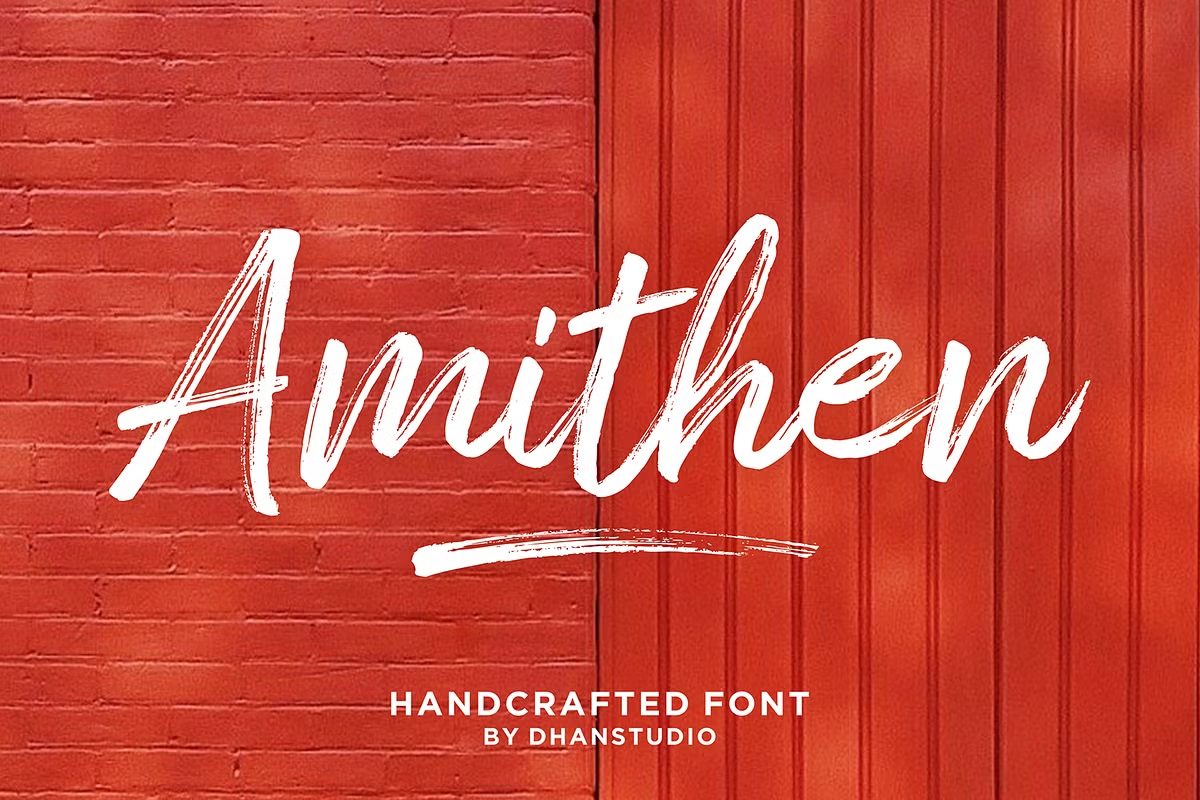
Amithen Font is a bold, textured brush font with a loose, painted feel. I first tested it on a poster layout where I needed something rough but still readable at a glance.
What struck me was how the strokes look like real brush marks, not flat vector lines. The letters carry small splatters and tapering edges, so the typeface feels hand-made without looking messy.
When I dropped it onto darker backgrounds, the shapes held up well. The strong contrast in the letterforms kept the words clear, even with the rough texture.
Font Style & Design Analysis
This is a brush font built for impact. The style leans towards fast, confident strokes, like quick signwriting. It works most naturally as a display font where you want energy and movement in the text.
I could not find a clear, confirmed credit for the designer or foundry of Amithen Font. Because of that, I treat any information about its origin as unverified and always look back to the original download source for clarity.
The letters are tall with slightly narrow shapes, and the spacing is tight but not cramped. Weight sits on the heavier side, with thick stems and rough outlines. The overall mood feels urban and direct, suitable for strong, active branding.
Where Can You Use Amithen Font?
Large titles are where this typeface shines. I use it for posters, event flyers, and bold social graphics, where the textured strokes can be seen clearly at a distance.
On small sizes, the rough edges can merge, so I avoid it for long paragraphs or tiny captions. Short headlines, product names, or logo marks work best, especially when you want something punchy and informal.
It suits audiences used to streetwear, music, or sports visuals. I find Amithen Font helpful in creating a loud visual identity for youth-focused brands, while still keeping the text readable and structured.
Font License
The licence for Amithen Font is not fixed across every source, so personal and commercial permissions can differ. I always check the official licence details before using it in any paid client work or large distribution project. It keeps things safe and lets me use the font with confidence.


