

About Cochin Font
Cochin Font is a classic serif typeface with fine lines and elegant details. I first met it in a book layout project where I needed something calm, readable, and slightly traditional.
Since then, I have tested it in print and on screen. What stands out to me is how the thin serifs and gentle curves give text a bookish feel without looking stiff. It feels like a bridge between old-style metal type and modern digital layouts.
Font Style & Design Analysis
This is a serif font with a refined, literary character. The letterforms are narrow, with high contrast between thick and thin strokes. It leans more towards a book typeface than a loud display font, which keeps it grounded.
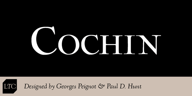
The original designer and foundry for Cochin Font are not publicly confirmed in the sources I checked. I would always look at the specific release or package you download, as credits can change between digital versions.
The curves on letters like “a”, “c”, and “e” feel soft, while the serifs stay sharp and crisp. Spacing is fairly tight, so body text can look dense if you do not add a little tracking. It works best in regular weights; bolder cuts can feel heavy for such delicate shapes.
Where Can You Use Cochin Font?
I find Cochin Font works well for book covers, chapter titles, and essays where you want a traditional tone. At medium sizes, its letterforms stay clear and give long texts a quiet, steady rhythm.
For small text, the fine serifs and high contrast can make thin strokes fade on low-resolution screens. I usually keep it above 11–12pt in print and avoid very small UI labels. It shines more in editorial layouts than in tight, functional interfaces.
Large headings, invitations, menus, and classic branding pieces benefit most. If you are designing for readers who enjoy literature, history, or heritage brands, this serif font feels at home. It suits calm, thoughtful visual identities rather than loud or playful projects.
Font License
Licensing for Cochin Font can vary between different vendors and packages. Always check the official source for clear terms on personal and commercial use, including desktop, web, app, and embedding rights before you commit it to a client project.
Whenever I reach for it, I’m reminded how a quiet, well-drawn serif can still hold its own in modern layouts.


