

About Coolvetica Font
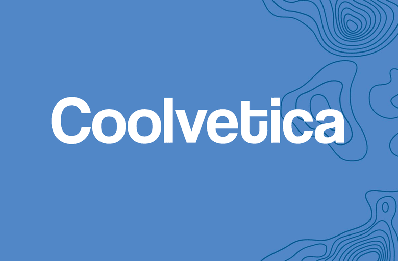
Coolvetica Font is a bold, retro sans-serif typeface that echoes 1970s logo styles. I first tried it while rebuilding a poster that needed a strong, compact headline.
What stood out to me was how tight and chunky the letters felt without becoming messy. The smooth curves, short caps, and soft corners give it a relaxed, nostalgic look, but the forms still feel clean enough for modern layouts.
Font Style & Design Analysis
This is a sans-serif font with a clear display focus. The letterforms are heavy, rounded, and tightly spaced, so it feels made for big, confident titles rather than body copy.
The original designer credit for Coolvetica Font is not publicly confirmed in every source I checked. When I use it in client work, I always go back to the official distributor or foundry to double-check credits and licence notes.
The shapes are wide, with shallow curves and almost no straight vertical cuts, which creates a smooth rhythm across a word. The spacing is naturally tight, especially in uppercase, so it locks into strong blocks of text. It offers a bold weight that reads loud, playful, and slightly retro without feeling cartoonish.
Where Can You Use Coolvetica Font?
I find Coolvetica Font works best as a display font for headlines, logos, and short phrases. On posters, album covers, and event graphics, those dense letters create an instant focal point.
At large sizes, the rounded corners and close letter spacing feel intentional and stylish. At smaller sizes, the same tight spacing can reduce legibility, so I avoid using it for paragraphs, UI text, or long descriptions.
This font suits brands and projects that want a relaxed, retro edge: streetwear labels, cafes, bar signage, 70s-inspired visuals, and youth-focused campaigns. When I pair it with a neutral text font family, it becomes a strong tool for bold visual identity work.
Font License
Licensing for Coolvetica Font can vary between sources, especially for personal versus commercial use. I always check the official provider for the most current licence terms before using it in paid client projects or large-scale branding.


