

About Reeses Font
Reeses Font is a playful script typeface with a bold, flowing look that feels made for treats and snacks. I first noticed it while exploring candy-style logo ideas and needed something lively but still readable.
I spent time testing it in mock packaging and simple poster layouts. The font stands out because the strokes feel chunky and smooth, almost like piped icing. It has a friendly bounce that draws the eye without looking messy.
What makes it practical for me is how clear the letters stay, even with all the curves. It looks fun on screen and in print, especially when I use warm colours and simple backgrounds.
Font Style & Design Analysis
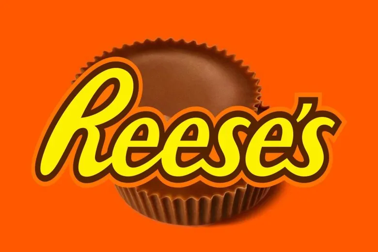
This is a script font with bold, rounded letterforms that lean towards a casual candy-shop style. The letters connect in an easy, flowing way, so words feel like one smooth stroke rather than stiff shapes.
As far as I can see, the original designer or foundry for Reeses Font is not publicly confirmed. I treat it as an unofficial, fan-style typeface and avoid assuming any formal link to well-known chocolate brands.
The strokes are thick with soft corners, giving a heavy but friendly weight. Spacing is fairly tight, which suits logos and headlines more than long text. The mood is playful and informal, with a rich, rounded tone that suggests sweetness and comfort.
Where Can You Use Reeses Font?
I find Reeses Font works best as a display font in large sizes. It shines in logos, signage, and hero headlines where the curves and loops have room to breathe and the bold weight can really show.
It suits food packaging, dessert menus, sweet-shop branding, and kids’ event posters. When I build a visual identity around treats, fun, or nostalgia, this typeface helps signal that mood quickly to a casual audience.
For body copy or very small text, the thick strokes and tight spacing can feel heavy and reduce legibility. I pair it with a simple sans-serif or serif font family for paragraphs, letting Reeses Font handle key words, logos, and short tags.
Font License
The licence terms for Reeses Font are not fully clear, so I always check the official source before using it. Personal experiments may be fine, but commercial projects should only proceed once the specific licence and usage rights are confirmed.


