About Dior Font
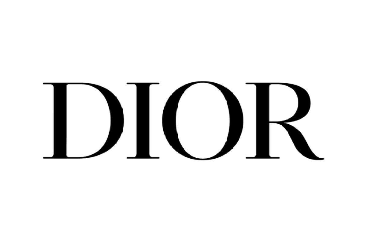
Dior Font is a refined serif typeface that leans into high-fashion style and sharp detail. I first looked at it while exploring fonts for a luxury skincare project, where I needed something calm but confident.
This Dior Font stands out for its high contrast between thick and thin strokes and its elegant curves. The letters feel carefully drawn, so it gives designs a polished, grown-up look without feeling stiff or dated.
Font Style & Design Analysis
This is a serif font with a clear nod to classic editorial typography. The strokes are slim and tall, with fine hairlines and expressive curves on key letterforms like R, C, and S.
From what I can see, the designer or foundry of this font is not publicly confirmed. Anyone using it should treat it as an unofficial take on luxury fashion lettering rather than an official Dior release.
The overall rhythm feels tight, with relatively close spacing that suits display work. Thin serifs, narrow counters, and high contrast give it a crisp, upscale tone. It works best when given space to breathe, especially in headings or short phrases.
Where Can You Use Dior Font?
I find this font most effective in branding and visual identity work where you want a luxury feel. Think beauty packaging, boutique logos, jewellery marks, or fashion lookbooks that rely on strong typography.
At large sizes, the fine details of the letterforms really show, so it shines in headlines, posters, magazine covers, and hero banners. At smaller sizes, the high contrast can make thin strokes disappear, so I would avoid long body text.
This serif font also suits invitations, menus, and social media graphics aimed at audiences who expect a polished, premium look. Paired with a clean sans-serif for supporting text, it creates a clear hierarchy that is easy to scan.
Font License
The licensing for Dior Font is not clearly documented, so I treat it with care. It may be fine for personal experiments, but any commercial use should wait until you confirm the licence terms from the official source. I always double-check before client work.


