
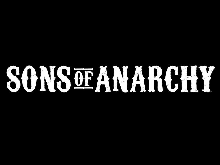

About Sons Of Anarchy Font
The Sons Of Anarchy Font is a bold display font that echoes the rugged, outlaw style of the TV series logo. I first spent time with it while testing title options for a gritty poster concept.
What struck me straight away was how loud it feels on screen. The sharp, heavy letterforms grab attention even in a busy layout. I also noticed it has a strong texture and presence, which makes it more suited to dramatic, statement graphics than quiet, minimal work.
Font Style & Design Analysis
This is a display font designed for impact rather than long reading. The overall direction is bold, angular, and slightly rough, giving it a worn, rebellious feel. It clearly aims to echo biker culture and metal-inspired titles.
As far as I can find, the exact designer or foundry for the Sons Of Anarchy Font is not publicly confirmed. That lack of clear credit makes it important to treat it as a fan-made or unofficial lookalike, not an official studio release.
The letterforms feel tall and strong, with tight spacing that pulls words into dense blocks. Strokes are thick, and edges often feel chipped or distressed, adding texture. The mood is aggressive and dark, so it sets a tough, rebellious tone in any visual identity.
Where Can You Use Sons Of Anarchy Font?
I find the Sons Of Anarchy Font works best in big sizes: posters, headers, banners, and cover art. At large scales, the distress and sharp angles read clearly and give titles that heavy, dramatic punch.
For smaller text, it quickly becomes hard to read, so I avoid using it for body copy or UI elements. It suits projects linked to rock music, biker events, custom motorcycles, streetwear, or any design that needs a gritty, underground look.
This display font can also support fan art, themed social graphics, or mood boards inspired by the show. I usually pair it with a simple sans-serif or serif font family for supporting text, so the main title stays the clear star.
Font License
Licensing for the Sons Of Anarchy Font is not always clearly stated, especially with fan-made versions. I would only use it for personal or experimental work unless the licence is confirmed. Always check the official source for current commercial terms before client use. I like to keep that extra check as a habit.


