About Bodega Sans Font
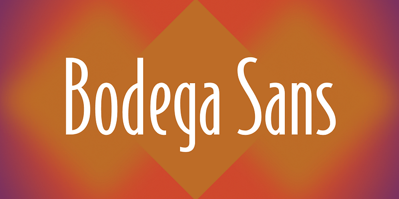
Bodega Sans Font is a clean sans-serif typeface with a strong graphic feel. I first noticed it while reviewing branding layouts that needed bold, simple shapes and clear hierarchy.
I spent time testing the Bodega Sans Font in headlines, menus, and short paragraphs. The compact structure and clear letterforms made it easy to control space without losing clarity.
What stands out for me is how it balances firmness and friendliness. The shapes feel geometric yet approachable, so it works well when a design needs impact without looking cold or technical.
Font Style & Design Analysis
This is a sans-serif font with a distinctly structured, display-driven look. The letterforms lean toward geometric construction, with straight strokes, smooth curves, and a strong vertical rhythm that keeps lines feeling tight and organised.
The designer or foundry of Bodega Sans Font is not publicly confirmed from trusted sources I checked. Because of that, I treat any authorship claims online with care and always look for licensing notes from the actual distributor.
The characters have firm shoulders, compact counters, and relatively tight spacing, which gives the font a dense, poster-ready presence. Heavier weights push a bold, graphic tone, while lighter weights feel sharper and more minimal, suiting headings, tags, and short UI text.
Where Can You Use Bodega Sans Font?
I find Bodega Sans Font works best as a display font in large sizes. Titles, banners, packaging, and signage benefit from its solid blocks of colour and clear silhouettes, especially where quick reading matters.
For digital projects, it suits brands that want a modern, urban visual identity. I would reach for it in posters, event graphics, restaurant menus, and product labels aimed at younger or design-aware audiences.
In small text, the tight spacing and strong shapes can feel heavy, so I keep it for short copy or pair it with a more neutral text font family. Used with care, it gives layouts a confident, structured voice without needing decorative extras.
Font License
Licence terms for Bodega Sans Font are not fully clear from public sources. I always check the official distributor for current licence details, both for personal experiments and any commercial branding or client work, before using it in live projects.


