Festina Lente Typeface: A Harmonious Fusion of Tradition and Modernity
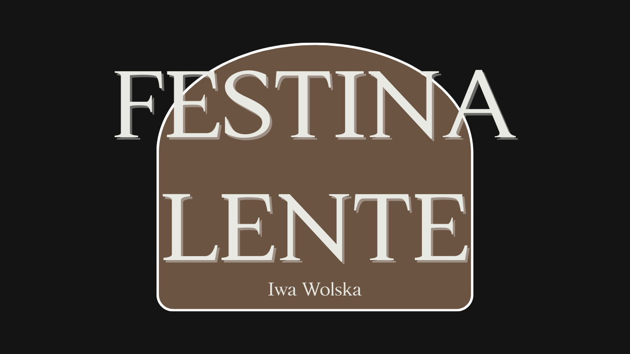
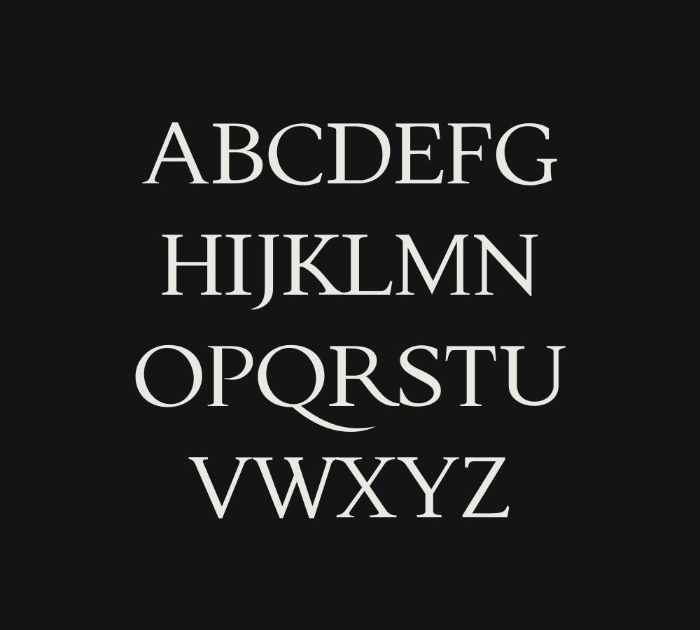
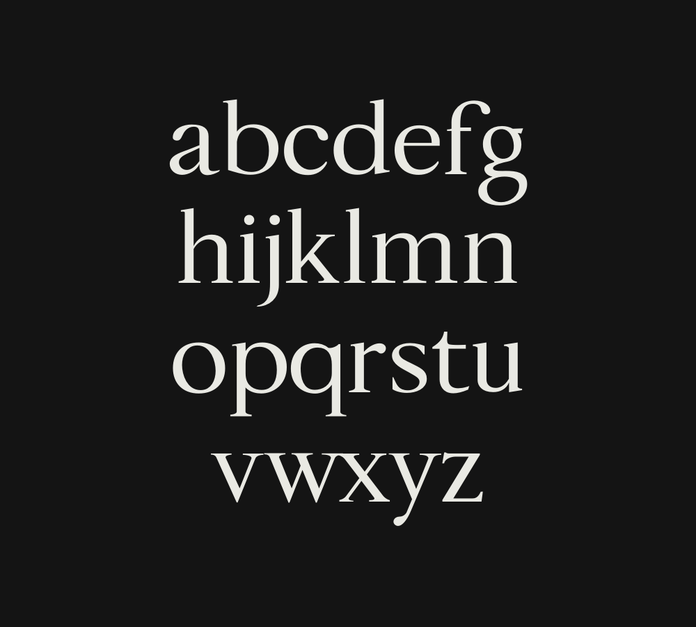
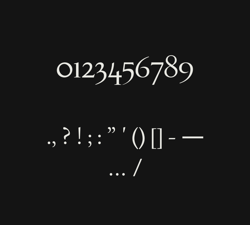
The serif font Festina Lente is a great example of this balance, as it combines the timeless rules of typography with the fact that language is always changing. Festina Lente is a typeface that was inspired by the prints of Aldo Manutius from the Italian Renaissance. It captures the spirit of a time that was steeped in custom while also being able to handle modern details that challenge traditional serif typefaces.
Designer: Iwa Wolska
Font Features:
- Timeless Elegance: Festina Lente brings forth a timeless charm that effortlessly bridges the gap between the past and present. Its graceful curves and clean lines exude a sense of classic refinement.
- Creative Adaptation: Crafting a typeface that harmoniously incorporates modern characters like W, U, J, and @ is no small feat. The designers of Festina Lente met this challenge with ingenuity, ensuring that the font remains versatile for contemporary use.
- Versatility: Whether it’s for a classic book, a modern website, or a sleek logo, Festina Lente fits seamlessly into various design contexts. Its adaptability makes it a valuable asset for designers across diverse industries.
- Legibility: A font’s primary function is to communicate effectively. Festina Lente achieves this with its high level of legibility, making it a reliable choice for conveying messages with clarity and style.
- Free for Commercial Use: One of the most appealing aspects of Festina Lente is its licensing. It is available for free for commercial use, allowing designers to use it without any legal constraints in their projects.
In a world where design constantly evolves, Festina Lente stands as a testament to the enduring beauty of classic forms, while also embracing the demands of modern communication. This typeface strikes a harmonious balance between the nostalgia of the past and the innovation of the present, making it an invaluable tool for designers seeking elegance and versatility in their work.
