

Note: To use this font for commercial purposes, click “Get Commercial License” Button!
About Fields Font
I’m a typographer and graphic designer who experiments with type to shape brand voices. While searching for something fresh for a branding project, I discovered the Fields Font. Its balance of retro warmth and modern refinement grabbed me immediately. I used it across logo marks, packaging concepts, and digital layouts.
The result surprised me, its personality carried every piece. I’m sharing this review because this font deserves attention, and I think fellow designers will find it just as versatile. When you’re looking for typography that tells a story, the right font family can be the difference between ordinary and unforgettable.
About the Font and the Designer
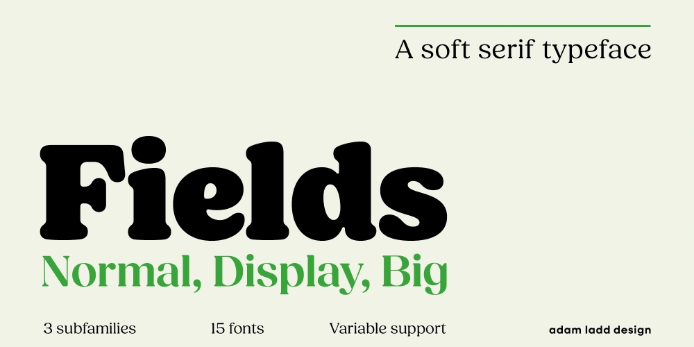
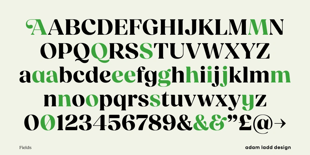
Fields Font is a serif typeface created by designer Adam Ladd. Known for producing approachable yet professional typography, Adam specializes in type design that feels human while staying precise. Released as a full font family, Fields offers fourteen styles. These range from extra-light weights to bold displays, ensuring adaptability for many design projects.
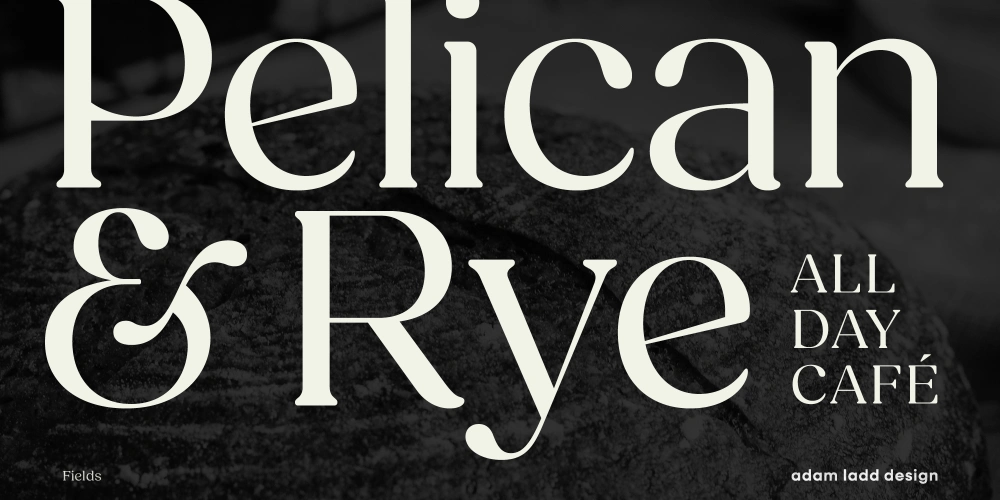
This typeface blends retro tones with modern details. Rounded serifs, teardrop terminals, and subtle tails give each character a friendly, approachable feel. It borrows inspiration from classics like Cooper and Souvenir, yet its interpretation feels contemporary. The Fields Display version amplifies contrast, producing a stylish, fashion-forward look, while the standard family maintains a softer, more versatile voice.
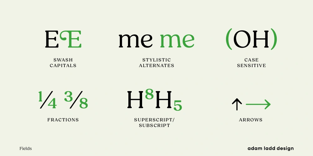
A standout addition is Fields Variable, which lets you customize with two sliders: weight and optical size. This tool makes fine-tuning easy, whether you need a light tone for text or a bold impact for titles. OpenType features add layers of flexibility: alternates, swash capitals, stylistic filters, and case-sensitive punctuation all expand creative possibilities.
Fields reflects careful craftsmanship, evident in its detail, balance, and adaptability. It feels equally at home in website publishing, editorial layouts, and brand systems. Adam Ladd’s design library consistently supports professional use, and Fields is a strong continuation of his thoughtful, user-friendly approach.
Features of the Fields Font
Fields is more than just a serif, it’s a complete typographic toolkit. The family includes over 700 glyphs supporting 100+ Latin languages, making it ideal for international branding or commercial campaigns. Designers gain access to ligatures, fractions, and arrow dingbats, expanding practical use in both print and digital.
Its medium contrast provides a classic, vintage feel, while the Fields Display high-contrast style creates a more dramatic, elegant presence. This flexibility is rare, giving you two distinct moods in one system. The rounded serifs, details like subtle tails, and plumper shapes keep it approachable without losing professionalism. The slanted character set adds a nostalgic edge, perfect for projects aiming at a 1970s-inspired look.
Another feature worth highlighting is versatility. Fields works seamlessly in Adobe programs, supporting advanced typographic styles and offering stylistic alternates to match different voices. The variable font version simplifies experimentation with weight and tone. That means you can design freely without jumping between separate files.
With its unique blend of casual warmth and confident structure, Fields suits video and broadcast graphics, packaging, logos, and editorial spreads. The level of glyph support, combined with thoughtful design details, makes this a font family built for serious work yet still inviting for personal creative projects.
Where Can You Use This Font?
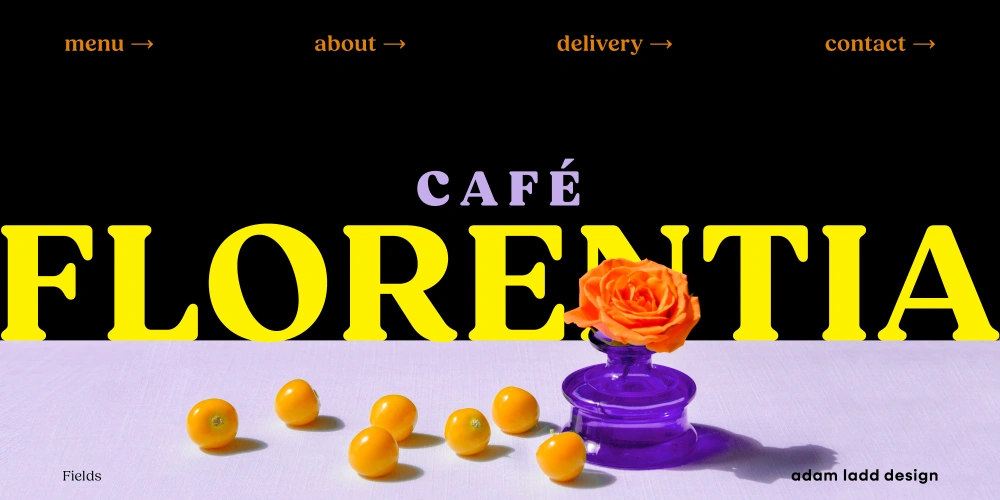
The Fields Font family is ideal for projects that need character and clarity. I’ve used it in branding systems where approachable elegance mattered most. For example, on packaging, its plump curves conveyed warmth, while its strong structure added trustworthiness.
On websites, the softer weights made body text easy to read, while bold display cuts delivered standout headlines. In design projects with a vintage influence, the retro spirit came through naturally. Think posters, album art, or event graphics, anywhere you want that balance of nostalgia and modern energy.
For video and broadcast, Fields Display’s contrast shines. Its sharp details remain visible at larger scales, giving motion graphics sophistication. At the same time, lighter weights adapt for subtler uses like lower thirds or captions.
Brands looking for typographic styles that carry across mediums will appreciate this font family. It has enough variation to cover logos, campaigns, and editorial layouts without feeling repetitive. And with Fields Variable, it’s simple to adjust tone across a single identity system.
If your work involves contemporary visuals but you still want nods to classic design, Fields offers that blend. From handmade packaging vibes to sleek, modern apps, this font adapts smoothly and feels reliable wherever you use it.
Font License
Fields Font Free Download is available for personal projects. That means you can explore its styles without cost while experimenting in your own work. For commercial use, a license purchase is required. Buying supports the type designer and ensures ongoing support and updates.


