

Note: To use this font for commercial purposes, click “Get Commercial License” Button!

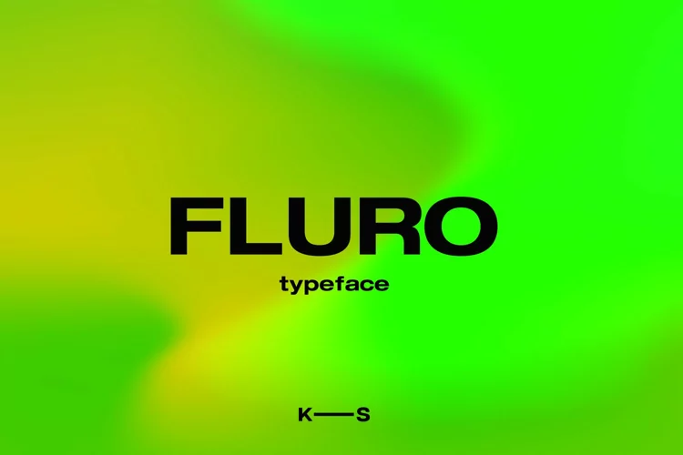
About Fluro Font
I’m a typographer and graphic designer who often experiments with fresh typefaces for branding projects. I came across Fluro Font while exploring free fonts and alternatives that stand out in minimal design work. Its clean sans serif look caught my attention instantly.
I first used it in a client’s brand identity package, testing the Fluro Bold and Bold Outline styles across web headers and business card mockups. The results were striking, modern, legible, and polished. Sharing this review feels important because many designers search for fonts considered similar to Fluro, yet this one delivers unique weight styles and clear character support.
About the Font and Designer
Fluro Font is a geometric sans-serif hybrid created by KAZER STUDIO. Designed to look modern and minimal, the typeface emphasizes balance and legibility. It comes in five distinct weight styles: Light, Regular, Semibold, Bold, and a bonus Bold Outline version. This variety gives designers flexibility when layering text in branding systems or creating clean digital interfaces.
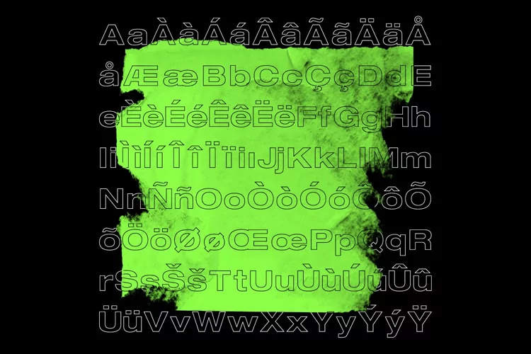
The typeface is more than just bold appearances. It also includes a wide set of special characters, making it practical for multilingual projects. Fluro offers language support that works across PC, Mac, and Linux systems, ensuring consistent rendering in both print and web design.
As someone who often searches catalogs and uses font finder AI tools, I can say Fluro’s overall appearance compares well with other free fonts considered similar, but it offers a more polished edge. It’s versatile enough for headlines, yet subtle enough for longer text blocks in marketing images. The sans serif structure feels geometric but maintains a humanist softness, preventing it from looking too rigid.
Features of Fluro Font
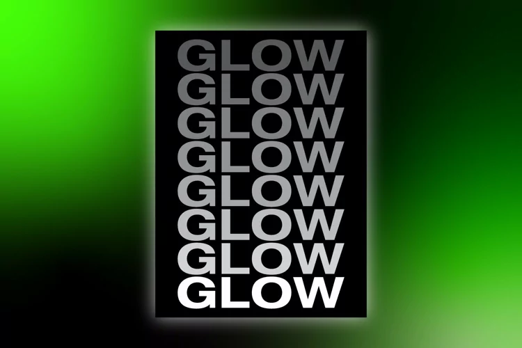
Fluro Font’s biggest strength is its flexible weight range. Having Light, Regular, Semibold, and Bold means you can scale hierarchy easily across web, print, or product packaging. The Bold Outline style is a standout feature that adds contrast and impact without feeling overdone.
The typeface also includes specialized kerning. This ensures characters maintain balance, no matter if you’re typing in lowercase regular text or uppercase bold headlines. Clean kerning prevents awkward spacing, which often separates polished fonts from amateur free fonts.
Fluro’s language support makes it usable in multilingual campaigns. The ability to preview across systems like Mac, PC, and Linux ensures the font looks consistent. Designers don’t have to worry about misaligned characters when exporting assets.
Another strong feature is the hybrid design approach. The typeface is geometric yet minimal, combining crisp straight lines with softer curves. This balance keeps it both legible and visually modern. Fonts considered similar to Fluro may share its sans serif category, but they often lack the same refinement.
For anyone building a catalog of free fonts and alternatives, Fluro stands out because it includes not only weight styles but also an exclusive bonus outline style. That extra option gives creatives more room to experiment in layouts without sourcing multiple fonts.
Where Can You Use This Font?
Fluro Font works well in both digital and print branding projects. I recommend using Fluro Bold or Bold Outline for headers on websites or posters. Their strong presence makes logos and key marketing messages pop. For text-heavy sections, the Regular or Semibold weights provide balance without overwhelming the design.
Business cards benefit from its minimal and clean appearance. A Fluro Bold name paired with Regular contact information creates a professional look. The typeface also works in modern editorial spreads, where geometric and legible fonts are essential for reader engagement.
Digital products gain an advantage from Fluro’s legibility on screens. Whether you’re building UI components, app menus, or image-based ads, the font maintains clarity across resolutions. Designers searching for fonts and alternatives for Fluro will find it reliable in small sizes as well as large displays.
Another practical use is in branding systems that demand consistency. The weight styles, combined with specialized kerning, let you design hierarchies that scale across platforms. If you’ve tried similar free fonts, you’ll notice Fluro feels more refined in its alignment and spacing.
For those who experiment with mockups, Fluro previews beautifully in both minimalist catalogs and bold product images. The font’s versatility makes it an excellent choice for creatives who need a modern sans serif that works everywhere.
Font License
Fluro Font Download is free for personal use. Designers can test it in branding projects, mockups, or concept images without cost. For commercial use, a license must be purchased from KAZER STUDIO. This ensures legal coverage when using the typeface in paid client projects or wide-scale campaigns.


