
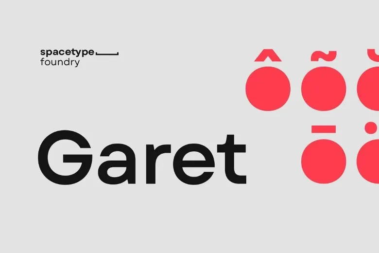

About Garet Font
Garet Font is a clean, geometric sans-serif typeface that leans on simple shapes and clear strokes. I first tried it while looking for a calm, modern font family for a digital product mockup.
What struck me straight away was how even and steady the letterforms feel. Circles and straight lines balance well, so nothing looks fussy or overdesigned. In daily use, it feels dependable, especially for projects that need a neutral, modern voice without drawing too much attention to the font itself.
Font Style & Design Analysis
This is a sans-serif font with a strong geometric direction. Most letters sit on clear circles and straight verticals, which gives the typeface a tidy, almost modular look. The overall design feels low‑drama and functional, which suits structured layouts.
The public information about the designer or foundry of Garet Font is not clearly confirmed. Because of that, I treat it as an independent typeface and always double‑check any source before using it in client work.
The letterforms have open counters, especially in a, e, and s, so small sizes stay readable. Spacing is fairly generous, which helps on screens but can need slight tracking tweaks for tight headlines. Weights often range from light to bold, allowing a controlled hierarchy. Overall, it carries a cool, measured tone that works well for modern interfaces and calm branding.
Where Can You Use Garet Font?
On screen, I like Garet Font for app UI, dashboards, and clean landing pages. Its clear shapes hold up at small sizes, so body text and labels stay sharp and easy to scan on mobile and desktop.
At larger sizes, it works nicely for headings, section titles, and simple posters. The geometric style gives logos and wordmarks a neat, rational feel, especially for tech, finance, and education brands that want a clear visual identity without strong decoration.
Print pieces such as brochures, reports, and minimal packaging also suit this font family. Audiences who expect clarity and order—students, professionals, and digital‑first users—tend to respond well to its steady visual rhythm and straightforward tone.
Font License
The exact licence terms for Garet Font are not universally standard, so I never assume usage rights. Personal and commercial projects may have different conditions. Before using it for any paid or public work, I always check the official source for the latest licence details.


