About Gilmer Font
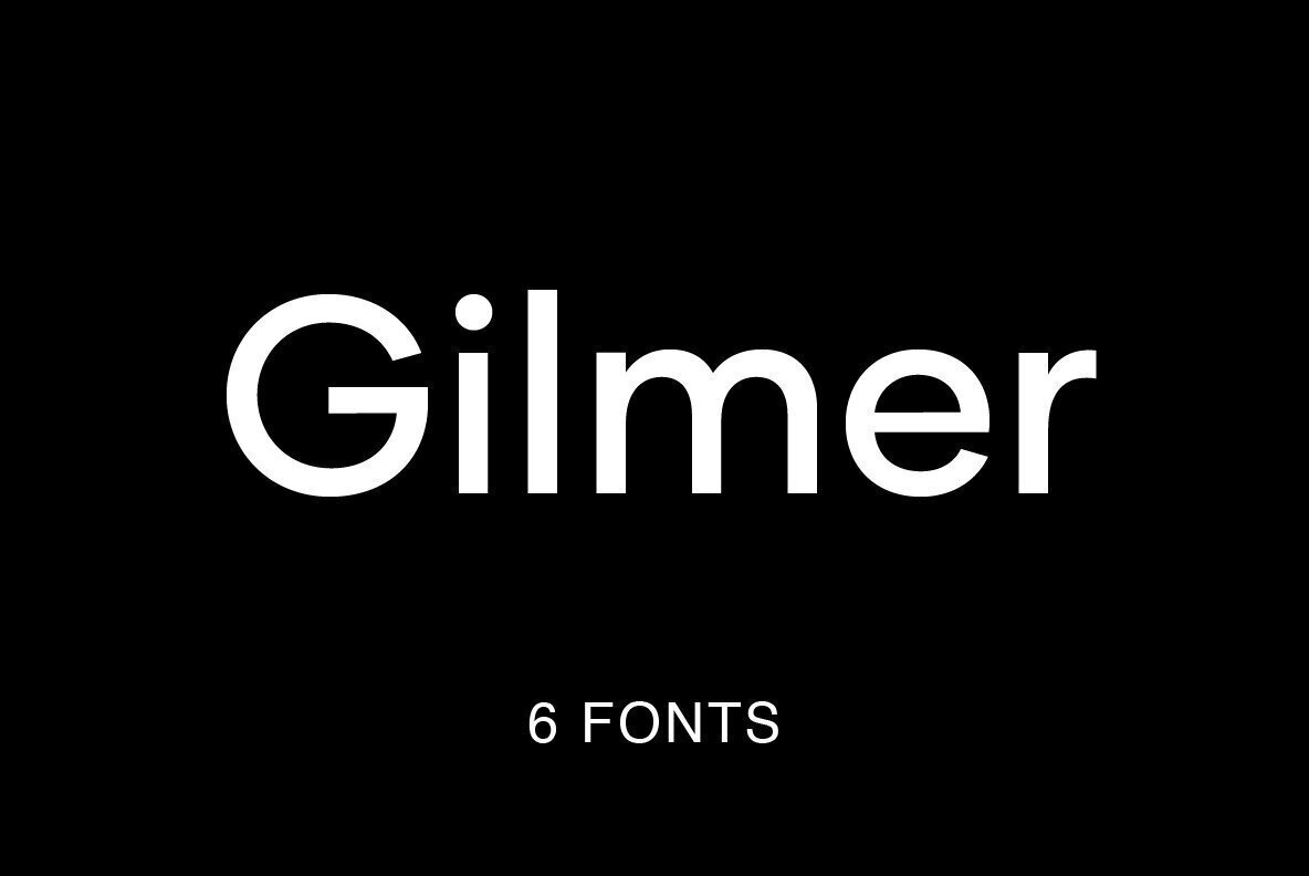
Gilmer Font is a geometric sans-serif typeface with clean, simple shapes and a modern feel. I first tried it when testing options for a compact brand system.
What struck me right away was the balance between strict geometry and friendly curves. The letters feel sturdy, but not cold. In layouts, it gives a neat structure without stealing all the attention.
I like how it drops into a grid-based design and just works. It holds alignment well, keeps text blocks tidy, and makes interfaces look a bit sharper with very little effort.
Font Style & Design Analysis
This is a sans-serif font with a clear geometric direction. Most letterforms sit on simple circles and straight lines, which gives a strong, tidy rhythm. It reminds me of mid-century modern typography, but with softer details.
The designer or foundry for Gilmer Font is not publicly confirmed from reliable sources I can access. I always suggest checking the original download or purchase page for up-to-date credit information.
Looking closely, the counters are open, the spacing is even, and the vertical strokes feel consistent in weight. At regular sizes, the texture is calm and steady. In heavier weights, it starts to feel more like a solid display font, ideal for firm, simple headlines.
Where Can You Use Gilmer Font?
I find Gilmer Font most useful in branding and basic visual identity work. It suits tech, education, and modern retail projects where clarity matters. Logos built from its uppercase letters feel compact and reliable.
On screens, the font handles small interface text fairly well, especially in lighter weights. It works for app menus, buttons, and short labels. For longer reading, I tend to keep sizes a bit larger to avoid a stiff texture.
Set big and bold, it fits posters, social graphics, and slide titles. The geometric structure talks well to younger and design-aware audiences. It pairs nicely with a softer serif or a simple humanist sans for contrast.
Font License
Licence terms for Gilmer Font can vary, especially between personal and commercial use. I always check the official source for the exact licence, including web, app, and print rights, before using it in any client project.
Whenever I need a clean geometric base that still feels approachable, this font stays on my shortlist.


