
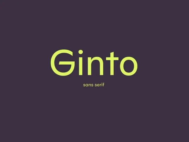

About Ginto Font
As a typographer and graphic designer, I’m always drawn to fonts that balance structure and personality. I discovered the Ginto Font while exploring Dinamo Typefaces for a client’s rebranding project. Its clean geometry and bold energy stood out instantly. I wanted something modern but expressive, and Ginto delivered that perfectly. I used it in a visual identity system for a lifestyle brand, and it brought a fresh yet timeless aesthetic to the work. I’m writing this review because this typeface family impressed me not just as a design tool but as a work of typographic art.
The Font Type and Designer
Ginto Font is an exuberant geometric-humanist typeface created by Seb McLauchlan, a London-based designer known for his innovative approach to sans-serif typefaces. It was developed through Dinamo, a studio famous for forward-thinking typography. Ginto reinterprets mid-century modernist ideas while adding warmth and motion. It captures the evolution from strict modernist purity to the more expressive, baroque and animated styles of the ’50s and ’60s.
The Ginto font family is divided into two sister families, Ginto Normal and Ginto Nord, each serving distinct purposes. Ginto Normal is compact and poised, offering a sensible set of weights ranging from Thin to Black, which perform beautifully across many sizes and environments. Ginto Nord, on the other hand, pushes the design further. It expands the x-height and character width, introducing a bolder, more confident tone with variations stretching from delicate Hairline to Monolithic Ultra Bold.
Seb McLauchlan designed Ginto to embrace tension between circular and rectangular forms, creating balance through rhythm and geometry. The result is a typeface that delights in tension, combining compact shapes, rational design, and emotional flair. It feels human yet engineered, serious yet playful — an ideal blend for modern branding.
Features of This Font
The Ginto Font offers a variable font structure that adapts across multiple styles and weights. Its exuberant style blends modernist structure with humanist warmth, making it versatile for both minimal and expressive designs. Each character has a unique energy, shaped by the tension between circles, rectangles, and curves. This design choice gives the font its signature movement and poise.
The character width and x-height have been carefully expanded to enhance readability across media. Whether in digital interfaces or editorial designs, it performs consistently. The ABC Ginto family includes Ginto Nord Condensed, which brings more compact proportions for tighter layouts without losing clarity. The set of weights, from Hairline to Ultra, allows flexibility in establishing visual hierarchy.
Its geometric-humanist construction means it retains precision while still feeling natural. Designers working with modernist branding systems or sleek typographic compositions will find its tone adaptable. The font supports multiple European languages, including Afrikaans, Albanian, Estonian, Hungarian, Romanian, and Slovenian, making it suitable for global projects. Every detail, from its ligatures to character overview, reflects craftsmanship. This is not just another sans-serif; it’s an intentional typeface family designed by Seb McLauchlan to bring life and rhythm into text.
Where Can You Use This Font?
The Ginto Font is ideal for projects that blend modernity and character. It works beautifully in branding, editorial design, posters, and digital interfaces. The Ginto Font Free Download version gives designers a chance to explore its expressive range before committing to commercial use.
It shines in logos, typographic layouts, and visual systems that require elegance and structure. The contrast between Ginto Normal and Ginto Nord makes it suitable for both text-heavy compositions and bold headlines. Its compact and poised structure ensures professional polish, while its exuberant geometric-humanist tone keeps it fresh and engaging.
For creative or commercial work, this typeface handles editorial typography, motion graphics, and even custom brand environments with ease. The variable font format adapts to responsive screens and print applications, ensuring consistent aesthetics across all mediums. Whether you’re working on a minimalist website, a magazine layout, or a forward-thinking visual identity, Ginto Font brings balance, energy, and confidence.
Font License
The Ginto Font is free for personal use, making it accessible for experimentation and small projects. For commercial or extended professional work, a proper license is required from Dinamo Typefaces. Purchasing the full version unlocks all weights, styles, and language support, ensuring complete creative control. The Ginto Font Free Download is perfect for designers who want to explore this stunning typeface before using it commercially.


