
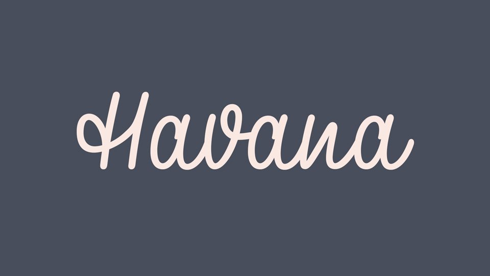

About Havana Font
Havana Font is a smooth script typeface with an easy, flowing rhythm. I first noticed it while testing relaxed logo ideas for a café concept and it immediately felt informal but still controlled.
When I tried it in a simple wordmark, the connected letterforms gave the name a gentle swing without looking messy. It stands out because the strokes feel hand-drawn, yet the shapes stay readable and balanced in everyday layouts.
Font Style & Design Analysis
This is a script font, built around connected strokes and cursive shapes. The design leans towards friendly handwriting rather than formal calligraphy, so it feels casual and approachable on screen and in print.
The original designer or foundry of Havana Font is not publicly confirmed. I would treat any download source with care and always look for clear credit details and licence notes before using it on client work.
The letterforms have soft curves, rounded terminals, and a gentle slant that gives motion. Spacing is fairly tight, with letters linking into smooth words, which suits headlines more than dense text. In medium weights it carries a relaxed, warm tone that still keeps structure.
Where Can You Use Havana Font?
For me, Havana Font works best as a display font in logos, packaging, and short headlines. At large sizes, the curves and joins stay clean and give a clear sense of personality without needing extra graphic elements.
In smaller text, the connected strokes can start to merge, so I avoid using it for long paragraphs or detailed UI labels. It feels more at home in branding pieces, posters, social graphics, and event titles where a human touch matters.
Projects aimed at lifestyle, food, crafts, or family audiences benefit most from this script style. I also like it for friendly visual identity systems where a brand wants to look informal, welcoming, and slightly nostalgic rather than sharp or corporate.
Font License
Licence terms for Havana Font can vary between sources, so personal and commercial rights are not guaranteed. I always check the official licence text and usage limits before using it in paid client work or large-scale branding.
When I reach for it in a layout, it reminds me how much a simple handwritten curve can soften a design and make it feel more human.

Leave a Reply