

About Hulkamania Font
Hulkamania Font is a bold display font with loud, comic-book energy. I see it used a lot in fan art and retro wrestling graphics, where big, rough lettering feels right at home.
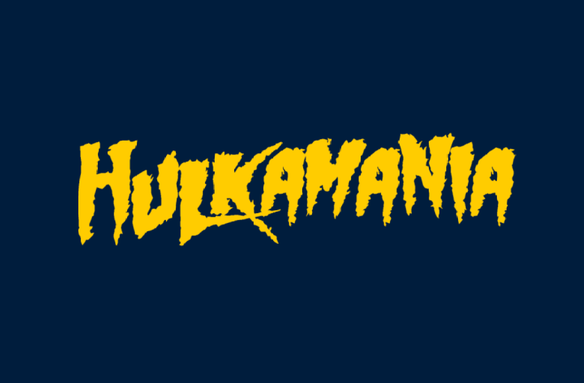
I first looked at it when testing type for a playful poster set. The jagged shapes and heavy weight jumped out straight away. It stands out because it feels raw and hand-drawn, not polished or corporate.
On screen, the font grabs attention even in a busy layout. It is not subtle, but that is the point. I treat it as a visual shout, perfect when I need instant impact.
Font Style & Design Analysis
This is a display font built for maximum punch, not for long reading. The letterforms are thick, slanted, and irregular, which creates a sense of motion. It reminds me of old action posters and loud comic covers.
The designer and original foundry for Hulkamania Font are not publicly confirmed. When I research it, I find many unofficial versions and fan-made takes, which makes clear credit hard to track with certainty.
The strokes feel heavy, with sharp angles and rough outlines that suggest a hand-drawn brush or marker. Spacing is tight, so words form solid blocks of colour. In use, the mood feels aggressive, energetic, and a bit chaotic, which works well when the visual identity needs attitude.
Where Can You Use Hulkamania Font?
I reach for this font when I need a headline that almost jumps off the page. Event posters, YouTube thumbnails, gaming banners, and fan projects are natural fits, especially where nostalgia and high energy are key.
At large sizes, the rough edges and bold shapes look strong and readable. At smaller sizes, the details can blur, so I avoid using it for body text, captions, or UI labels. It really works best as a short, punchy title.
Projects aimed at wrestling fans, retro action themes, or playful youth audiences benefit the most. Used with a simple supporting font family, Hulkamania Font can anchor a loud, confident visual identity without much extra decoration.
Font License
Licensing around Hulkamania Font is not always clear, especially with fan-made versions. I only use it commercially after checking the specific source for licence terms and making sure personal and commercial rights are both clearly allowed.


