About Killigrew Font
Killigrew Font is a dramatic blackletter typeface with sharp angles and dense texture. I first tried it on a poster mockup where I needed strong, old-world impact.
I spent time testing it on titles, labels, and mock brand marks. What stood out was how quickly it set a mood with very little colour or imagery. The letterforms feel deliberate, heavy, and confident, which makes layout decisions quite simple.
Font Style & Design Analysis
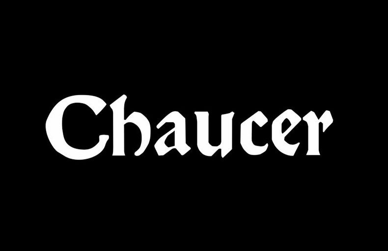
This is a blackletter font with tight, vertical strokes and strong contrast. The overall direction leans towards historic signage and gothic book covers rather than casual reading. It feels built for short, powerful words.
I have not found a clearly confirmed designer or foundry for Killigrew Font. Credit details are not publicly reliable, so I treat the source with care and always look for updated information when I use it in client-facing work.
The letterforms have narrow counters, pointed terminals, and compact spacing, so words form dark, textured blocks. It tends to look best at heavier display sizes. The mood is serious, slightly aggressive, and very controlled, which suits bold visual identity work.
Where Can You Use Killigrew Font?
I use Killigrew Font mainly for headlines, logos, and short phrases where I want a gothic edge. It handles posters, album covers, and game titles well, especially when paired with simple backgrounds.
At large sizes, the strokes and angles feel crisp and intentional. Small sizes are harder to read because of the dense shapes and tight spacing, so I avoid it for body text, UI labels, or anything that needs quick scanning.
The font suits audiences into metal music, fantasy themes, or dark historical settings. It can work in branding for niche shops, events, or merch lines where a strong, moody visual identity is key. When paired with a clean sans-serif, it becomes more flexible in layouts.
Font License
Licence terms for Killigrew Font can vary, so I always check the official source before use. Personal use may be allowed, while commercial projects often need a proper licence. I recommend reading the latest licence notes carefully each time.


