
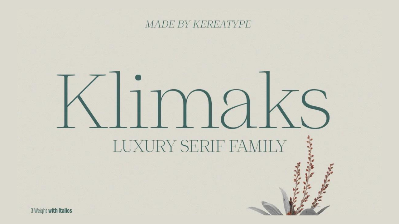


Introducing Klimaks Font: Where Elegance Meets Versatility
Choosing the right font can make or break a design once it comes to writing. It’s not just about the letters and characters; it’s also about setting the right mood and getting the point across. Enter Klimaks, a modern thin serif font that blends tradition and current design with ease. Klimaks is a versatile font made by the talented designer Kereatype. It’s worth taking a closer look.
Evolution of Elegance
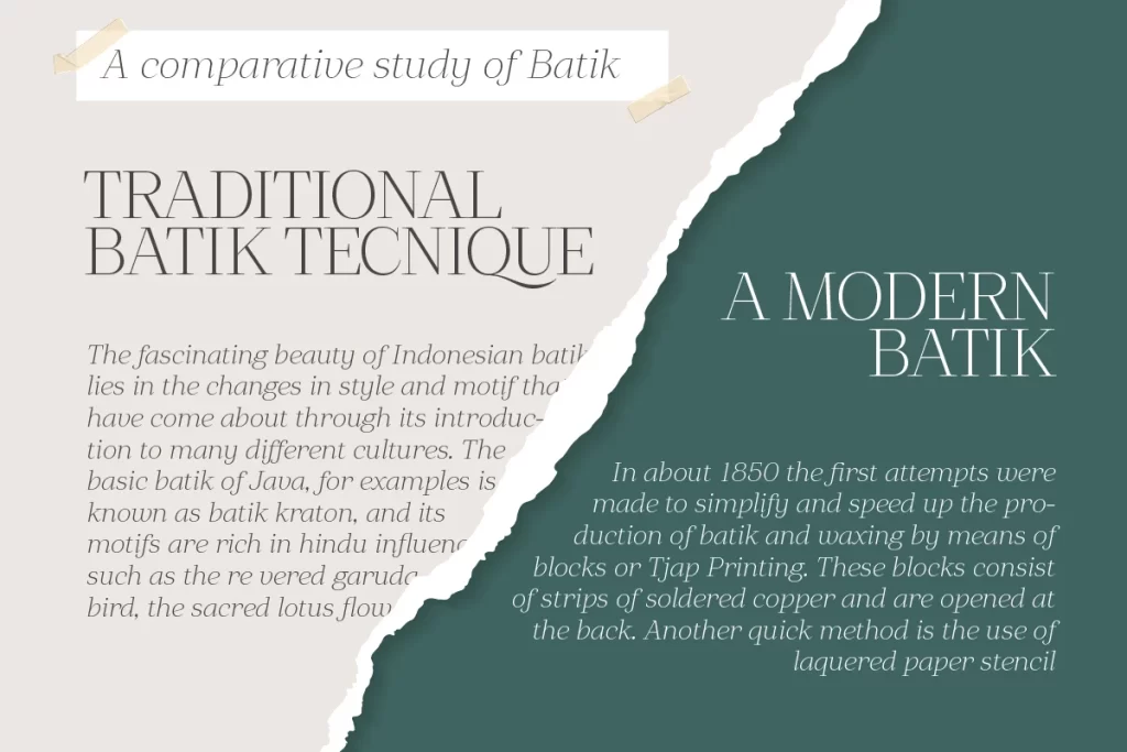
The Klimaks typeface draws inspiration from transitional serifs, a style that has stood the test of time in the world of typography. However, what sets Klimaks apart is its ability to evolve while remaining true to its original vision. The design process was meticulous, resulting in a font that can adapt to a wide range of applications without losing its essence. Whether you’re working on a logo, greeting cards, posters, branding, or any other project, Klimaks is up to the task.
Intricate Details, Readability Preserved
One of the remarkable features of Klimaks is its intricate details. While some fonts lose readability when used in small point sizes or large text arrays, Klimaks remains highly readable. This is a testament to the designer’s commitment to crafting a font that excels in both form and function. Whether you’re designing a book title or creating wedding invitations, Klimaks ensures that your text is not only elegant but also easily legible.
Geometry Meets Optical Balance
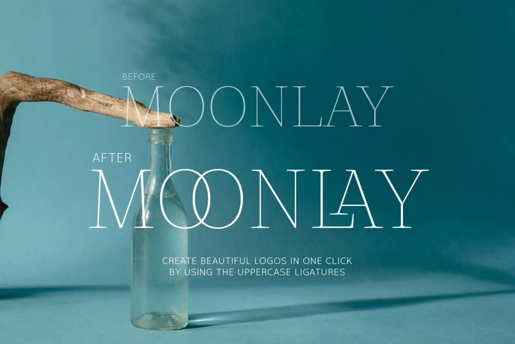
Klimaks is not just a font; it’s a work of art. Crafted from scratch, it exemplifies luxury serif design. What makes it truly unique is its structural logic, which seamlessly blends pure geometry with optical balance. This careful fusion results in a font that not only looks beautiful but also feels balanced on the page. Klimaks has a distinct presence that sets it apart from ordinary fonts.
Versatility Beyond Compare
The hallmark of a great font is its versatility, and Klimaks excels in this regard. Its ability to adapt to various styles is truly remarkable. Whether you’re working on modern envelope lettering, book design, hand-drawn or watercolor themes, or DIY projects, Klimaks rises to the occasion. It effortlessly adds a touch of sophistication and elegance to any creative endeavor.
Accessible for All Your Projects
Kereatype offers Klimaks as a free font for personal use, making it accessible to designers, artists, and enthusiasts alike. However, for commercial use, a paid version is available, allowing you to utilize its beauty and versatility in your professional projects. This blend of accessibility and affordability ensures that Klimaks can be a valuable addition to your font library, no matter your skill level or project scope.
Conclusion
In the world of typography, finding a font that strikes the perfect balance between elegance and versatility is a rare treasure. Klimaks, with its roots in transitional serifs, its intricate details, and its commitment to readability, is that treasure. Designed by Kereatype, this font is a testament to the endless possibilities of typography in modern design. Whether you’re designing logos, posters, or wedding invitations, Klimaks adds a touch of luxury and sophistication to your creative work. So, why settle for ordinary when you can elevate your design with the timeless beauty of Klimaks?


