


Note: For Commercial Use Click “Buy The Font” Button!

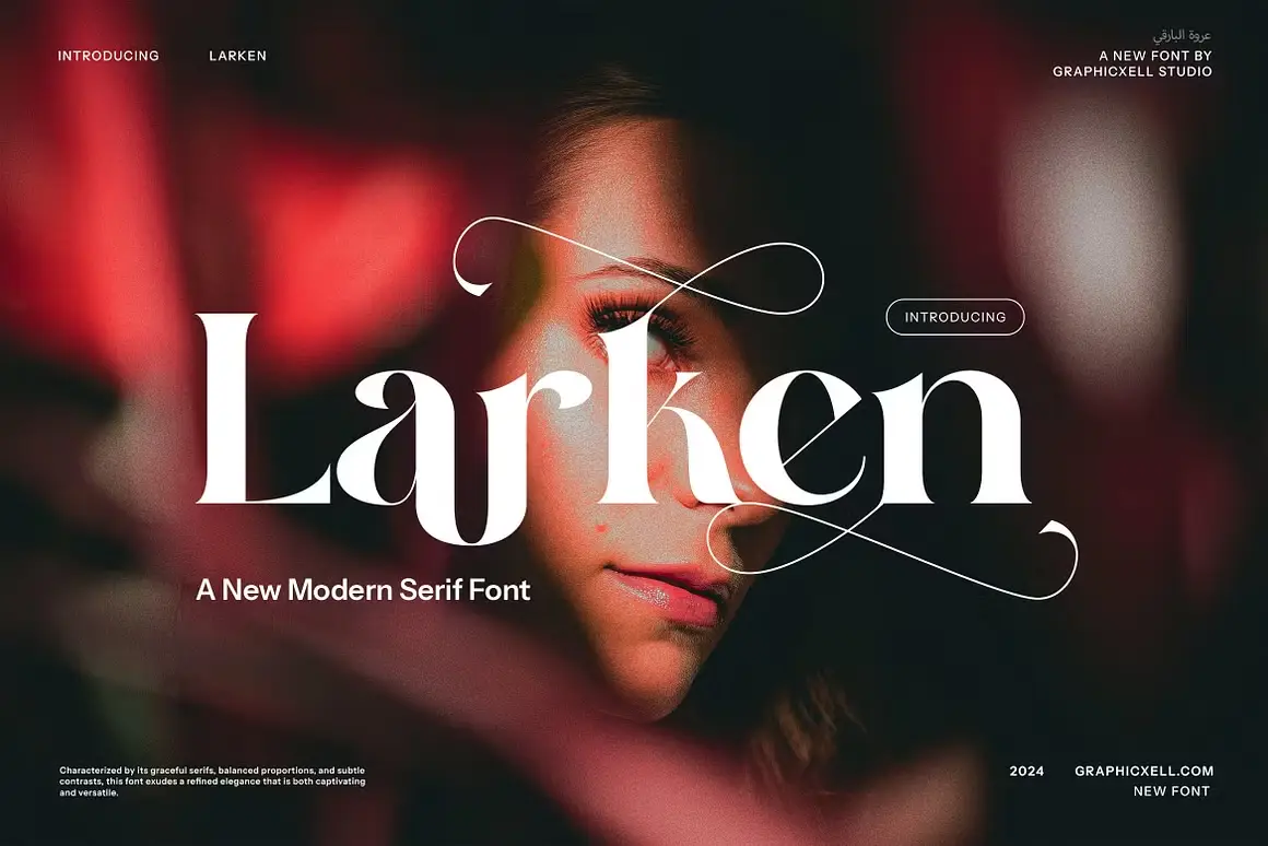
About Larken Serif Font Family
I stumbled upon Larken Font during a branding project for a luxury skincare client last month. As a typographer with over 8 years in design, I’m always hunting for typefaces that blend elegance with modern sensibility. Larken caught my eye immediately while browsing through Ellen Luff’s portfolio. Its unique blend of classic serifs with contemporary touches made it perfect for my high-end packaging designs.
The client absolutely loved how it elevated their brand identity! I’m sharing this review because I believe more designers should know about this gem. Let me walk you through what makes this font so special and why it might be perfect for your next project too.
The Designer: Ellen Luff and Font Type
Larken Serif Font was created by Ellen Luff, a talented type designer whose work showcases incredible attention to detail. This elegant serif typeface was specifically designed to reflect nature, with a focus on creating natural softness and expressiveness while maintaining exceptional usability.
What makes Larken stand out is how it balances traditional dynamic letter shapes with subtle simplicity. The typeface features sloping serifs that provide stability and nobility, while tender curves create an organic appearance. The font includes sharp wedges and pointy angles that become more pronounced in stronger weights, giving it a decisive character that many serif fonts lack.
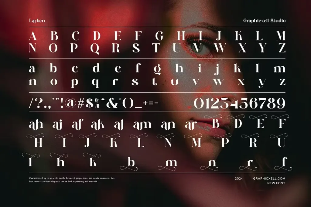
Ellen Luff’s approach to the italics is particularly interesting. While incorporating expected letter changes like the single-story ‘a’ and the ‘f’ with descender, she made the surprising design choice to keep the ‘g’ the same shape but slanted in the italic version. This contemporary twist gives Larken its distinctive personality within the serif typeface family.
Features That Make Larken Special
Larken Font Family offers four core styles supporting all major Latin-based languages, making it incredibly versatile. The true italics enhance the aesthetics significantly, bringing energy to the design that makes it suitable for modern applications across different mediums.
One of Larken’s most remarkable qualities is how it performs at different sizes. At large point sizes, you can truly appreciate the beautiful letter shapes and organic curves, while at smaller point sizes, the same restraint and focus creates an even texture perfect for longer reading. The natural curves, swells and sloping trunks grow in character as the font gains weight, creating visual interest without sacrificing readability.
The regular weights feature lowered contrast and optical corrections, which create a warm and gentle appearance on the page or screen. These thoughtful adjustments make Larken unusually flexible—working well for both headlines and body text.
The Larken character set comes packed with numerous OpenType features including additional symbols, stylistic alternates, unique ligatures (both standard and discretionary), and case-sensitive punctuation. These elements combine to produce a stable workhorse family ready to tackle projects of any size while maintaining its distinctive personality.
Where Can You Use This Free Font?
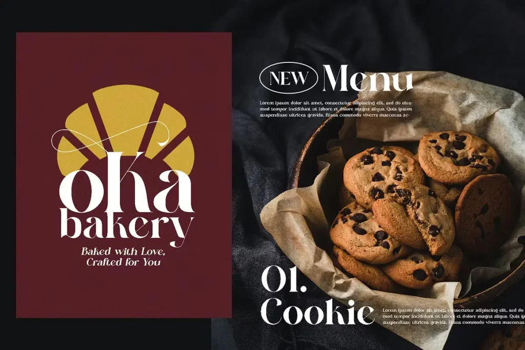
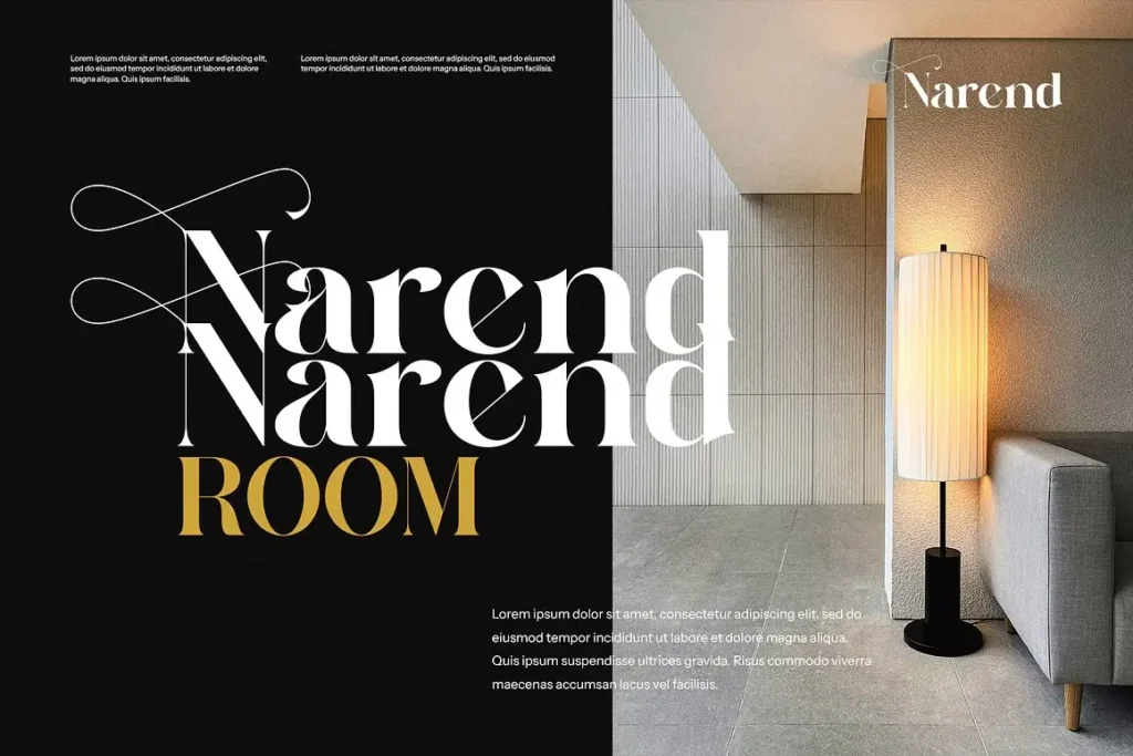
Larken excels in multiple design contexts thanks to its elegant versatility. For branding projects, its distinctive character creates memorable logos and identity systems that convey both tradition and innovation. The font truly shines in display sizes, making it ideal for packaging design, particularly for premium products where its noble simplicity with sharp, contemporary edges communicates sophistication.
In editorial design, Larken works beautifully for headlines and pull quotes, especially when set larger than 20px. While it can work for short paragraphs of body text, its tighter spacing and stronger contrast make it best suited for display purposes. Fashion magazines, luxury catalogs, and high-end websites benefit greatly from its balanced combination of classic structure and modern details.
Wedding invitations and formal event materials gain a special elegance from Larken’s organic curves and gentle repetition. The font performs exceptionally well in print materials where texture and tactile quality matter. Restaurant menus, wine labels, and boutique signage all gain a touch of refined character with this typeface.
For web design, Larken creates striking headers that immediately establish a sophisticated tone. The font pairs wonderfully with clean sans-serifs for body text, creating a pleasing contrast between headings and content that guides the reader’s eye naturally through the page.
Font License
Larken is available in both free and commercial versions. The free version is available for personal use only. If you’re creating client work or any commercial projects, you’ll need to purchase the full commercial license.
The complete Larken family includes variable weights, thin, regular, medium, light, extra bold, bold, and black versions—all with matching italics. This extensive range gives designers tremendous flexibility across projects while maintaining a consistent brand voice.
The commercial license provides access to all OpenType features and the full character set, which is essential for professional design work. Investing in this license supports Ellen Luff’s continued type design work while giving you a versatile tool for countless design challenges.


