

About Lollapalooza Font
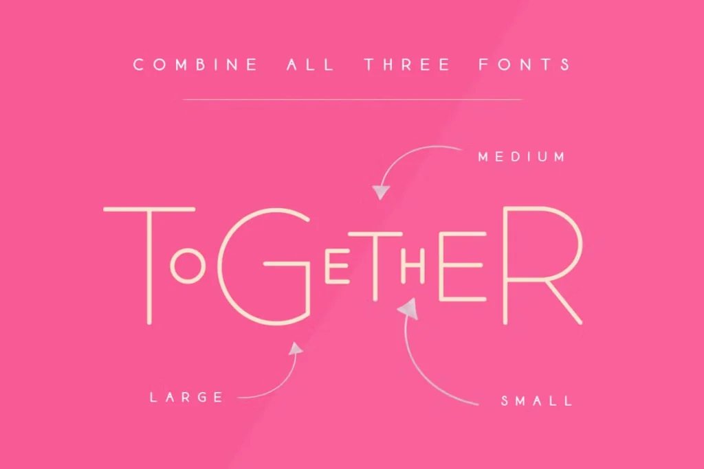
As a typographer and graphic designer with an eye for unique styles, I stumbled upon the Lollapalooza font while searching for something fresh for a music festival promotional campaign. The quirky character immediately caught my attention! I’ve since used it on several branding projects, most recently for a local coffee shop’s summer menu that needed a playful vibe. What makes this font special isn’t just its look – it’s the versatility you get from combining its three distinct sizes.
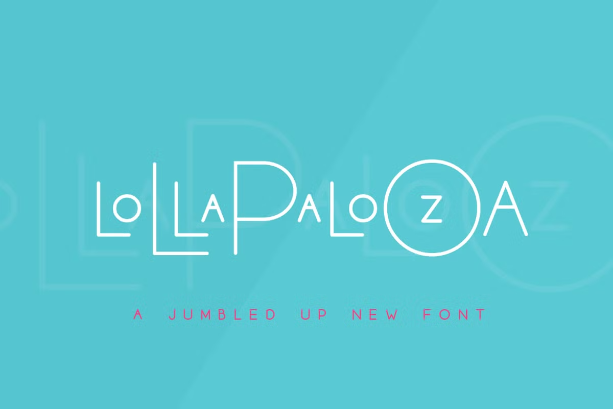
The Lollapalooza Display Font was created by Salt & Pepper Designs, a boutique design studio known for crafting typefaces with personality. Unlike typical fonts that come in standard weights, Lollapalooza arrives as a trio – Small, Medium, and Large versions that work together as a cohesive family. This approach gives designers like me creative flexibility without sacrificing harmony.
This typeface shares its name with the famous Chicago music festival, and that’s no accident. The design captures that same spirit of creative expression and boldness. The characters feature slightly irregular edges and unique proportions that break away from traditional type design rules. Salt & Pepper Designs released this font with modern designers in mind – those looking to create work that stands out in today’s visually saturated world.
Features of Lollapalooza Font Family
Lollapalooza’s most striking feature is its trio format. Each version (Small, Medium, and Large) has its own character while maintaining family resemblance. This allows for creative layering and combinations within a single design.
The font includes full character sets in both OTF and TTF formats, making it compatible with almost any design software. Web font versions come in EOT, SVG, WOFF, and WOFF2 formats – perfect for digital projects that need to maintain their stylish look online.
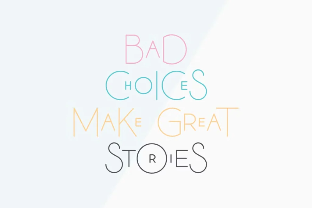
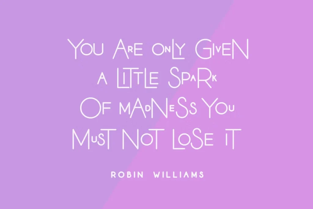
Letters have a hand-drawn quality with slightly uneven baselines that give text a friendly, approachable feel. The uppercase characters work particularly well for headlines and logos, with distinctive shapes that grab attention.
The spacing between characters is carefully balanced – tight enough to create a cohesive look but with enough breathing room to maintain readability even at smaller sizes. When used for logos, the font creates an instantly memorable impression thanks to its unique stylistic elements.
Text set in Lollapalooza has a modern yet playful personality that works especially well for brands wanting to appear approachable but still professional. The letterforms contain subtle variations that prevent the mechanical look of more traditional typefaces.
Where Can You Use This Logo Font?
Lollapalooza Sans Serif Font shines in poster designs where its personality can take center stage. The varying sizes make it perfect for creating eye-catching headlines with depth and dimension.
Music-related projects naturally benefit from this typeface’s festival namesake connection. Album covers, concert promotions, and band merchandise all look fresh and contemporary when styled with Lollapalooza.
Retail brands targeting younger audiences will find this font creates an immediate connection. I’ve seen it work wonders on packaging for specialty food items, clothing tags, and social media graphics where standing out matters.
The font transforms ordinary logos into memorable brand marks. Its distinctive character shapes mean businesses using Lollapalooza in their identity won’t be confused with competitors.
Digital projects benefit too – website headers set in this font immediately signal creativity and originality. The web font formats ensure your online presence maintains the same visual impact as print materials.
Children’s products and educational materials gain instant appeal with this font. The slightly irregular shapes feel friendly and accessible to young readers while still maintaining professionalism for parents.
Font License
Lollapalooza is free for personal use projects like hobby designs, school assignments, or personal social media graphics. This makes it perfect for testing in your projects before committing.
For commercial work like client projects, product packaging, or anything generating profit, you’ll need to purchase a license from Salt & Pepper Designs. The investment is reasonable considering the versatility you get from the three-font package.
The purchase includes lifetime updates and dedicated support from the designers – something I’ve found incredibly helpful when working on tight deadlines for clients. So, free download this font for your personal projects.


