About Mattone Font
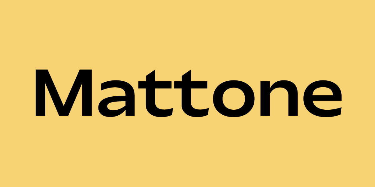
Mattone Font is a clean sans-serif typeface with a solid, straightforward feel. I see it as a practical choice when I need simple shapes that do not distract from the message.
I first came across it while testing options for a stripped-back landing page. The letters felt easy to read and steady on the screen. That balance of clarity and weight is what makes it stand out for me in everyday design work.
Font Style & Design Analysis
This is a sans-serif font with simple, unfussy letterforms. The strokes look even, and the shapes lean towards geometric, though not in a cold or rigid way. It aims for utility more than personality.
The exact designer or foundry for Mattone Font is not publicly confirmed. I could not verify a clear credit from reliable sources, so I treat it as an independent release rather than a well-known foundry family.
The characters have consistent spacing, which keeps words tight but readable. Weights feel best suited to headings and short text blocks, giving a firm, grounded tone. Overall, it behaves like a stable sans-serif that supports clear layout and strong alignment.
Where Can You Use Mattone Font?
I find Mattone Font most useful in digital interfaces, such as dashboards, app screens, and simple websites. At larger sizes, its clean shapes make buttons, labels, and section titles very easy to scan.
In print, it can work for posters, flyers, and packaging where you want a modern but neutral voice. Small sizes are readable, though I prefer it for subheadings and short paragraphs rather than dense body copy.
This font suits audiences that expect clarity and order: tech products, basic corporate materials, student projects, and straightforward branding systems. When a project needs a reliable font family that does not overpower imagery or colour, it slots in comfortably.
Font License
Licence details for Mattone Font are not fully clear from public sources. I would always check the official provider for current terms, and confirm that personal and commercial use are both allowed before using it in client or paid work.


