About Planet Kosmos Font
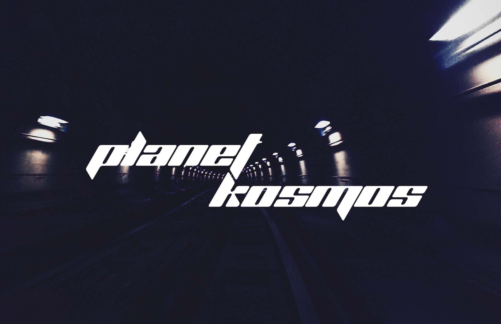
Planet Kosmos Font is a bold sci‑fi display font with heavy, blocky shapes and strong angles. I first noticed it in a retro game poster where the title needed to feel loud and mechanical.
When I tested it in a layout, it stood out straight away. The letterforms feel chunky and futuristic, almost like they were cut from metal plates. It is not subtle, but it is very clear and easy to spot on a crowded page.
What makes it useful for me is how quickly it sets a space or tech mood. One word in this font can change the whole visual identity of a poster or banner.
Font Style & Design Analysis
This is a display font built for impact rather than long reading. The overall design leans into sci‑fi, with squared curves, tight joins, and sharp corners. It feels engineered, like something from old arcade cabinets or space strategy games.
The original designer credit for Planet Kosmos Font is not publicly confirmed, at least from the sources I can access. When I work with fonts like this, I always look for a clear readme or licence note from the creator before using it in any client work.
The letterforms are wide, with heavy strokes and very little contrast, so every character feels solid and compact. Spacing is fairly tight, which helps headlines look like a single strong block. In use, the mood is industrial, futuristic, and slightly retro, rather than sleek or minimalist.
Where Can You Use Planet Kosmos Font?
I find Planet Kosmos Font works best for titles, logos, and large UI labels where you want an instant sci‑fi signal. Game covers, event posters, and streaming overlays are obvious matches. It suits tech‑minded audiences and retro gaming fans.
At large sizes, the chunky shapes read clearly and give strong presence. On smaller text, the tight spacing and heavy forms can blur together, so I avoid using it for body copy or detailed UI elements. It is best kept for short, punchy words.
This display font also helps when a project needs a futuristic visual identity without lots of extra graphics. I have dropped it into simple black‑and‑neon layouts and it instantly sets the theme. Used with care and good contrast, it can anchor a whole sci‑fi brand direction.
Font License
Licence terms for Planet Kosmos Font can vary between sources, and I have not seen a single official statement. Always check the original download or publisher for clear licence details, especially before any commercial or client use. For personal experiments, I still read the terms first. It saves headaches later.


