

About Recoleta Font
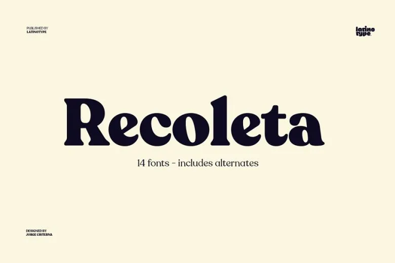
Recoleta Font is a warm, soft-edged serif typeface that blends retro curves with a clean, modern feel. I first tried it on a poster project where I needed something friendly but still grown-up.
When I work with Recoleta Font, the heavy curves and rounded terminals stand out. The shapes feel confident, yet not stiff. It catches attention fast in a layout, especially in big titles and short, bold phrases.
Font Style & Design Analysis
This is a serif font with chunky, flowing letterforms and a slightly vintage voice. I see strong nods to 70s magazine typography, but with smoother curves and more even texture on screen.
The exact designer and foundry credit for Recoleta Font is not publicly confirmed, so I always check the source where I download or licence it for accurate attribution details.
The large x-height, generous curves, and tight-but-readable spacing give it real presence in headlines. Heavier weights feel bold and sculpted, while lighter ones look softer. Overall, the font sets a warm, inviting tone that still feels organised and controlled.
Where Can You Use Recoleta Font?
I find Recoleta Font works best as a display font in titles, logos, and key brand phrases. It shines on posters, packaging, and website hero sections where large sizes let the curves breathe.
At smaller sizes, the chunky serifs and tight forms can look a bit dense, so I avoid long body text. It pairs well with a clean sans serif for paragraphs, keeping the visual identity balanced and easy to read.
This typeface suits lifestyle brands, cafes, creative studios, and editorial layouts that want a relaxed, retro-inspired edge. It feels approachable for younger audiences, yet still clear enough for professional contexts such as brand decks and social graphics.
Font License
Licence terms for Recoleta Font can vary between sources. Personal and commercial use may require different licences, so I always check the official provider for current pricing, usage limits, and any web or app embedding rules before a project.


