

About Reklame Script Font
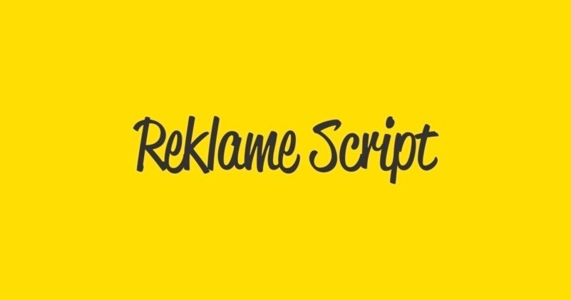
Reklame Script Font is a flowing script typeface with bold, confident strokes. I first noticed it while exploring options for vintage-style headlines and logo sketches.
When I tested it in a few mock posters, the letters linked together in a smooth, easy way. The rhythm felt controlled, not messy. It stood out because it delivered that retro sign-painter feel but still stayed readable at medium sizes.
What caught my eye most was how the curves lean forward, as if the writing is in motion. It gives designs energy without turning chaotic, which is rare in stronger script fonts.
Font Style & Design Analysis
This is a script font with a bold, hand-painted look. The letterforms feel inspired by old shop fronts and advertising, with a casual but deliberate stroke. It looks like it was drawn with a brush pen and then tightened for digital use.
The original designer or foundry of Reklame Script Font is not publicly confirmed from the sources I checked. I would always look at the official distributor or licence page if clear authorship is important for a project.
The strokes are thick, with some contrast between upstrokes and downstrokes, though not extreme. Spacing is tight, which keeps words compact and punchy. At larger sizes, the swashes and loops feel playful yet controlled, giving a warm, informal tone that suits expressive display work.
Where Can You Use Reklame Script Font?
I find Reklame Script Font works best as a display font for headlines, logos, and short phrases. At big sizes, the script details show clearly, and the heavy strokes give strong presence on posters, packaging, and hero banners.
For branding and visual identity, it fits cafés, food products, barbers, vintage markets, and any project that needs a friendly, crafted feel. It can pair well with a clean sans-serif for body text, letting the script handle only the key words or logotype.
In small text or long paragraphs, the bold script shapes become harder to read, so I avoid it for captions or dense copy. I use it where I want quick impact, such as signage, social media titles, labels, or promotional graphics aimed at relaxed, lifestyle-focused audiences.
Font License
Licence terms for Reklame Script Font can vary between sources, especially for personal versus commercial use. I would always check the official provider for current licence details before using it in paid client work or large campaigns.
I like how it adds a confident, human touch to designs without feeling overdone, so I keep it in mind whenever a project needs that bold, handwritten headline moment.


