
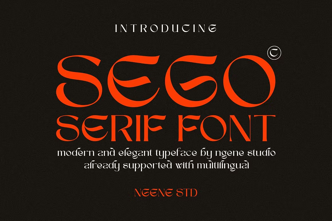

About Sego Font
I discovered Sego Font last month while hunting for the perfect typeface for a luxury skincare brand project. As a typographer with 8+ years in design, I’m picky about serifs—most feel either too stuffy or too trendy. Sego hits that sweet spot of elegant and modern touch with fresh personality.
I’ve since used it on a restaurant menu design and wedding invitation suite. The client reactions? Pure excitement. What makes Sego special is how it commands attention without shouting. If you work with premium brands or need typography that balances classic and contemporary, keep reading.
The Designer and Font Style
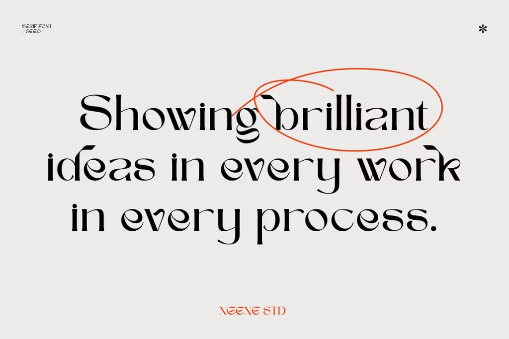
Sego Font font by ngene, a typographic artist known for creating character-rich serif fonts that break away from conventional approaches. This vintage-inspired serif brings unexpected twists to traditional letterforms.
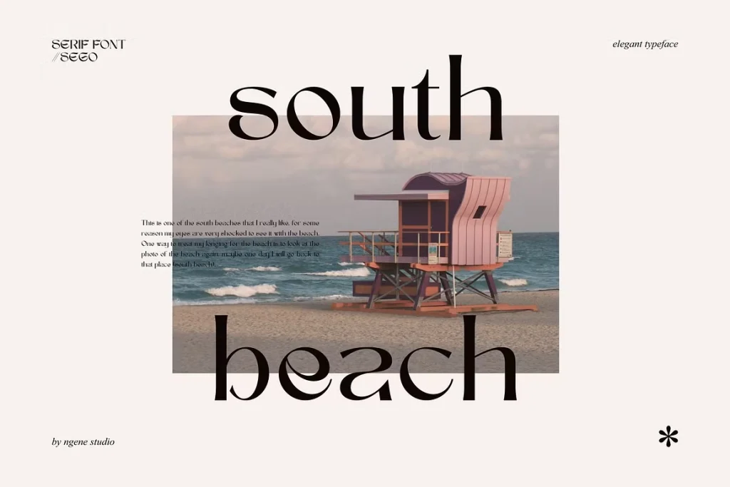
What separates Sego from other serif options is its confident personality. Each character features subtle details that feel hand-crafted yet precisely executed. The uppercase letters display a regal quality with measured stroke contrast, while lowercase characters maintain excellent readability even at smaller sizes.
The font balances its vintage roots with contemporary sensibilities. It’s not trying to be another generic serif—Sego offers distinctive terminals and unique character proportions that make designs instantly more sophisticated. The x-height is carefully calibrated to work beautifully in both print and digital applications.
Ngene has included thoughtful details like strategic ink traps that improve performance at smaller sizes while adding visual interest when used large in headings. The overall effect is a typeface that feels both familiar and fresh—a difficult balance many serif fonts fail to achieve.
Features of Sego Font
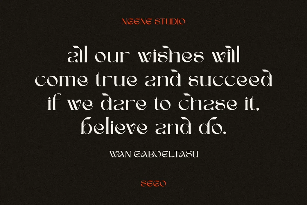
Sego Font delivers impressive versatility through its extensive character set and alternates. The OpenType features unlock creative possibilities that transform basic text into custom-feeling typography.The font includes:
- Multiple stylistic alternates for key characters
- Ligatures that create fluid letter combinations
- Specialized swashes for decorative applications
- Small caps for sophisticated text hierarchies
- Numerals in both old-style and lining formats
These alternatives let you fine-tune the personality of your text. Need something more traditional for body copy? Apply the standard characters. Want eye-catching headlines? Activate the alternates for dramatic effect.
The kerning pairs are exceptionally well-crafted, saving hours of manual adjustments when setting headlines. Text blocks maintain even color and rhythm, a testament to ngene’s attention to spacing details.
Sego performs beautifully across applications—from Adobe Illustrator to web typography implementations. The file format supports modern software requirements while maintaining clean vector paths that scale flawlessly from business cards to billboards.
What makes Sego truly stand out is how it handles the transition between weights. The character shapes maintain their distinctive personality whether used in lighter or heavier applications, creating cohesive design systems across various contexts.
Where Can You Use This Font?
Sego Serif Font shines in projects that demand sophistication with a touch of character. It’s perfect for:
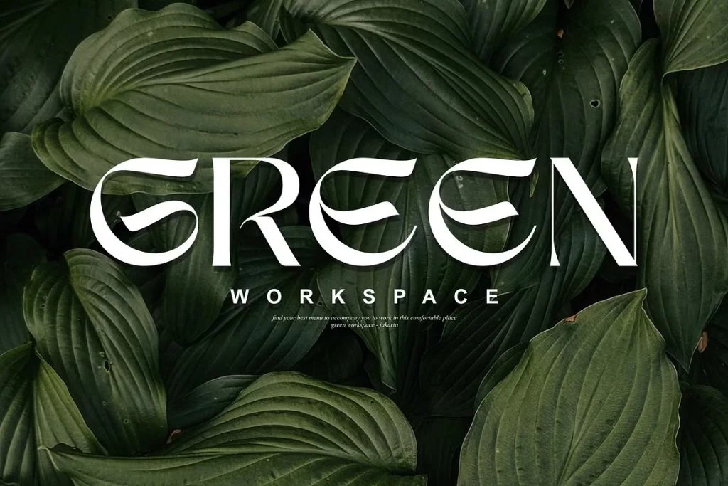
Logo design for upscale brands: The distinctive serifs create memorable wordmarks that position companies as established yet forward-thinking.
Editorial design: Magazine layouts gain instant refinement with Sego headlines paired with complementary sans-serif body text.
Packaging design: Luxury product labels benefit from Sego’s ability to communicate quality through typography alone.
Wedding stationery: Invitations and programs feel custom and elevated without becoming overly ornamental.
Web design for creative professionals: Implemented through modern web typography techniques, Sego creates portfolio sites that stand apart from template-driven designs.
Restaurant menus and wine lists: The font communicates culinary sophistication and attention to detail.
What surprised me most was how versatile Sego proves in digital environments. Unlike many serifs that struggle on screens, Sego maintains clarity and character even at challenging sizes. I recently used it for a client’s email newsletter headers, and it rendered beautifully across devices.
The font particularly excels when paired with minimalist design elements—it carries enough visual interest to reduce reliance on decorative graphics while maintaining professional polish.
Font License
Sego Font operates under a premium license from designer ngene. The license permits both personal and commercial use across print and digital works. For designers creating client work, you’re covered for logo design, branding systems, marketing materials, magazines and others without additional fees.
The standard license includes web font implementation, though large-scale commercial applications may require extended licensing. The font files come in OpenType format compatible with all major design software including Adobe Illustrator and can be exported to PDF without issue.
Before downloading, check ngene’s current copyright terms as license details occasionally update. The investment is worthwhile for serious designers who need typography with distinctive character.


