


About Veto Sans Font
There’s something about fonts that gets me every time, and Veto Sans? It’s in a league of its own. I had to review it, not just because it’s amazing, but because I think everyone should know about it. It’s a rare find—a typeface that stands out for being both unique and super functional.
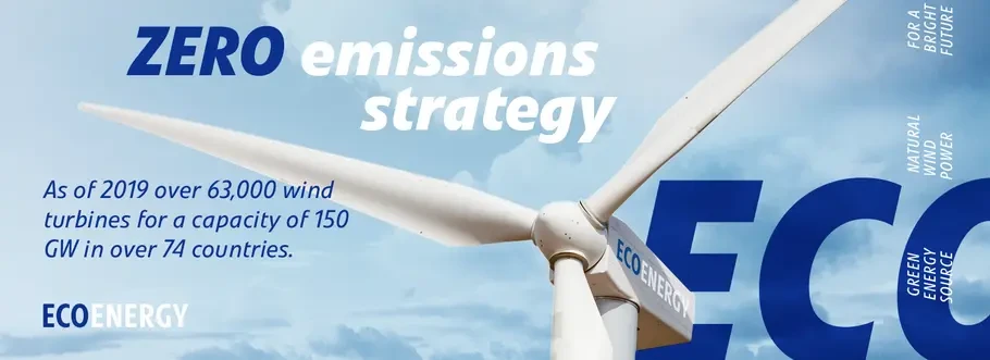
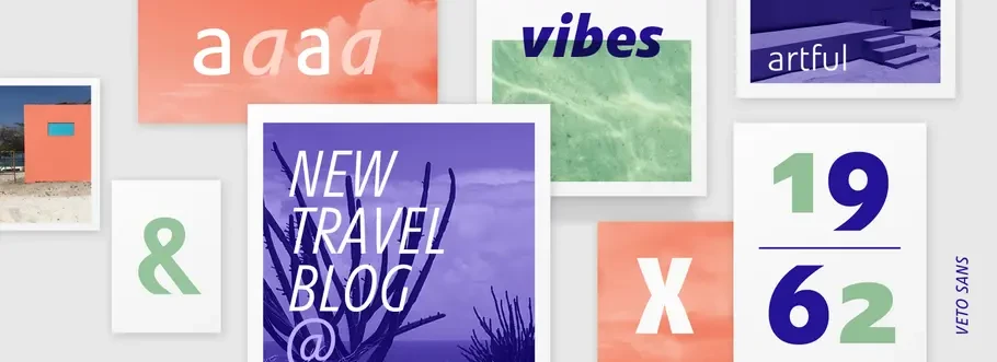
So, I put it to the test in my latest branding project, and let me tell you, Veto Sans didn’t just participate; it led the way. This sans-serif font became the cornerstone of my design, making everything from business cards to banners come alive in ways I’d only imagined.
And the outcome? Absolutely stunning. With Veto Sans, my project didn’t just succeed; it made a statement, captivating everyone who saw it.
Marco Ganz, a creative designer, made Veto Sans. He worked together with Monotype foundry and mixed traditional and modern designs. Their work is all about being innovative and excellent in font design.
Detail Overview About Veto Sans Font Font Family
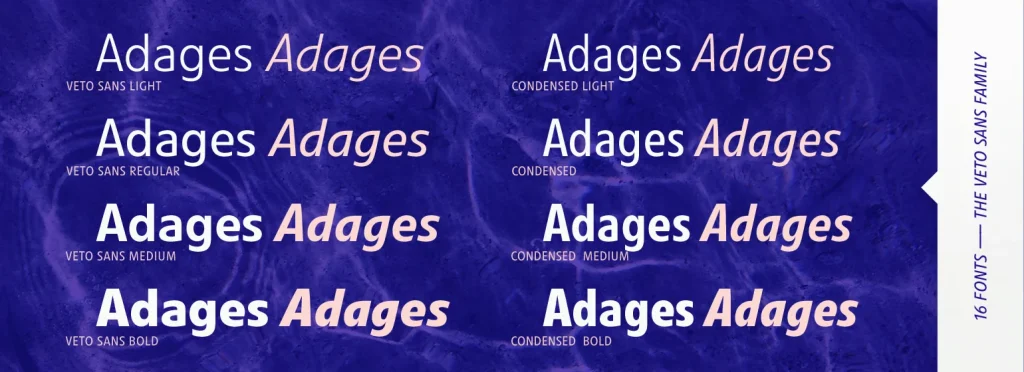
Veto Sans is super versatile, and that includes veto sans condensed and bold versions. It looks amazing whether you’re scrolling through it on screens or flipping through pages in print. No matter what you’re up to – be it an ad campaign, branding stuff, corporate materials, or putting together an editorial layout – this font, licensed by Monotype, has your back.
And let’s not forget it’s great for signage and wayfinding projects, too – it’s incredibly versatile. With its desktop license, it’s easily accessible for all sorts of design work.
One of the standout features of Veto Sans is its impeccable balance between form and function. Marco, the genius behind this font, really put his all into making the letters shape not just sleek, but also super friendly. He figured out the perfect spacing – both between and inside the letters – making Veto Sans not just a treat for the eyes, but easy to read too, even in its condensed and bold formats.
Speaking of character, the italic designs in Veto Sans are a stroke of genius. They not only complement the roman weights flawlessly but also inject a dynamic energy into the font family, making the bold italic a particularly dynamic choice.
And with a wide range of international characters, localization is a breeze – making Veto Sans, with its comprehensive license options through Monotype, a global player in the world of typography.
Licensing Options
Veto Sans is a must-have for designers but it’s not free. You need to buy it from MyFonts to support its creators. This helps continue quality font design and keeps things legal and ethical. To buy the font file from my fonts click the ‘download font’ button and enjoy the font.


