Let’s face it, finding the perfect font can feel like searching for a needle in a haystack. As a typographer and graphic designer, I’m always on the hunt for unique typefaces that not only look great but also communicate the right message. Recently, I stumbled upon Comic Code Font and it was like a lightbulb went off!
I was working on a children’s book cover that needed a playful yet professional feel, and Comic Code Font hit the nail on the head. It’s like the font designers took the friendly charm of Comic Sans and gave it a serious upgrade, making it perfect for projects where you want to inject personality without sacrificing clarity.
Plus, with its focus on readability, it’s a great choice for anyone concerned about dyslexia or other reading difficulties. The carefully crafted glyphs and thoughtful typography make it a joy to read, almost like handwriting but with a modern twist.
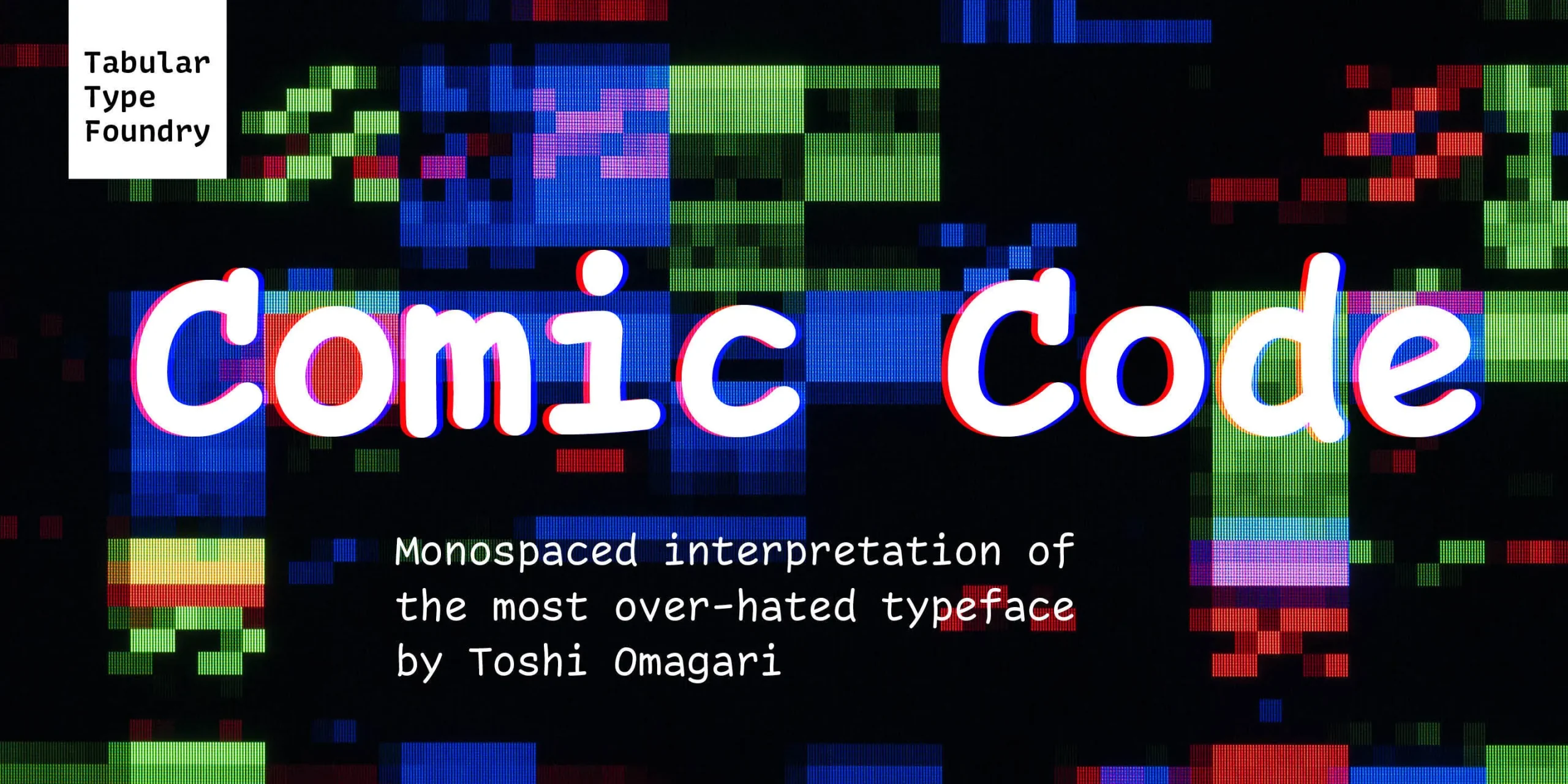
What really sets Comic Code Font apart is its unique backstory. It’s a clever twist on the beloved (and sometimes controversial) Comic Sans, taking its friendly charm and making it even more legible and versatile. The designer, Toshi Omagari, has truly outdone himself with this one.
Decoding Comic Code Font
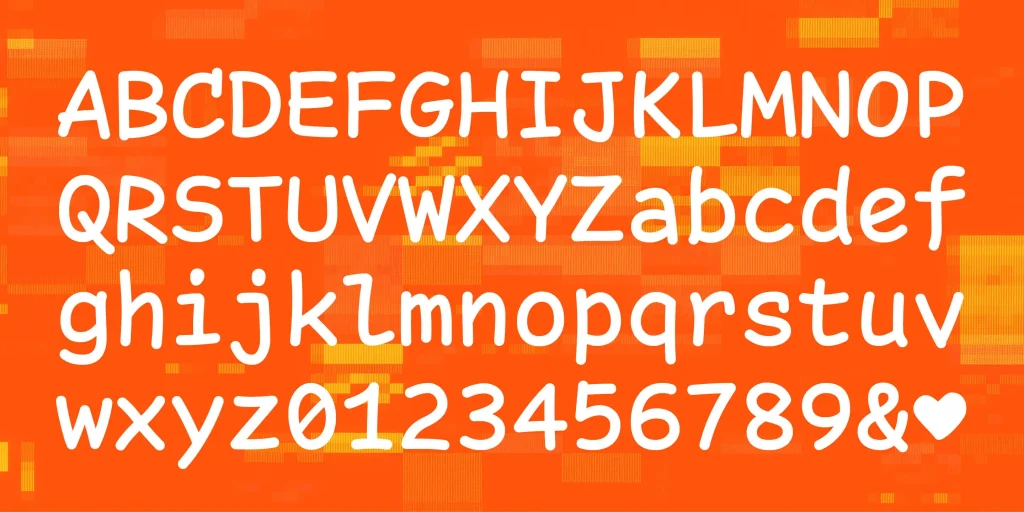
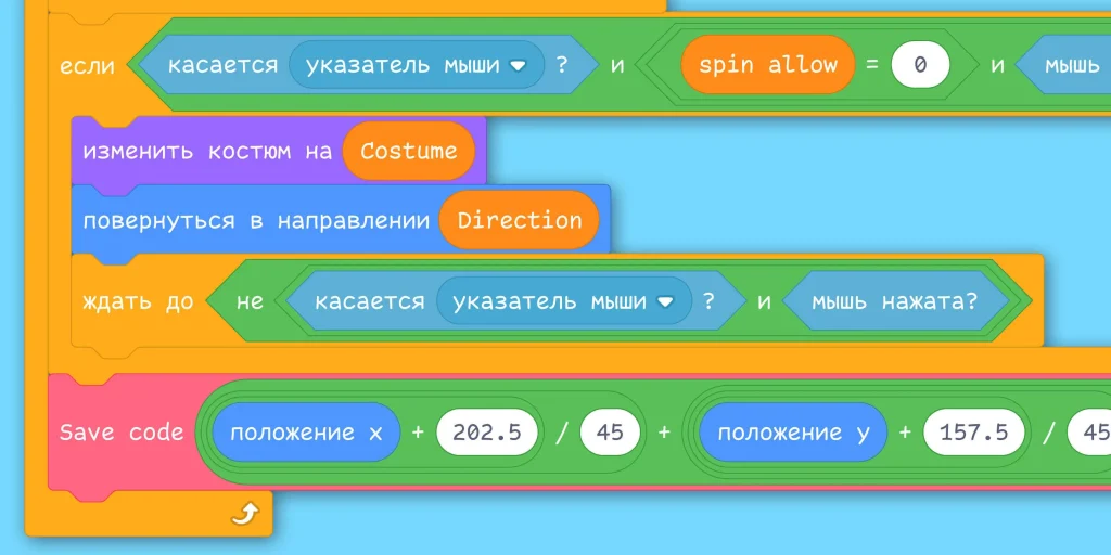
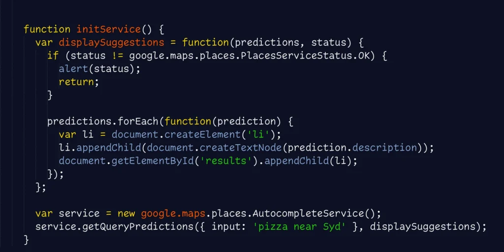
Comic Code Font is a monospaced adaptation of Comic Sans, designed specifically for programming. Think of it as a love letter to the casual font, but with a focus on readability and functionality.
Omagari, a talented typographer, took inspiration from the friendly characteristics and low-resolution legibility of Comic Sans, creating a typeface that feels both familiar and fresh.
The result is a font that’s both playful and professional, perfect for projects where you want to inject a bit of personality without sacrificing clarity. Omagari’s attention to detail is evident in every aspect of the font, from the carefully crafted letterforms to the subtle ligatures that enhance readability.
In fact, Comic Code Font seems to perform just as effectively for dyslexic readers as Comic Sans, judging by the response.
Features That Make Comic Code Stand Out
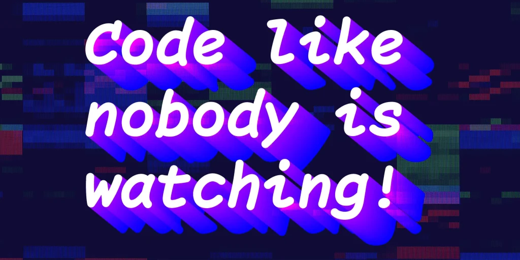
Comic Code Font comes in two families: the standard family and Comic Code Ligatures. The standard family also offers ligatures as a discretionary option. Ligatures can be particularly helpful in programming languages like Haskell, as they can improve the overall flow and readability of code.
One of the things I love about Comic Code Ligatures is that the dashes are semi-connected. This allows them to look connected enough to enhance readability, but still countable, addressing a common criticism of ligatures.
Unlike Comic Sans, which has an artificially made bold that looks clunky, Comic Code Font boasts manually drawn bold and italic variations, adding a touch of elegance and sophistication. For those who primarily use code, there’s also a Coding Essentials pack that includes only the essential weights (Regular, Bold, Italic, and Bold Italic) at a discounted price.
Where Can You Use This Font?
Comic Code Font is incredibly versatile and can be used in a variety of projects.
While it was designed with programming in mind, its playful yet professional aesthetic makes it perfect for:
- Children’s books and educational materials: Its friendly and approachable style is sure to engage young readers.
- Branding and marketing materials: Use it to create a unique and memorable brand identity.
- Web design: Add a touch of personality to your website with Comic Code Font.
- Graphic design projects: From posters to illustrations, Comic Code Font can add a touch of whimsy to your designs.
Font License
Comic Code Font is available for purchase through the Tabular Type Foundry website. They offer a variety of licensing options to suit your needs. If you’re not sure if you’re ready to commit to a paid font, there are also trial versions with a limited character set available. For those who want a free alternative, there’s Comic Mono, a font that tackles the same basic idea.
