
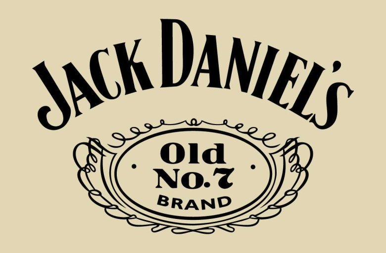

About Jack Daniels Font
The Jack Daniels Font is a bold serif typeface that echoes the look of the famous whiskey label. I first tested it on a vintage-style poster, then tried it in a few mock brand layouts.
What struck me is how instantly recognisable it feels, even when the words change. The heavy curves, tall caps, and old-style charm make this font stand out as a strong display choice with a clear, traditional voice.
Font Style & Design Analysis
This is a serif font with a classic, bottle-label feel. The letterforms lean toward high contrast, with thick main strokes and thinner joins that create a sharp, framed look at larger sizes.
The exact designer and foundry for the Jack Daniels Font are not publicly confirmed. Whenever I work with it, I treat it as a lookalike style rather than an official brand typeface and keep that in mind during client conversations.
Uppercase characters feel tall and proud, with tight spacing that suits centred layouts. The weight reads as bold, which gives strong presence on dark backgrounds. Overall, the mood is traditional, masculine, and slightly ornamental, ideal for heritage-flavoured visual identity work.
Where Can You Use Jack Daniels Font?
I find the Jack Daniels Font works best as a display font on posters, labels, and packaging. It shines at large sizes where the serif shapes and curves are clear and legible.
For brand work, it suits craft drinks, barbecue restaurants, live music venues, and any project that wants an old saloon or Americana vibe. Used in headlines with a simpler supporting font family, it can anchor a strong, consistent visual identity.
At small text sizes, the contrast and tight spacing can become harder to read, so I avoid using it for long body copy. Instead, I rely on it for logos, wordmarks, menu headings, event graphics, and social media titles where impact matters most.
Font License
Licensing for the Jack Daniels Font and any lookalike styles can vary, especially for commercial projects. I always check the official source or vendor for clear terms on personal and commercial use before using it in paid client work. That extra step keeps projects safe and respectful.


