

About Copernicus Font
I’m a typographer and graphic designer who often looks for fonts that balance history with modern relevance. While researching serif typefaces for a branding project, I came across the Copernicus Font. The mix of elegance and strength caught my attention, so I tested it in layouts for a client’s identity system.
Its wide stance and workhorse personality brought structure without losing sophistication. That balance convinced me it was worth sharing a full review. Fonts like this don’t just serve as tools, they shape the entire tone of a design.
About the Font and the Designer
The Copernicus Font Family is a serif typeface with roots in history but designed for the needs of today. It takes inspiration from the work of Robert Granjon in the 1560s, whose letterforms stood apart for their sturdiness. Those designs were revived as Plantin in the early 20th century for Monotype, a typeface that influenced countless modern fonts. Copernicus is a revivification of that design, a version meant to capture the qualities of Plantin but reinterpret them for the 21st century.
The typeface was developed under Labor & Wait, with contributions from Chester Jenkins and Kris Sowersby. Their goal was not to replicate Granjon’s forms exactly, but to channel the same resilience and wide stance into a new design. Where Plantin leaned into print technology of its era, Copernicus reflects digital needs and modern aesthetics. The italics were carefully drawn to complement the roman weight, maintaining energy without sacrificing clarity.
Chester Jenkins and Kris Sowersby are both known for typeface designs that combine function and personality. In Copernicus, they brought together tradition, innovation, and craft, creating something that is equally at home in branding, editorial design, and digital use.
Features of the Copernicus Font
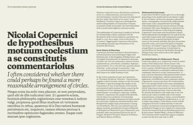
The Copernicus Font is best described as a versatile serif. It’s sturdy and reliable, making it a true workhorse in design projects. The letterforms have a wide stance, giving them presence on the page while still reading smoothly in long text. Compared to other serif fonts, its proportions feel modern but rooted in history.
One of its strengths is flexibility. The font comes with italics, condensed styles, and weights that make pairing simple. Designers often look for font pairings that balance tradition with freshness, and Copernicus delivers that through its adaptability. Whether paired with a clean sans-serif or another serif font, it maintains character.
The serif font shows its retro edge through its connection to Plantin and Granjon, yet it feels current in digital settings. It works well in Adobe tools, websites, and print layouts. Each glyph has been drawn with precision, making the typeface look professional in both display and paragraph use.
For designers, Copernicus is more than a single-use style. It’s a family that supports creative applications across branding, editorial spreads, and even packaging. Its balance of history and innovation makes it a dependable resource for projects that demand authority and elegance at the same time.
Where Can You Use This Font?
The Copernicus Font works across a wide range of projects. In branding, its sturdy yet elegant structure builds trust while keeping the visual tone approachable. A brand identity using this serif can feel classic without looking outdated, which is ideal for companies seeking timeless appeal.
In editorial design, Copernicus shines in body text and headings. The workhorse nature of the typeface makes it suitable for long-form reading while still standing out in titles. Designers often need fonts that can handle both, and this typeface fits that demand perfectly.
Creative uses extend to packaging, where the serif font communicates reliability and sophistication. Pair it with clean layouts, and it elevates a product’s appearance instantly. Wedding invitations, posters, and professional documents also benefit from its strong yet refined personality.
Digital applications are just as effective. Copernicus works well in web design, where readability and style both matter. Its condensed styles give designers flexibility in tight spaces, while the italics add energy to emphasis. Whether you’re working on a modern brand system or a traditional project, this serif typeface provides the versatility to deliver consistent results.
Font License
The Copernicus Font Free Download is available for personal use, which makes it easy to test in design experiments or creative practice. For commercial projects, a proper license must be purchased through Labor & Wait or their distribution partners. This ensures respect for the work of Chester Jenkins, Kris Sowersby, and the foundry, while giving designers access to the full font family with its complete set of styles.


