

About Kind Sans Font
As a typographer and graphic designer, I’m always on the hunt for fonts that feel human without losing clarity. That’s what drew me to the Kind Sans Font Family. I came across it while working on a branding project for a wellness brand. I needed something calm but modern. Sharp but warm. Kind Sans checked all those boxes.
I’m writing this review because I genuinely enjoyed using it. Fonts can make or break a brand’s message, and this one helped bring my design to life. It wasn’t just clean—it felt personal. And that’s rare.
It’s not a free font, so I took a leap and licensed it. Totally worth it.
About the Font and the Designer
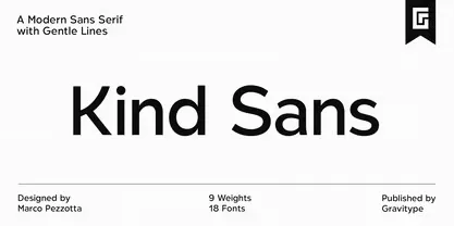
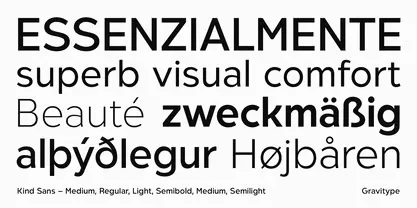
Kind Sans is a refined sans serif designed to be easily approachable. It blends clean geometric lines with soft curves to offer a pleasing reading experience. Visual comfort and legibility are at the heart of this font. That balance really shows in long-form text, short headers, and even logos.
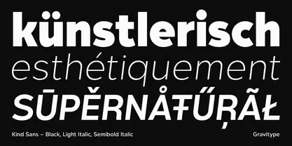
The font features 9 uprights and 9 italics, giving you full control over tone and style. Whether you want something bold, neutral, or whisper-light, there’s a weight for it.
Kind Sans Font Family was crafted by Marco Pezzotta, under the design label Gravitype. He didn’t just make a functional font—he gave it personality. There’s harmony in the spacing. Care in the rhythm. And the glyphs feel carefully drawn, not generated.
This isn’t one of those overly quirky sans fonts. It’s confident but calm. You’ll notice fine detailing in every character, from the Kind Sans Thin all the way to the heaviest italic. It keeps things structured without ever being stiff. That’s not easy to do.
Features of the Font
The Kind Sans Font Family includes more than just weights. It’s a full type system built for versatility. The set includes:
- 9 uprights and 9 italics
- Alternates for added style control
- Ligatures, ordinals, and fractions for advanced typography
Each character was drawn to feel intentional. Whether you’re working in branding, editorial, UI, or packaging, the glyphs adapt well across sizes. Everything feels spacious, even when tightly packed.
Kind Sans supports Latin-based languages, which is a plus for international design work. The kerning is smooth. The alignment feels just right. You don’t need to do a lot of micro-adjustments.
One of my favorite touches is how balanced it feels. It’s simple without being boring. It’s elegant without being flashy. That kind of refined sans serif is hard to find.
Where Can You Use This Font?
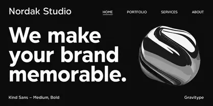
Kind Sans Font works almost anywhere clean, friendly design is needed. I’ve used it for a wellness brand, but I could easily see it used in:
- Tech startups that want a trustworthy look
- Lifestyle blogs that need warmth in body text
- Packaging for skincare or organic goods
- Branding systems that need a lot of weight variation
- UI and apps where clarity is key
It’s also great in editorial settings. The legibility and visual comfort make reading long paragraphs easier on the eyes. The Kind Sans Thin style looks beautiful in large titles or soft branding marks.
Because it’s not overused, it helps your work stand out. There’s a quiet confidence to this sans font family that elevates your design without stealing attention.
The wide variety of weights makes it great for graphic files, decks, posters, and digital work. It’s a great choice when you want modern design, without falling into a trendy trap.
Font License
The Kind Sans Font Family is not a free font. You need to buy a license to use it commercially. You can download Kind Sans Font from MyFonts or the Gravitype website.
Once purchased, the font is available as a digital file for personal or commercial use, depending on the license version you pick.


