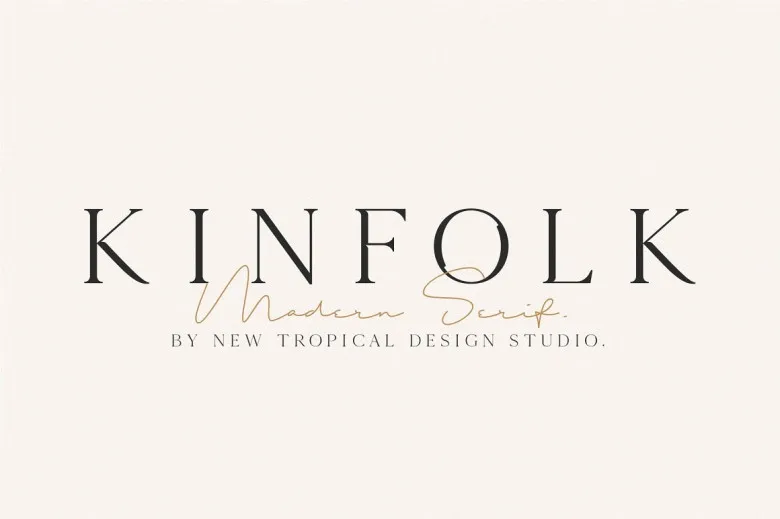

About Kinfolk Font
Kinfolk Font is a calm, bookish serif typeface that feels built for slow reading and simple layouts. I first tested it on a set of editorial mockups and a small lifestyle brand concept.
It stood out for its gentle contrast and smooth curves. The letters have a soft presence, without feeling too decorative or fussy. In use, the font feels steady and readable, which makes it easy to trust on the page.
Font Style & Design Analysis
This is a serif font with a classic, literary direction. The letterforms lean towards traditional book typography, with clear shapes and modest stroke contrast. It aims for comfort on the eye rather than sharp drama.
The original designer or foundry for Kinfolk Font is not publicly confirmed. When I researched it, I could not find a clear, reliable credit, so I treat the authorship as uncertain.
The serifs are small and tidy, giving the font a neat rhythm in text. Spacing feels slightly open, which helps at smaller sizes. Weights I have seen look on the lighter side, creating a relaxed tone suited to soft branding and long-form reading.
Where Can You Use Kinfolk Font?
For me, Kinfolk Font works best in editorial projects: magazines, journals, and thoughtful blogs. In headings, it gives a calm, slow-living mood. At medium sizes, it holds detail without stealing attention.
In longer paragraphs, the open spacing and balanced letterforms support comfortable reading. I would use it for articles, essays, and simple book interiors, especially for lifestyle, craft, or food content where the pace is gentle.
Branding is another strong use. A small studio, café, or boutique label could build a soft visual identity with this typeface. It suits audiences who value calm design: minimal packaging, wellbeing brands, and quiet, image-led websites.
Font License
Licence details for Kinfolk Font are not fully clear from public sources. Always check the official licence before using it, especially for commercial projects. For personal experiments, I still confirm terms to avoid misuse.