

Note: To use this font for commercial purposes, click “Get Commercial License” Button!
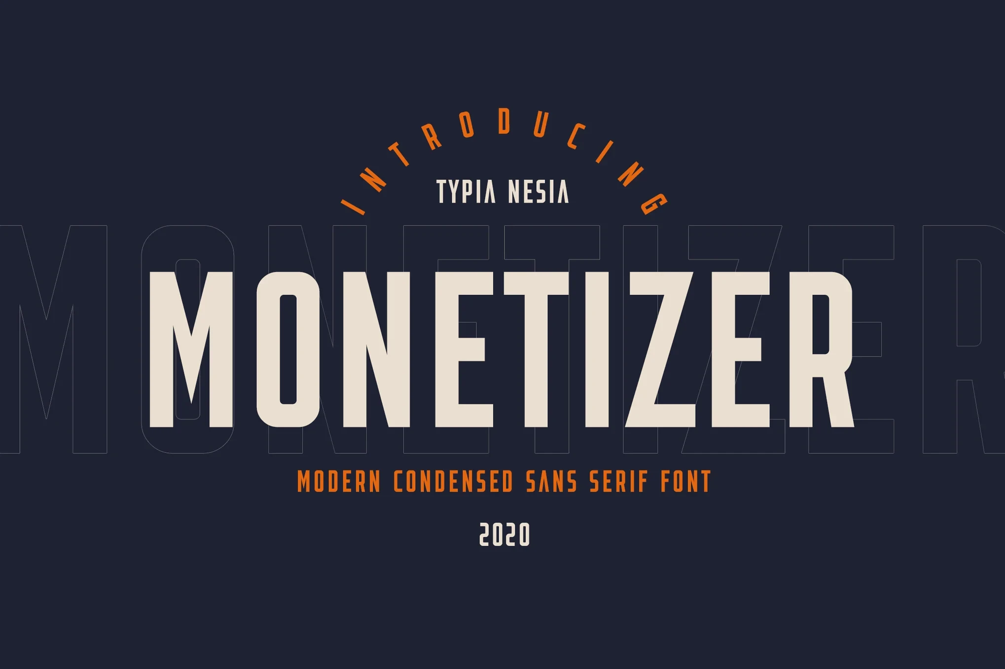
About Monetizer Font
I’m a typographer and graphic designer who works with brands to build visual identities that stand out. I found Monetizer Font while searching for a bold yet clean typeface for a branding project. The name caught my eye, but the style sealed the deal.
I used it on a set of logo concepts and social banners. It felt sharp, modern, and confident. After seeing how well it worked across different formats, I knew it deserved a proper review. If you’re looking for a font that mixes structure with style, keep reading.
What is Monetizer Font?
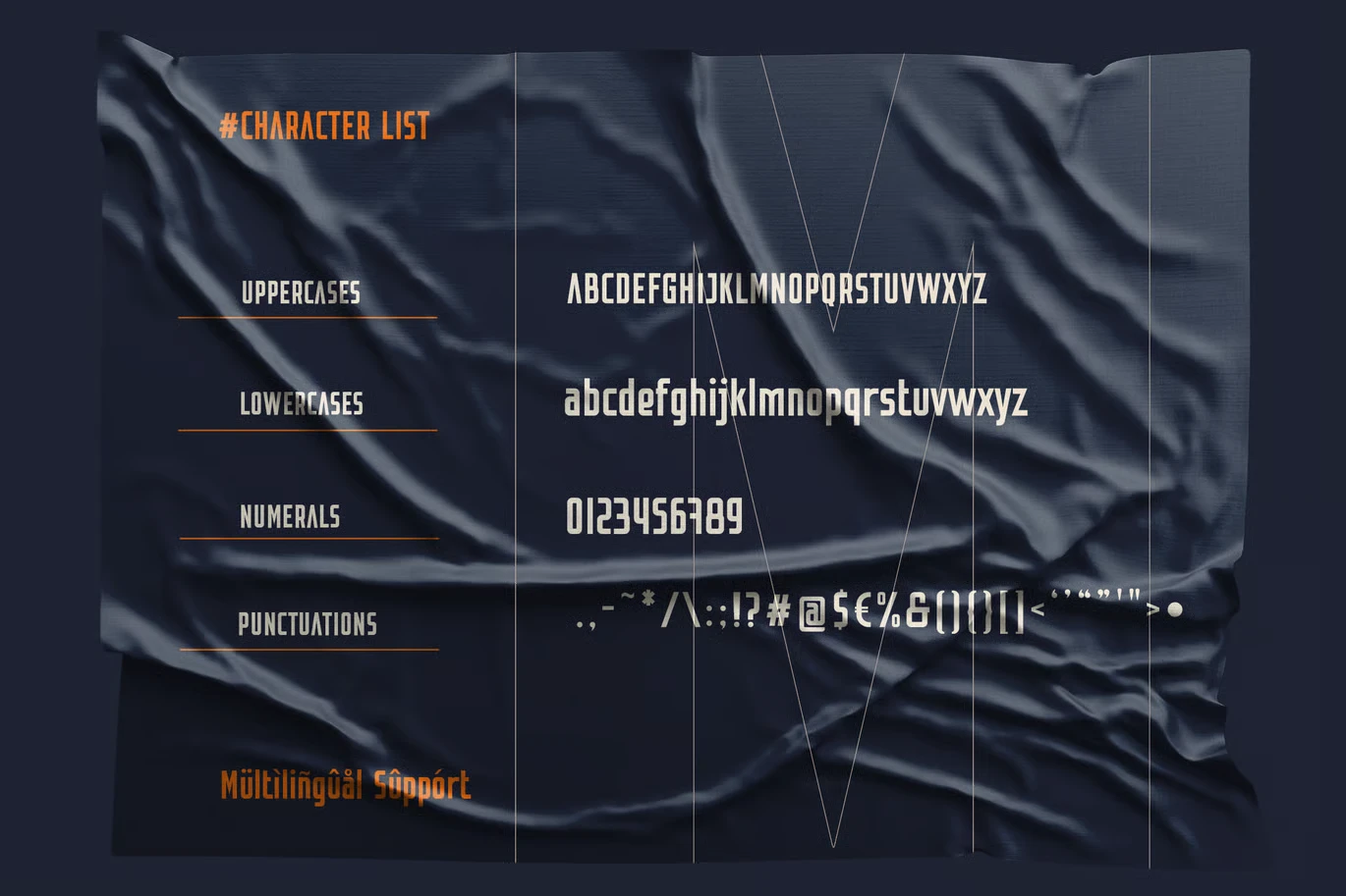
Monetizer Font is a modern condensed sans serif typeface made for bold visual work. It was designed by Typia Nesia, a well-known name in creative typography. Their fonts often feature strong lines, clean curves, and layouts that feel smart without being stiff.
This one fits perfectly into that vision. It’s narrow but easy to read. It has the look of a display font with the focus of something built for real design use.
The Monetizer Font download comes ready to use. It works well on Mac and Windows, and it installs with no issues. This font is perfect for both digital and print work, especially if you’re aiming for something strong but not overwhelming.
Typia Nesia builds their fonts with purpose. Monetizer is part of a bigger collection of fonts that aim to be both creative and commercial. The brand is known for quality, and this typeface lives up to it.
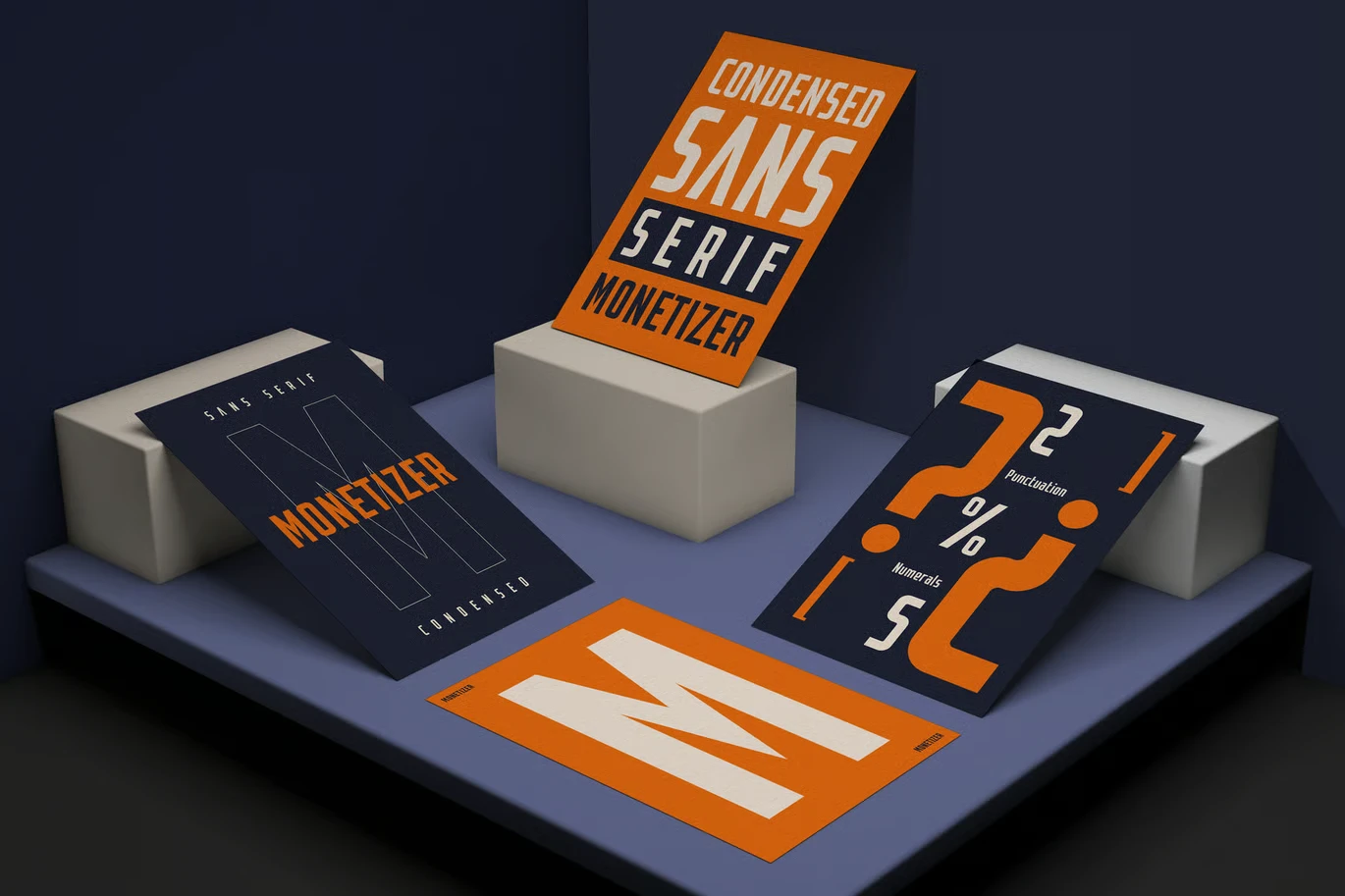
Key Features of Monetizer Font
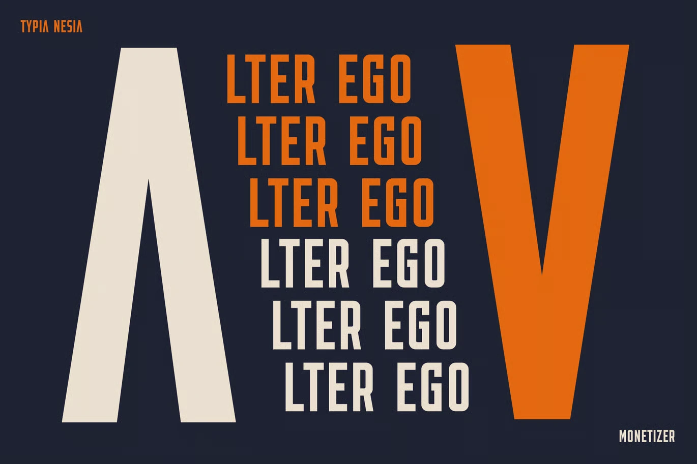
Monetizer keeps things simple, and that’s what makes it powerful. The first thing you’ll notice is its height. It’s a condensed sans serif font, which means it saves horizontal space while keeping vertical clarity. That gives your layout a tall, clean, and sharp look.
Each letterform is well-balanced. Nothing feels too wide or too narrow. The spacing is tight but readable, which is great for headings. It’s a modern sans serif that works hard in limited space.
This font is perfect for projects that need structure. It feels especially right for bold headlines, titles, and digital banners. In my project, I used it for product packaging and editorial design mockups. It stayed crisp across every platform.
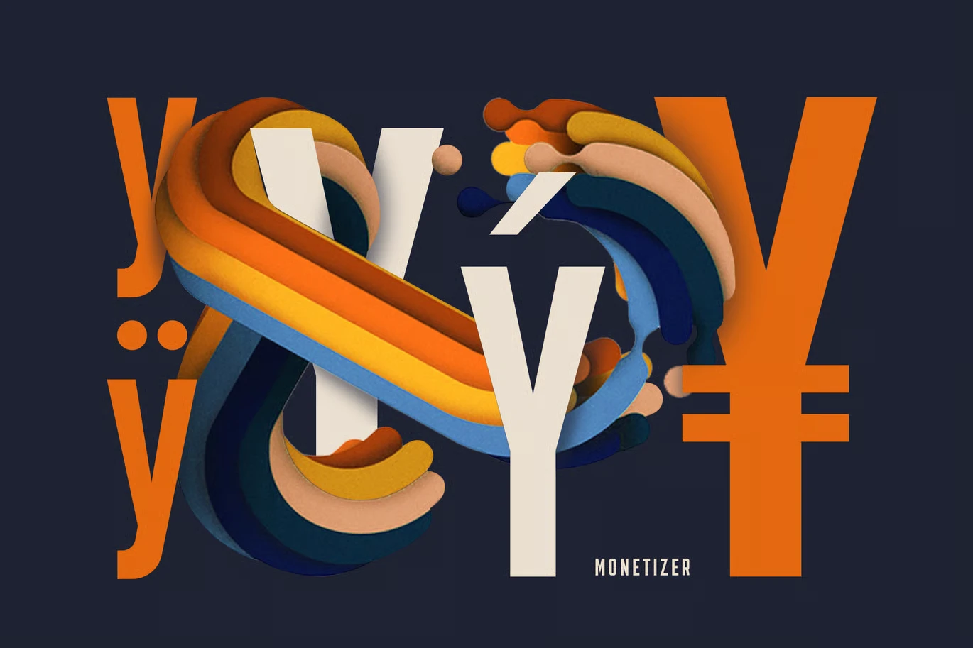
What makes it even better is how versatile it is. You can use it for logo branding, sport design, blog design, and even card invitations. The font doesn’t rely on heavy styling to stand out. It holds its own with clean, simple lines.
There are a lot of similar fonts, but few that match Monetizer’s balance of strength and subtlety. It’s one of those rare display fonts that you’ll reach for again and again.
Where Can You Use This Font?
Monetizer Font works best in projects where clarity and strength matter. It’s perfect for branding, especially when the goal is to feel modern but still professional. If you’re building a logo, this font gives you bold impact without too much noise.
Use it in editorial design layouts where space is tight but style still matters. It stacks well, plays nice with grids, and stays clean in dense text environments. It’s also great for modern advertising design pieces, like posters, online ads, and web headers.
Working on a stationery design kit or special event invite? This font can add structure while keeping things elegant. It’s bold enough for names and headlines, but not too aggressive.
Creative uses go beyond branding. Think art quote designs, home decor prints, or packaging layouts. I even tested it on a few blog design samples, and it worked just as well in a digital layout as it did in print.
If you’re the kind of designer who values clean form, easy installation, and wide application, add this font to your toolkit. It’s a great addition to your design resources.
Font License
Monetizer Font is free for personal use. If you’re working on a commercial project, make sure to buy the proper license from Typia Nesia. That supports the work behind it and gives you full rights to use it in paid designs.


