In the vast world of typography, the age-old debate of sans serif vs serif fonts continues to capture the attention of designers and readers alike. Choosing the right font can make or break a design, affecting not only the aesthetics but also the readability and overall impact of the message. But what exactly are the differences between these two font styles, and how can we utilize them effectively in our projects? Let’s dive into the fascinating realm of sans serif and serif fonts to discover their unique characteristics, history, and how they can be combined to create stunning designs.
Key Points:
- Serif fonts are characterized by small lines or tapers at the beginning and end of letter strokes, conveying a sense of authority.
- Sans serif fonts feature an uncluttered look that is popular for digital media due to their legibility.
- When choosing between serif and sans serif font types, consider factors such as readability, design aesthetic, medium considerations and target audience in order to create impactful designs.
Understanding Serif Fonts

Serif fonts are typefaces that feature serifs, which are small decorative lines found at the end of letterforms. These fonts have been used for centuries, particularly in print media, and are known for their traditional and formal appearance.
The choice between serif and sans serif fonts often depends on context and desired aesthetic, as each font type has distinct characteristics, historical roots, and popular examples.
Characteristics of Serif Fonts
Serif fonts are characterized by small lines or tapers at the beginning and end of letter strokes, giving them a classic and formal aesthetic. These decorative lines, often referred to as “foot”, provide a sense of authority, professionalism, and history.
The presence of serifs in a font has a significant impact on readability, particularly in lengthy passages of text. Serif fonts enhance readability and reading speed due to their decorative strokes at the end of each letter.
In contrast, different fonts, such as display fonts and sans serif typefaces, are often used for headlines and short texts due to their modern and clean appearance. However, using the wrong typeface can negatively impact the overall design and readability of the text.
History of Serif Fonts
The history of serif fonts dates back to Roman antiquity, with their use in carved stone inscriptions and later in print media. Until the 19th century, all books were set exclusively in serif type, but with the emergence of sans serif fonts, the choice between serif vs sans serif became a matter of preference and context.
Today, serif fonts continue to be utilized in various print media, such as books, magazines, and newspapers. Their long history and association with tradition and formality make them a popular choice for body text in printed materials.
However, with the rise of digital media, sans serif fonts have become increasingly popular due to their legibility on screens.
Popular Serif Fonts
Serif typefaces are widely used across different platforms. Examples of such typefaces are Times New Roman, Georgia, Palatino and Garamond. These fonts are commonly employed in newspapers, books, and formal documents due to their classic and formal look.
Notable examples of serif fonts in branding include the Bodoni font, which is widely utilized by Vogue to emphasize its esteemed status. In contrast, modern brands often opt for sans serif logos to convey a clean and minimalist aesthetic.
The choice of a particular font, whether serif or sans serif, depends on the context, desired aesthetic, and intended audience.
Understanding Sans Serif Fonts
Sans serif fonts, also known as sans serif typefaces, are typefaces that lack the extending features known as “serifs” at the end of each letter. These sans serifs are often characterized as modern, approachable, and uncluttered, making them a popular choice for digital media and modern design, especially when comparing them vs sans serif fonts.
Popular examples of sans serif fonts include Helvetica, Futura, and Arial, which are frequently utilized in web design, logos, and digital content as a default typeface.
Characteristics of Sans Serif Fonts
Sans serif typefaces are generally considered more modern than their serif counterparts, as they lack the strokes that distinguish a serif typeface. The French word “sans” meaning “without”, is often used to describe this style of typeface. Sans serif typefaces are typically used to convey a sense of cleanliness, minimalism, friendliness, or modernity.
The absence of decorative lines or tapers in sans serif fonts results in a minimalist and contemporary look. This modern and pared-down aesthetic has contributed to the increasing popularity of sans serif fonts, particularly in tech companies and startups that want to convey a sense of innovation and approachability.
History of Sans Serif Fonts
The history of sans serif fonts began in the early 19th century, with their increasing popularity in digital media and modern design. Sans-serif letters have been present in printed media since 1805. Their simple letterforms and lack of decorative strokes make them easier to read on small screens and low-resolution devices, contributing to their widespread use in digital platforms.
As technology has advanced and digital media has become more prevalent, sans serif fonts have continued to gain traction in the design world. Their legibility on screens and scalability in both large and small sizes make them an ideal choice for digital settings such as websites, landing pages, and mobile apps.
Popular Sans Serif Fonts
Helvetica, Futura, and Arial are among the most frequently utilized sans serif fonts. Their clean and modern appearance makes them suitable for a variety of applications, including web design, logos, and digital content.
Sans-serif typefaces are often used in settings where legibility is a priority, such as titles, credits, column headings, and infographics. They are also a frequent choice for global brands seeking a modern and approachable aesthetic, such as tech companies and startups.
Comparing Serif and Sans Serif Fonts
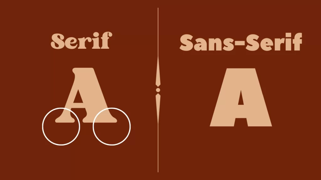
When it comes to readability, legibility, and design aesthetics, serif and sans serif fonts each have their unique strengths and weaknesses. In this section, we will explore these key differences and discuss the factors that contribute to the ongoing debate between serif and sans serif fonts.
Serif fonts are characterized by the small lines or strokes that extend from the edges of the letterforms. These lines are known as serifs and they help guide the eye along the line of text. Sans serif fonts.
Readability and Legibility
The readability and legibility of a font are often debated between serif and sans serif fonts. Traditionally, serif fonts have been considered more readable in print due to their distinct letterforms and the presence of serifs, which aid in guiding the eye along the line of text. On the other hand, sans serif fonts are typically considered more legible on screens, as their simpler letterforms and lack of serifs make them easier to read on small screens and low-resolution devices.
The choice between serif and sans serif fonts depends on factors such as the medium, message, and audience. For example, a printed book may benefit from a serif font to enhance readability, while a website or mobile app might opt for a sans serif font to ensure legibility on various screen sizes and resolutions.
Design Aesthetics
In terms of design aesthetics, serif fonts are generally perceived as formal and traditional, while sans serif fonts tend to appear more approachable and contemporary. The decorative lines and tapers present in serif fonts evoke a sense of history and authority, whereas the clean and simple lines of sans serif fonts convey a modern and minimalist vibe.
Ultimately, the choice between serif and sans serif fonts depends on the desired aesthetic and message of the project. For example, a law firm may opt for a serif font to convey a sense of professionalism and tradition, while a tech startup might choose a sans serif font to reflect its innovative and forward-thinking approach.
Choosing the Right Font for Your Project
The right font can significantly impact the success of a design project, making it essential to consider the medium, message, and audience when selecting a font. In this section, we will discuss the importance of these factors and provide guidelines for choosing the right font for your project.
Whether it involves print or digital media, formal or casual content, and traditional or modern aesthetics, the right font can make all the difference. It is important to consider the medium, message, and audience when selecting a font to ensure the best possible outcome for your project.
Medium Considerations
When selecting a font for a project, it is crucial to consider the medium in which it will be used. Serif fonts are typically preferred for print materials, as their decorative strokes enhance readability in long passages of text. Newspapers, books, and magazines often employ serif fonts for body text, while display fonts (such as sans serif typefaces) are used for headlines and other shorter text settings.
On the other hand, sans serif fonts are more suitable for digital platforms, such as websites, landing pages, and mobile apps. Their legibility on screens and scalability in both large and small sizes make them an ideal choice for digital settings.
Message and Audience
The message and audience of a project should also be taken into account when choosing a font. Serif fonts are suitable for formal and traditional projects, such as legal documents, academic papers, and financial reports. Their classic and authoritative appearance conveys a sense of professionalism and history.
In contrast, sans serif fonts are more appropriate for modern and casual designs, such as websites, presentations, and marketing materials. Their clean and minimalist appearance appeals to a wider audience and reflects a more approachable and contemporary aesthetic.
Combining Serif and Sans Serif Fonts
In some design projects, combining serif and sans serif fonts can create a visually appealing and harmonious composition. By using font pairing principles and drawing inspiration from effective font pairings, designers can achieve a cohesive and impactful design.
This design should effectively communicate their message and appeal to their target audience.
Font Pairing Principles
Font pairing principles involve contrast, similarity, and hierarchy. When combining fonts, it is essential to maintain key qualities between them, use sans serif for heading type and serif for body type, and assign distinct roles to each font. Additionally, it is advisable to limit the font palette to three fonts, utilize contrast to create a visual hierarchy, and comprehend the mood and history of the project.
Achieving harmony when pairing fonts requires an understanding of the mood and history of the project. It is important to ensure that the chosen fonts complement each other and create a cohesive design. By adhering to font pairing principles, designers can create visually appealing and balanced compositions that effectively communicate their message and resonate with their audience.
Examples of Effective Font Pairings
Some popular font pairings for 2023 include Lato and Raleway, Italiana and Cinzel, Roboto Condensed and Roboto, Open Sans and Merriweather, and Spline Sans and Outfit. Combining a bold sans serif font for headings with a classic serif font for body text, or using a decorative serif font for titles and a clean sans serif font for subtitles and captions, can create visually appealing and harmonious designs.
These examples of effective font pairings demonstrate the power of combining serif and sans serif fonts in design projects. By adhering to font pairing principles and drawing inspiration from successful combinations, designers can create impactful and visually appealing compositions that effectively communicate their message and resonate with their audience.
Typography Trends in 2023
As we look forward to 2023, typography trends will continue to evolve, with industry-specific trends and design style trends taking center stage. In this section, we will explore the upcoming trends in typography and how they may influence the choice of fonts in various design projects.
The use of bold and italic fonts will continue to be popular, as they can be used to emphasize certain words or phrases. Sans-serif fonts will remain popular, as they are easy to read and look modern. Serif.
Industry-specific Trends
Industry-specific trends include the increasing use of sans serif fonts in tech and startup companies, while serif fonts remain popular in traditional industries such as law, finance, and publishing. Modern brands often opt for sans serif logos to convey a clean and minimalist aesthetic, while traditional brands may prefer serif fonts to emphasize their esteemed status and history.
These industry-specific trends highlight the importance of choosing the right font for a particular project, taking into account the company’s industry, target audience, and desired aesthetic. By selecting fonts that align with industry trends and effectively communicate the brand’s personality, designers can create impactful and memorable designs.
Design Style Trends
Design style trends in typography include the rise of custom fonts, the blending of serif and sans serif elements, and the exploration of new font styles and combinations to create unique and impactful designs. Custom fonts allow designers to create a distinct look and feel for their projects, while the blending of serif and sans serif elements can result in captivating and harmonious compositions.
As we look forward to 2023, designers will continue to experiment with new font styles and combinations, pushing the boundaries of typography and exploring fresh and innovative ways to communicate their message. By staying abreast of design style trends and incorporating them into their projects, designers can create visually striking and impactful designs that resonate with their audience and stand out in the ever-changing world of typography.
Summary
In conclusion, the debate between serif and sans serif fonts is far from over, as each font type has its own unique characteristics, history, and applications. By understanding the differences between these two font styles and considering the medium, message, and audience of a project, designers can make informed decisions about the right font for their work. As we look forward to 2023, typography trends will continue to evolve, with industry-specific trends and design style trends shaping the way we use fonts in our designs. With a keen eye for typography and a willingness to experiment, designers can create stunning and impactful designs that effectively communicate their message and resonate with their audience.
Frequently Asked Questions
Which is more readable serif or sans serif?
Answer: Based on research, sans-serif fonts are generally more readable than serif fonts, especially for people with low vision. This makes them the preferred choice when it comes to readability.
What are the examples of serif and sans serif fonts?
Answer: Serif fonts are characterized by the small lines or strokes that extend from the edges of the letterforms, known as serifs. Popular examples of serif fonts include Times New Roman, Garamond, Baskerville, Georgia, and Courier New.
Sans serif fonts are made up of straight lines and curves without any serifs; some of the most popular examples include Arial, Helvetica, Proxima Nova, Futura, and Calibri.
Why use a sans serif font?
Answer: Using sans serif fonts in digital designs has become increasingly popular because they’re easier to read on screens and create a modern, clean look. Sans serif fonts have more open counter spaces and fewer decorative elements that can decrease clarity, making them much easier to read on smaller devices.
They also help maintain a professional yet approachable tone, perfect for conveying brand messages.
What are serif fonts best used for?
Answer: Serif fonts are best used for written text intended for long-term reading, as they make words easier to discern. As such, serif fonts are most commonly found in publications such as books, newspapers, and magazines, and online on websites which provide long-form content.
They are also great for creating a more formal, professional look and feel.
What is the main difference between serif and sans serif fonts?
Answer: The main difference between serif and sans serif fonts is their visual style: serif fonts have decorative lines at the ends of letter strokes, while sans serif fonts are more minimalistic and modern-looking.
This difference can be seen in the way the two types of fonts look on the page. Serif fonts are often seen as more traditional and classic, while sans serif fonts are seen as more modern and contemporary.
The choice of font can have a big impact on the overall look.
