

Note: For Commercial Use Click “Buy The Font” Button!
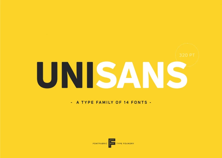
About Uni Sans Font
I’m a typographer and graphic designer who often experiments with new type families for branding projects. While working on a recent design, I came across the Uni Sans Font. Its sharp yet soft geometric structure caught my attention immediately.
I used it in a client presentation, and the results were clean, bold, and modern. Writing this review felt natural because Uni Sans is one of those fonts that stands out when put to practical use. It doesn’t just look good in a specimen, it performs in real design contexts. That’s why I wanted to share my take on it with other designers.
About the Font Type and Designer
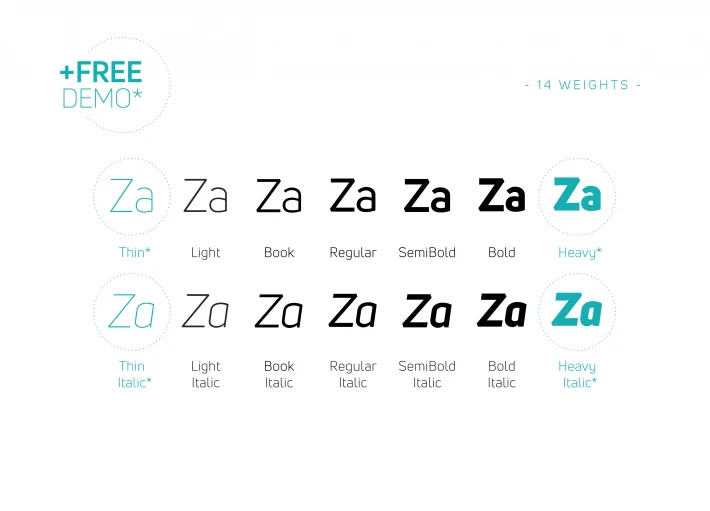
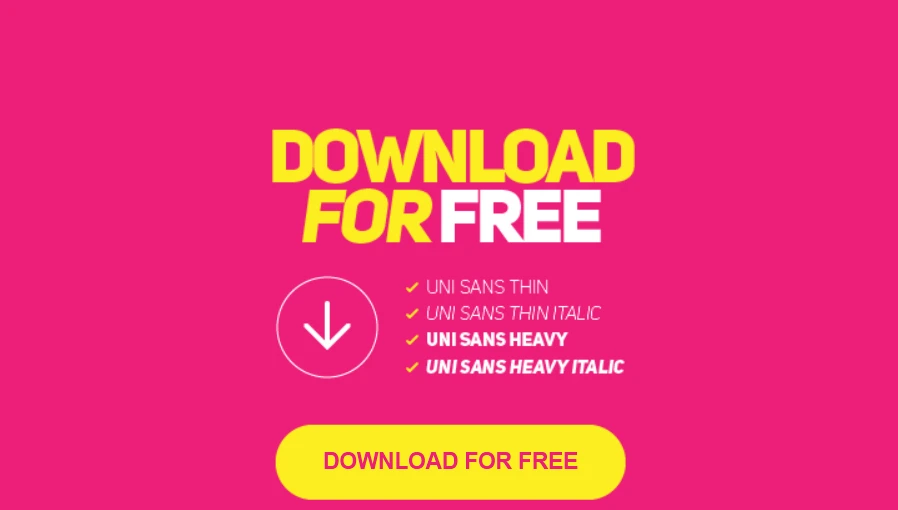
The Uni Sans Font Family was created by Svetoslav Simov and published by Fontfabric, a well-known type foundry that produces professional sans serif families. This font comes with fourteen styles: seven upright and seven oblique. That variety makes it flexible for both display and text applications.
Uni Sans is inspired by classic grotesque typefaces such as DIN and Dax, yet it has its own character. It balances geometric precision with softened details, making it approachable without losing its boldness. Kerning is carefully tuned, which helps keep readability consistent across different sizes and weights. Whether you’re pairing it with other sans serif fonts like Open Sans or testing font pairings in motion graphics, it blends seamlessly while maintaining a strong presence.
Because of its geometric yet versatile design, Uni Sans performs well both on-screen and in print. Designers have praised it for working equally well in logos, packaging, and editorial layouts. That adaptability reflects Simov’s attention to both functional design and visual impact, which is why this type family has become a go-to option for many creatives.
Features of Uni Sans Font
Uni Sans stands out for its balance of clarity and strength. The family offers bold styles perfect for headlines and lighter styles that maintain legibility in smaller text. Each weight is engineered to handle digital use, so performance on websites remains sharp even at different resolutions.
The sans serif construction gives it a timeless appeal, while the softened geometric edges prevent it from looking too rigid. That makes it ideal for brands wanting a modern identity without appearing overly technical. Designers also find it easy to pair with open-source fonts like Google Fonts’ Open Sans, creating accessible design systems that work across multiple platforms.
Its versatility goes beyond aesthetics. Uni Sans supports multiple languages, which makes it practical for global projects. The inclusion of oblique variations allows motion designers to use it dynamically in video or digital advertising. Combined with a professional kerning system, the font maintains smooth readability whether it’s placed on posters, t-shirts, or digital banners.
Another notable aspect is the way it handles print design. The weight distribution ensures ink consistency, which means it looks professional in both small-scale business cards and large outdoor billboards. This makes Uni Sans not just a trendy free font, but a dependable typeface for professional work.
Where Can You Use This Sans Serif Font?
The Uni Sans Font works across a wide range of design contexts. In branding, its bold weights are strong enough for logos and taglines, while its lighter cuts can handle product packaging and stationery. For digital products, it offers clarity on mobile and desktop, giving UI elements a crisp and modern look.
In editorial and advertising, the geometric structure ensures headlines stand out without overpowering supporting text. Motion designers often use the oblique styles to create kinetic typography, giving animation projects a sleek feel. Since the font family includes enough weights for hierarchy, designers can structure content clearly without relying on multiple font families.
For merchandise, Uni Sans translates well onto fabrics like t-shirts and hoodies. Its clean letterforms stay sharp in print, which also makes it ideal for posters and banners. Businesses using it in commercial work should keep in mind that the Uni Sans Font Free Download is for personal use only, but the licensed version offers the full flexibility needed for professional projects.
Pairing Uni Sans with other sans serif fonts or even a serif option gives brands a wide design range. When paired with Open Sans Regular, for example, it creates a modern balance that works well in websites and corporate identity systems. Whether for bold product design or minimalist web layouts, Uni Sans adapts easily.
Font License
The Uni Sans Font is free to download for personal projects, but commercial use requires a paid license. Designers can find the download link through Fontfabric, where the full family is available. Always check copyright and licensing before applying it to professional products.


