
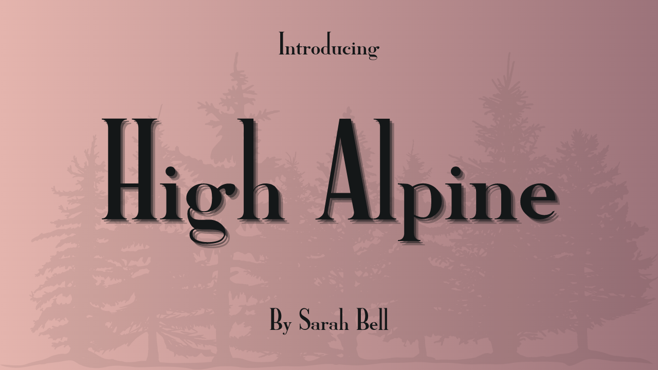

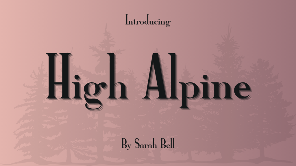
Introducing High Alpine Font: Elevate Your Designs with Sarah Bell’s Masterpiece
Are you tired of the same old fonts that lack personality and flair? Do you want to make a bold statement with your design projects? Look no further than High Alpine, a semi-bold serif display font designed by the talented Sarah Bell. With its striking features and versatility, High Alpine is the perfect choice for designers looking to elevate their work to new heights.
Designer: Sarah Bell
Sarah Bell, the creative mind behind High Alpine, has crafted a font that stands out in the world of typography. Her meticulous attention to detail and innovative design approach shine through in every aspect of High Alpine. Bell’s passion for typography has led her to create a font that is not only visually captivating but also incredibly functional.
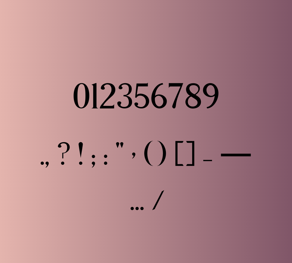
Design Characteristics
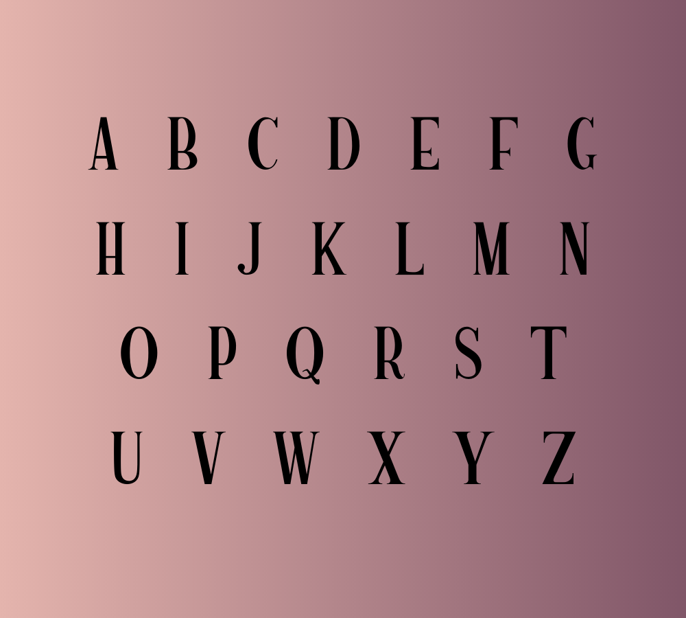
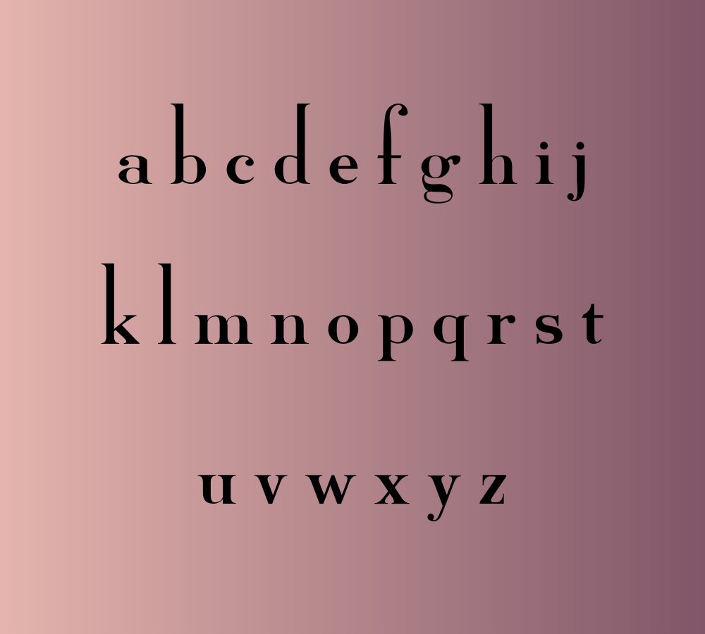
High Alpine is characterized by its tall ascender and short descender, which combine to create a commanding appearance for uppercase letters. This distinctive feature makes it ideal for eye-catching headlines and attention-grabbing designs. When you want to make a statement, High Alpine is the font that will help you achieve it.
Variety and Personality
High Alpine goes the extra mile by offering a plethora of alternative characters. You can find uppercase letters with high crossbars and lowercase letters with longer stems. These alternatives provide you with endless possibilities to infuse variety and personality into your designs. Whether you’re aiming for a bold, dynamic look or a more subtle and refined aesthetic, High Alpine can adapt to your creative vision.
Versatile Applications
High Alpine is a font that transcends boundaries. It is equally suited for both digital and print applications. Whether you’re designing a website, creating a poster, developing packaging, or working on a logo, High Alpine can seamlessly integrate into your projects. Its versatility ensures that your designs will always look polished and professional.
Easy to Read
While High Alpine is known for its commanding presence, it remains highly readable. The clarity of its characters and well-balanced proportions ensure that your audience can effortlessly absorb your message. This readability is essential for effective communication in design, making High Alpine a font that doesn’t compromise on function for the sake of style.
License: Free for Commercial Use
One of the most remarkable aspects of High Alpine is its accessibility. It’s available for free for commercial use, allowing designers of all backgrounds to take advantage of its unique features without any restrictions. This means you can use High Alpine in your client projects, branding materials, or personal creations without worrying about licensing fees.
Conclusion
In the world of typography, High Alpine stands tall, quite literally. Sarah Bell’s creation combines the best of both worlds: striking visual appeal and functional readability. Its impressive ascender, short descender, and abundance of alternative characters provide you with the tools to craft designs that leave a lasting impression.
Moreover, the fact that High Alpine is free for commercial use makes it even more enticing for designers looking to enhance their projects without breaking the bank. So, whether you’re a seasoned professional or an aspiring designer, give High Alpine a try and see how it can elevate your creative endeavors. With High Alpine, your designs will always be a cut above the rest.


