
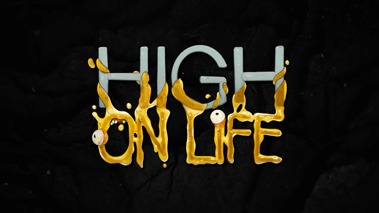


High on Life is a video game that has captured the attention of many gamers worldwide. One of the things that sets this game apart is its custom-designed font, which is used in the game’s logo. The font was designed specifically for the game by the studio, and it is unique to the game.
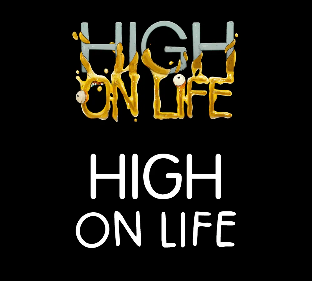
The logo for High on Life has two designs, one for the word “High” and one for the word “On Life.” The font used in the logo for the word “High” looks similar to Arial Rounded Regular, but it is not quite the same. The edge of the logo word “High” is rough and uneven, which gives it a unique and distinctive look.
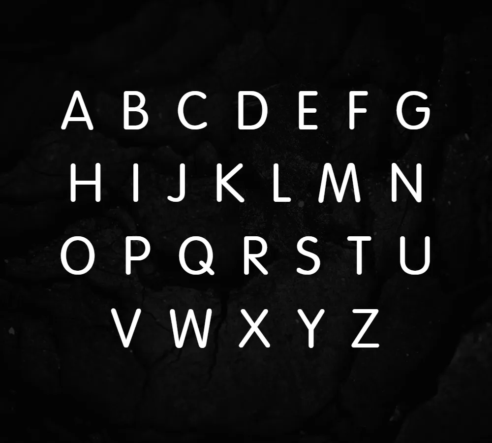
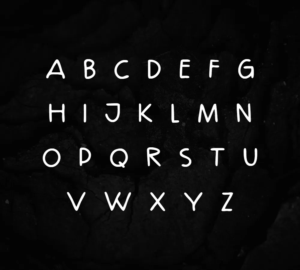
If you compare the High on Life font with Arial Rounded Regular side by side, you can see that there are differences in the structure and design of the letters. The High on Life font has a more pronounced curve to its letters, and the spacing between the letters is slightly different. These subtle differences are what make the High on Life font stand out from Arial Rounded Regular.
The font used in the logo for the word “On Life” is also custom-designed and does not match any existing fonts exactly. While there is a font called Aliman that looks similar to the logo word “On Life,” the design of the logo word “On Life” includes a liquid-like element surrounding the word, as well as a part of the word “High.” This element adds a unique touch to the logo and helps to make it stand out from other game logos.
Overall, the High on Life font is a testament to the creativity and attention to detail of the game’s designers. The custom-designed font gives the game a unique identity and helps to create a cohesive brand image. As the popularity of the game continues to grow, it is likely that the High on Life font will become even more iconic and recognizable.


