

Letov Font: The Perfect Blend of Elegance and Readability
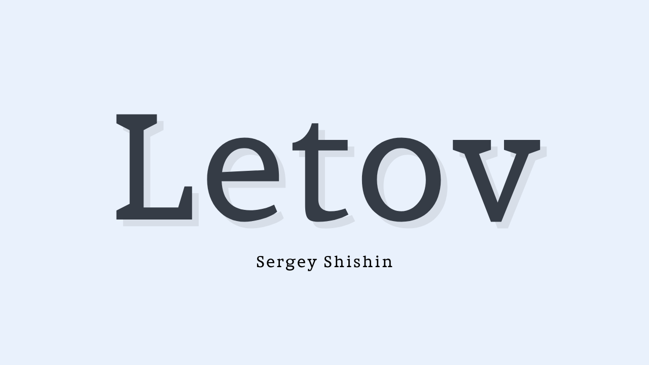
Letov is a serif font that brings together style and readability, which are often at different ends of the typography spectrum. Sergey Shishin made this amazing font, which combines elegance and readability in a way that makes it a great choice for a wide range of design projects. Letov Font has you covered whether you’re working on branding, editorial design, or just want to make your text look better.
Designer: Sergey Shishin
Let’s start by acknowledging the creative mind behind this font, Sergey Shishin. His expertise shines through in the careful crafting of Letov Font. Shishin’s dedication to creating a typeface that strikes the perfect balance between aesthetics and functionality is evident in every character.
License: Free for Commercial Use
One of the standout features of Letov Font is its accessibility. It’s available under a free license for commercial use, which means designers can incorporate it into their projects without any legal concerns. This generous licensing approach ensures that Letov Font can be enjoyed by both professionals and enthusiasts alike.
The Beauty of Letov Font
Letov Font is a stunning serif typeface that seamlessly blends both upper and lowercase characters. Its unique appeal lies in its ability to adapt effortlessly to various design applications. Here’s why Letov Font stands out:
Crisp Lines with Organic Waves
At first glance, Letov Font’s crisp lines may appear straightforward, but a closer look reveals a subtle organic wave. This unexpected element adds a touch of personality and uniqueness to the font, making it far from ordinary.
Maximum Readability at Small Sizes
Typography’s primary purpose is communication, and Letov Font excels in this aspect. Even at small sizes, it maintains maximum readability. This characteristic is particularly valuable for body text, ensuring that your message remains clear and legible.
Maximum Expressiveness at Large Sizes
While Letov Font excels in small-scale readability, it doesn’t shy away from making a bold statement when enlarged. Its expressive qualities shine through, making it a versatile choice for headers, titles, and other prominent text elements in your design.
Versatility at Its Core
Letov Font’s versatility is one of its most significant strengths. It can effortlessly adapt to a multitude of design projects:
- Branding: Letov Font adds a touch of sophistication to brand identities. Its elegant yet readable appearance can help your brand stand out in a crowded marketplace.
- Editorial Design: When working on magazines, newspapers, or books, Letov Font ensures that your readers have a comfortable and enjoyable reading experience.
- Digital Media: Whether it’s websites, social media graphics, or digital advertisements, Letov Font’s crisp lines ensure that your message is conveyed effectively on digital platforms.
- Print Materials: From brochures to posters, Letov Font can enhance the visual appeal of your print materials, making them more engaging and memorable.
User-Friendly Design
Beyond its aesthetics, Letov Font boasts a user-friendly design. It is easy to work with, making it a favorite among designers who appreciate both form and function. Its character set includes a wide range of glyphs and symbols, ensuring that it can accommodate various languages and design requirements.
In conclusion, Letov Font is a remarkable creation by Sergey Shishin that strikes a perfect balance between elegance and readability. Its unique blend of crisp lines and organic waves, combined with maximum readability at small sizes and expressiveness at large sizes, makes it a top choice for designers across the board. Moreover, its free-for-commercial-use license opens up a world of possibilities, ensuring that Letov Font continues to make waves in the world of typography for years to come. Whether you’re designing for print or digital, branding or editorial, Letov Font’s versatility and beauty will undoubtedly elevate your projects to new heights.


