About Rhythmic Font
I’m a typographer and graphic designer who’s always exploring fresh typefaces for branding. While working on a client’s visual identity, I came across Rhythmic Font. It instantly stood out. The hand drawn brush style felt raw, bold, and expressive. It matched my vision for a vibrant, modern brand. I first used it in a digital design mockup, and the feedback was incredible. Since then, I’ve tested it across posters, packaging, and a brand book. It’s become a go-to font when I want something with energy and character. This review shares my honest experience so other creatives can explore its potential too.
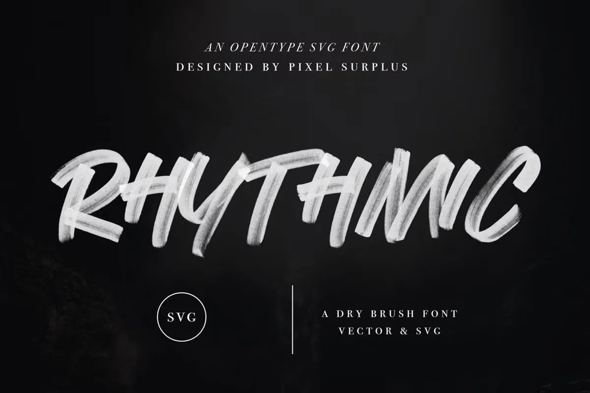
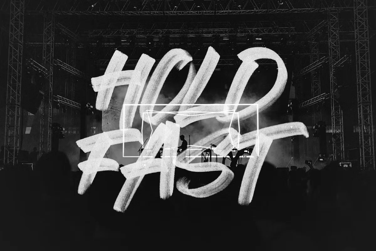
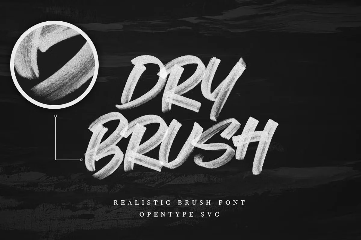
Rhythmic Font is a brush marker display typeface created by Surplus Type Co. It comes in two versions: Rhythmic SVG and Rhythmic Regular. The SVG version captures the original hand drawn texture, showing every stroke and faded edge with precision. This gives it a hyper realistic look. The Regular version simplifies things slightly, making it easier to use in all kinds of software. You also get a Photoshop file with the characters as layered graphics. This is helpful for detailed customization in branding or packaging layouts. Designed with passion, this typeface reflects rhythm and movement. Surplus Type Co has built a unique product that feels both artistic and controlled. If you explore their Behance page or MyFonts profile, you’ll notice their focus on expressive display fonts. Rhythmic is no exception. It adds emotion to the layout and offers a solid foundation for creative projects.
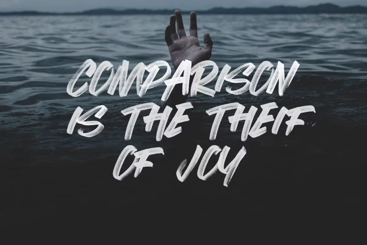
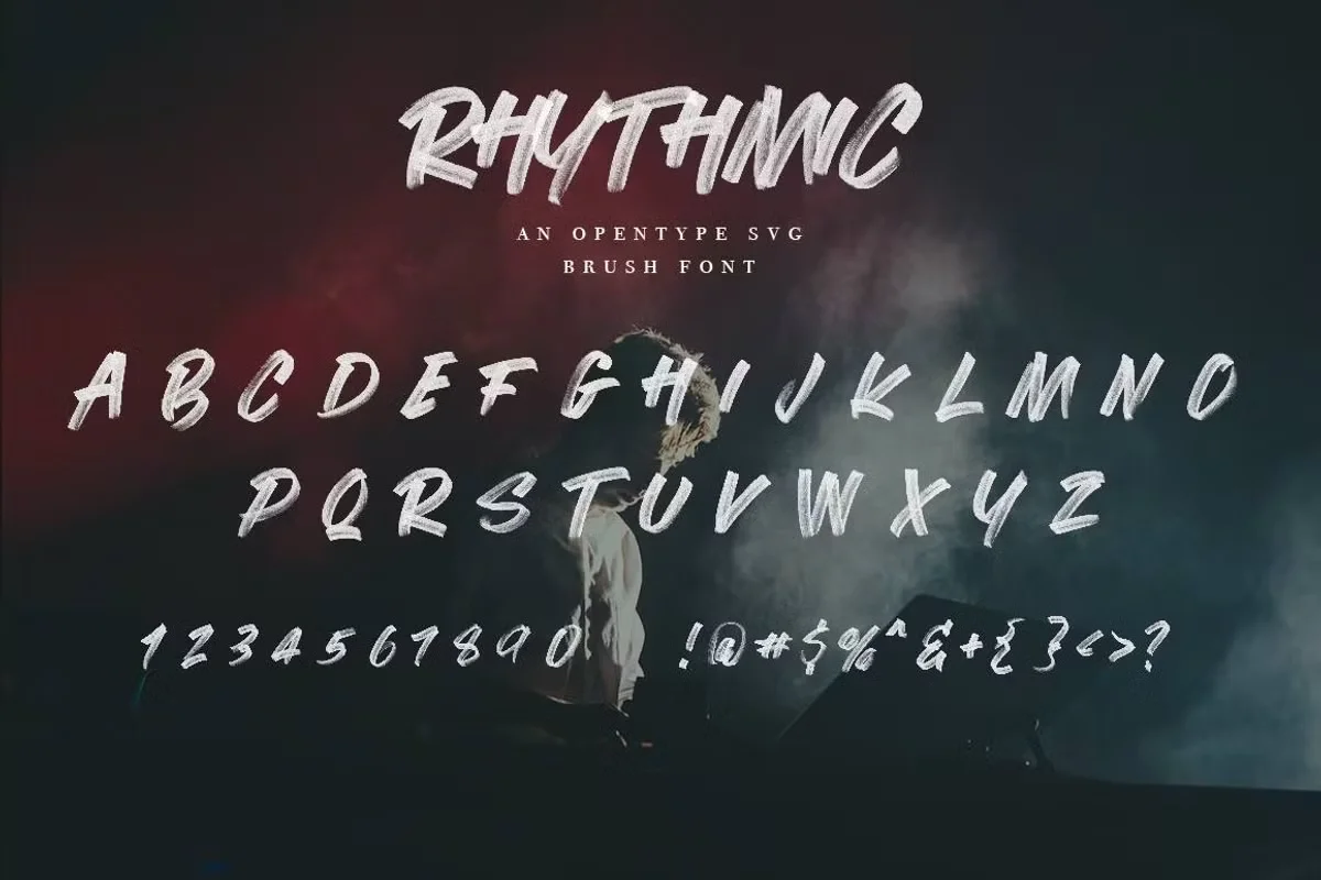
What makes Rhythmic Font stand out is its detail. Every brush stroke feels intentional. The cap-only style makes it bold and punchy. Whether you choose the SVG or Regular format, the letterforms stay wide and clear. The natural marker texture gives it a human touch. It’s not polished like a sans serif typeface, but that’s the point. This type is loud in the best way. It feels alive. The SVG version preserves the opacity and variation of a real brush pen. Each glyph is full of personality. You can use it in Photoshop, embed it into a website, or explore it in a full font family layout. It supports OpenType features and includes a set of key characters for creative flexibility. Great for headers, posters, or logos. The styling fits brands looking to stand out. Rhythmic Font has just enough variation to avoid monotony, while still being easy to work with in Adobe tools and across the web. It feels fresh without trying too hard.
Where can you use this font?
Rhythmic Font works best in visual projects that need impact. Think logo design, album covers, t-shirt graphics, product labels, and bold landing pages. Its hand drawn brush marker style gives each design a sense of movement. It doesn’t behave like a basic font. It brings rhythm and energy. I’ve used it in pitch decks, branding guides, and poster layouts. It holds its own even against bold imagery. If your brand voice is playful, artistic, or edgy, this is a perfect fit.
You can drop it into Photoshop projects and scale it without losing detail. The SVG version looks especially good in large display sizes. The brush texture remains sharp. You can also explore how it behaves in digital ads, typography projects, or header sections of your website. It gives titles a strong presence without needing extra styling. The Regular version is better for cases where texture-heavy fonts might slow performance.
This font was clearly made for creative studios who want more from their type. You can set up rhythm in the layout using contrast and spacing. The grid, variation, and unique letter structure all support a strong design direction. If you’re working on expressive branding, this font helps bring it to life.
Font License
The Rhythmic Font Download is available for free, but only for personal use. If you plan to use it in commercial work or for client projects, you must purchase a proper license type. The designer has made that clear. Always check the terms before use. You can reach out if you need support or want to explore extended licensing.
