


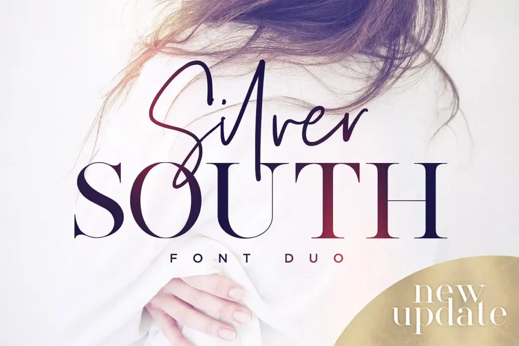

About Silver South Font
I stumbled across the Silver South Font Duo last month while hunting for the perfect typeface for a luxury skincare brand project. As a typographer with 8 years in graphic design, I’m always searching for fonts that deliver both character and versatility. Silver South caught my eye on Behance, and I immediately incorporated it into my client’s packaging design.
The contrast between the flowing script and sharp serif created exactly the upscale feel we needed. I’ve since used it for three more projects, including a wedding invitation suite that my clients absolutely loved. The font’s versatility surprised me – it works across both digital and print applications without losing its distinctive charm.
The Designer’s Vision
Silver South Font represents the remarkable craftsmanship of Sam Parrett, the creative mind behind Set Sail Studios. Parrett designed this elegant pairing as a modern take on classic typography, blending contemporary design sensibilities with timeless elegance. The stylish didot-style serif font showcases crisp, high-contrast strokes that communicate sophistication, while the expressive script companion flows with natural calligraphy-inspired movements.
What makes Silver South stand out in the crowded typography market is its thoughtful balance. The serif component offers structure and readability, while the script adds personality and flair. Parrett clearly understood the need for fonts that can work hard across multiple applications. His attention to glyph details – particularly the smooth connections in the script font – shows his expertise in type design.
The font represents a fresh direction in modern typography by combining clean, precise letterforms with organic flourishes. This balance makes Silver South equally effective for luxury branding, editorial design, or special event materials without feeling overused or generic.
Features That Shine
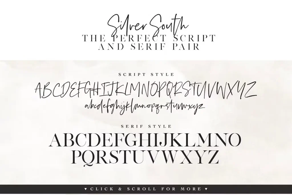
Silver South isn’t just beautiful – it’s packed with smart features that make designers’ lives easier. The package includes four complementary font files that work flawlessly together or stand strong independently.
The Silver South Script offers clean, flowing letterforms with a natural handwritten quality, while Silver South Script Alt provides a complete second version with alternative characters.
This clever approach lets you avoid repetition when letters appear multiple times in a word, creating a more authentic custom-lettered appearance. Simply switch to this font for an additional layout option when you need variety.
The Silver South Serif delivers crisp, elegant typography with its classy serif design, creating a perfect pairing contrast with the script variations. The font includes extensive punctuation, numerals and a large range making it practical for body text, not just headlines.
What impressed me most was the dedicated Silver South Ligatures font, which smartly handles letter combinations. For designers without OpenType software, this fourth font file provides easy access to beautiful letter combinations. If you do have OpenType capabilities, turning on “Discretionary Ligatures” automatically transforms standard letter pairs into custom ligatures.
The multilingual support covers 13 languages, including English, French, German, and more, making this a truly versatile tool for international projects.
Where Can You Use This Font?
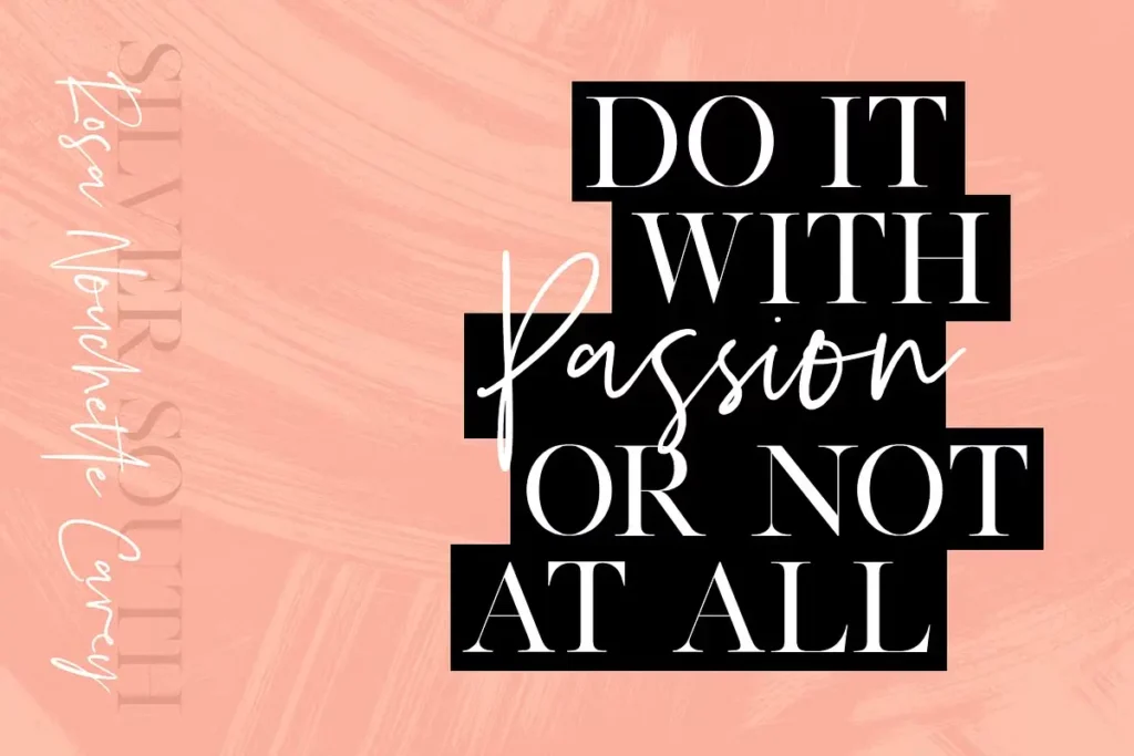
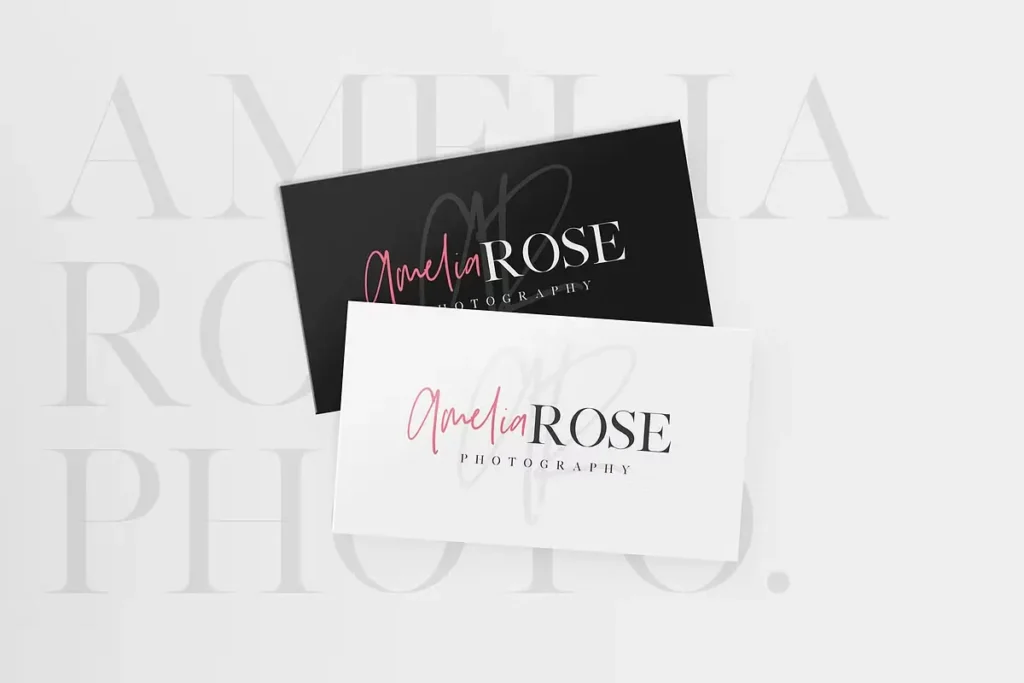
The Silver South Font Duo shines across countless applications. I’ve personally used it for logo design where the script component adds signature-like authenticity while the serif maintains readability. For wedding stationery, it delivers that perfect balance of romance and elegance – invitations, programs, and place cards all benefit from its sophisticated look.
On social media, Silver South cuts through the noise. Instagram quotes and promotional graphics gain immediate visual distinction with the font’s unique character. The serif component works perfectly for longer texts on Facebook posts or LinkedIn articles.
Product packaging is where I’ve seen Silver South truly excel. The script adds luxury to cosmetics, specialty foods, and beverage labels, while the serif handles important details like ingredients and descriptions. The contrast between the two creates visual hierarchy without requiring additional fonts.
For advertising materials, both print and digital, Silver South offers enough variation within its family to create complete campaigns. Magazine spreads, brochures, website headers, and display ads all benefit from its cohesive yet diverse character set. The font performs beautifully across Adobe software – from Illustrator to InDesign to Photoshop – and renders well on both Mac and Windows systems.
Licensing Options
Silver South Font comes with a premium desktop license that covers most standard design needs. The license allows use in logos, advertisements, social media posts, and wedding designs. For web projects, you’ll need the separate webfont license, which enables embedding on websites through CSS. The base license covers one designer on up to five computers, making it perfect for small studios or individual creators.
For larger teams or extended usage rights like mobile apps or PDF embedding, Set Sail Studios offers expanded permission options through their website. Always check the specific terms and conditions when purchasing to ensure appropriate coverage for your intended applications.


