
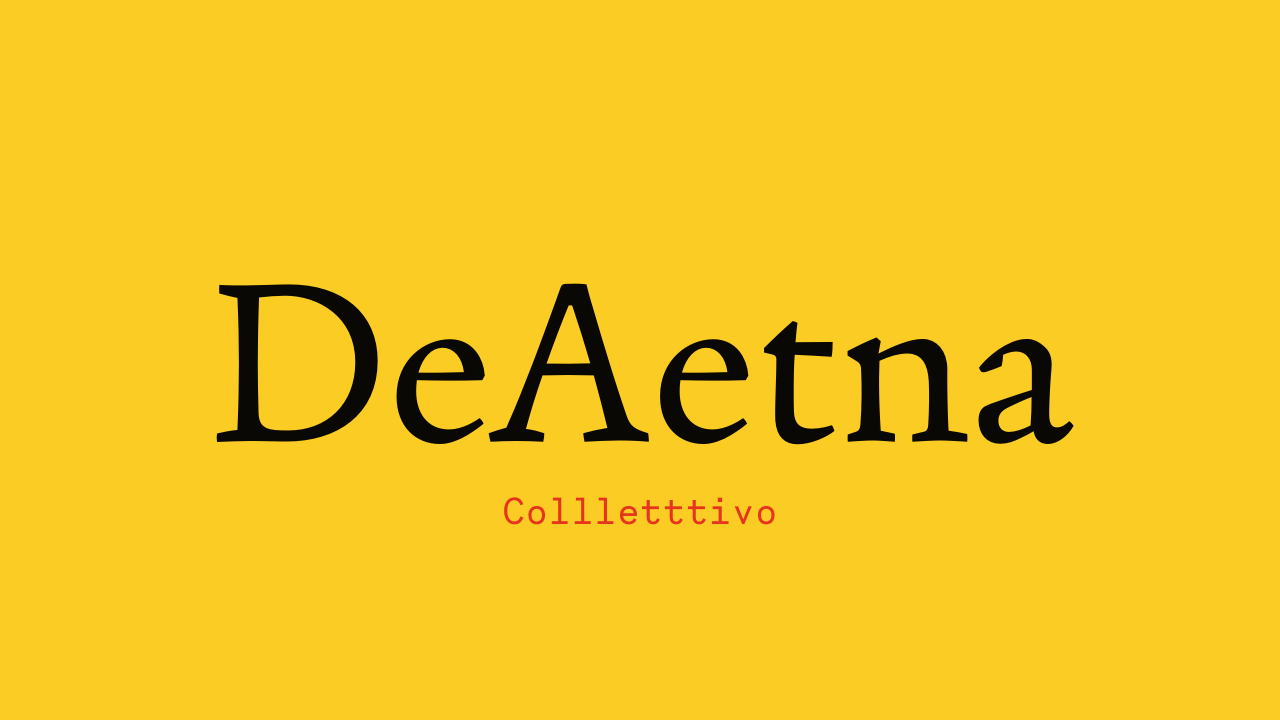


De Aetna Font: A Typeface Expert Review
De Aetna is a serif font that pays homage to a timeless typeface originally crafted by Francesco Griffo for the De Aetna publication back in 1496. This revival typeface breathes new life into the classic design, offering four distinct styles that infuse a distinctive charm and vitality into both text paragraphs and display type.
Designer: Michele Patanè
Michele Patanè, the talented designer behind De Aetna Font, has created a masterpiece in the world of typography. This font showcases Patanè’s commitment to combining elegance and liveliness into a single typeface.
Font Features
De Aetna Font is available in four distinct weights, offering versatility and adaptability for various design needs. Let’s take a closer look at some of its features:
1. Elegance
De Aetna Font exudes elegance. It has a refined and sophisticated appearance, making it perfect for projects that require a touch of class. Whether you’re designing wedding invitations, luxury brand logos, or high-end restaurant menus, this font will elevate your designs.
2. Liveliness
Despite its elegance, De Aetna Font also has a lively quality to it. This makes it suitable for a wide range of applications, from fashion magazines to creative advertising campaigns. Its lively character adds a sense of excitement and energy to your text.
3. Versatility
With four distinct weights – Regular, Italic, Bold, and Bold Italic – De Aetna Font is highly versatile. You can use it for both text paragraphs and display type, allowing you to maintain a consistent and visually appealing design throughout your projects.
4. Calligraphic Roots
The display sizes of De Aetna Font maintain a visual link to calligraphic roots, giving it a unique and artistic flair. This connection to calligraphy adds a touch of traditional craftsmanship to modern design projects.
5. Typographic Qualities
In contrast, when used in text sizes, De Aetna Font exhibits more typographic qualities. This makes it highly readable and suitable for body text in various publications, including books, magazines, and websites.
License: Free for Commercial Use
One of the standout features of De Aetna Font is its licensing – it’s free for commercial use. This means that individuals and businesses alike can use this font in their projects without worrying about licensing fees or restrictions, making it an excellent choice for a wide range of applications.
In conclusion, De Aetna Font, designed by Michele Patanè and available under a free commercial license, is a versatile and elegant serif font with a lively character. Its four weights, calligraphic roots, and typographic qualities make it an excellent choice for a wide range of design projects. Whether you need to convey sophistication, creativity, or readability, De Aetna Font has you covered.


